About
Contact
Login
English
Dutch
Search
Menu
Products
Digital Market Tracker
Experience Deep Dive
Platform
Industries
Automotive
Energy
Finance
Insurance
Retail
Telecom
Travel
Pricing
Case studies
Insights
What is CX Benchmarking?
Blog
Cases
Downloads
About
Contact
Get in touch
Product Updates
Industry
All
All
Automotive
Energy
Finance
Insurance
Recruitment
Retail
Telecom
Travel
Mar 2023
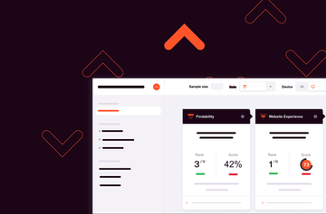
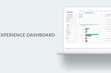
The WUA Customer Experience Dashboard gets updated with powerful new features
Dec 2021
Product Update: Demographic filters & starting screen
Feb 2021
Product Update: Topic Modelling
Get started now with our free trial
Start now for free
esc