The WUA Customer Experience Dashboard gets updated with powerful new features
WUA’s Customer Experience Dashboard provides incredible insights about what drives optimal digital customer experiences. As it has grown, this tool has become more extensive and complex. To improve the experience for our own customers, the Customer Experience Dashboard has undergone a new update.
With this latest revision, users can get even better insights and gain the freedom to access and use their data in more ways.
What’s the WUA Customer Experience Dashboard (and why did it need an update)?
Our Customer Experience Dashboard gathers massive quantities of data about customer experiences. Every time WUA conducts customer experience benchmark research, the data is collected and made available to our customers via the WUA Customer Experience Dashboard.
The dashboard makes it easy for companies to gain insights and analyze data from the customer experiences.
You can benchmark your customer experience against the best in your industry and learn from the deep qualitative and quantitative data available. These data can inform which actions are needed to improve your performance and pull-ahead of your competition with a superior experience. Through a careful analysis of how your experience compares to direct competitors, you can see which tactics are most successful and employ them to the maximum advantage.
The only drawback of the previous dashboard was that some users found it to be too extensive and overwhelming. The Customer Experience Dashboard is a key part of WUAs consultancy package, so we wanted to ensure it was easier for users to gain the most benefit. We’ve focused on making it easier to retrieve the data they need, and conduct their own analyses.
Practicing what we preach
We’re huge advocates of optimizing user experiences, so it was a natural priority for us to apply the same methodology to our own dashboard.
The process began with a benchmarking study, using 5 different UX data and website data analysis tools. We examined each of these carefully to compare dashboard design and smart usability tools.
Based on this input and our own UX design experience, we made a shortlist of specific things we wanted to improve. We conducted 3 rounds of usability sessions with (potential) customers, asking what their desires were. These were mapped to our shortlist and prioritized. After this, we tested the navigation and subsequently tested every new part of the dashboard, piece by piece.
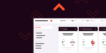
Now easier to find your research output thanks to improved UX
The optimization process was essential to improve the overall usability of our dashboard. We have now implemented an improved navigation structure, based on the three phases of the customer journey: findability, website experience, and conversion. With this structure, you can find the data you’re looking for more intuitively.
We’ve also structured the information into three layers, based on the granularity of the data: summary, highlights and details. For the summary, for example, we generate a simple, one-page management summary. This has been applied also for each of the three phases of the customer journey (findability, website experience and conversion), so we have the highlights per phase in a quick overview. Then you can zoom-in to the deepest level, and see all the gritty details.
Thanks to these changes in the navigation and the data structure, our customers can find the information they need faster and easier.
Watch a short video about the usability updates:
Putting your data to use with our algorithm-based consultancy
Using machine learning, we were able to offer a valuable new tool to the dashboard. This tool helps you prioritize your conversion optimization efforts based on the data. It provides valuable analyses and tips based on algorithmic analysis (machine learning) of massive datasets from our gigantic database.
With this tool we assemble all the qualitative and quantitative data about you and your competitors. This is then clustered into a set number of topics. For each topic, we determine your performance on this topic and how much impact it has on your conversion.
Using this AI-powered tool, you can easily see which topic needs the most attention based on how it impacts your conversion rate.
Finally, we created the topic analysis feature. This allows you to analyze different topics and see where you stand against your competitors. You can quickly determine who’s the best performer on this topic (in your market), and what your potential customers have to say about you on this topic. This feature allows you to quickly get to the nitty-gritty details to find out what specifically you need to do to improve your website and increase your conversion.
Watch a short video about the new tools:
Each of the updates we have made has been guided by our passion for the user experience, and how each feature adds value for our customers. We’re confident that you’ll agree; each of these has made it easier to get clear insights that lead to the best-performing digital customer experiences.
Want to learn more?
Schedule a demo with one of our specialists.