What you can learn from the fastest climbers in the Dutch health insurance market: Part 1
In the orientation study of a health insurance policy in The Netherlands, we see four really fast climbers on the desktop compared to last year: Menzis.nl, CZ.nl, DeFriesland.nl, and Unive.nl. What can other providers in the health insurance market and beyond learn from them?
This is part one of a series of two articles, part two can be found here.
Consumers are opting for CZ most often on both mobile and desktop when orientating themselves online about health insurance. This is evident from our most recent study in the healthcare market, conducted amongst 1000 respondents (see also this interview with Nils Vergeer of CZ).
The fastest climbers
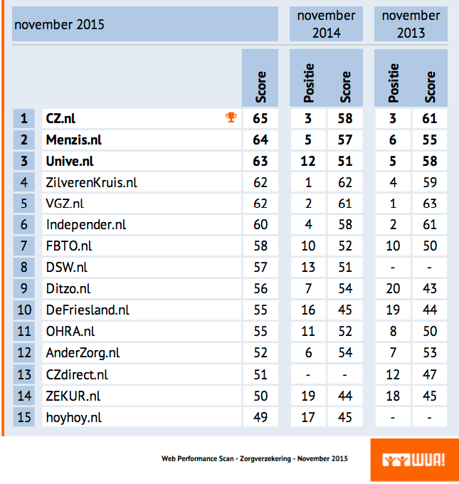
If we compare the absolute scores of the November 2015 measurement to those of the November 2014 measurements on the desktop, the four providers ranked by increase in WPS score are as follows:
2. DeFriesland.nl: +10 (van positie 16 –> 10)
3. CZ.nl: +7 (van positie 3 –> 1)
4. Menzis.nl: +7 (van positie 5 –> 2)
Insights Update Health Insurance
The table below shows the full ranking of the desktop study with all providers in a row (up to and including position 15). As mentioned earlier, CZ.nl is the winning provider on mobile as well as desktop.
Why are these four providers doing so well? For each component of the WUA! DSS research model(Findability, Look&Feel, Offerings, Brand, and Ordering Process) we look at where the biggest improvements can be found. This is article 1 in a series of two. In this article we’ll discuss the first three topics.
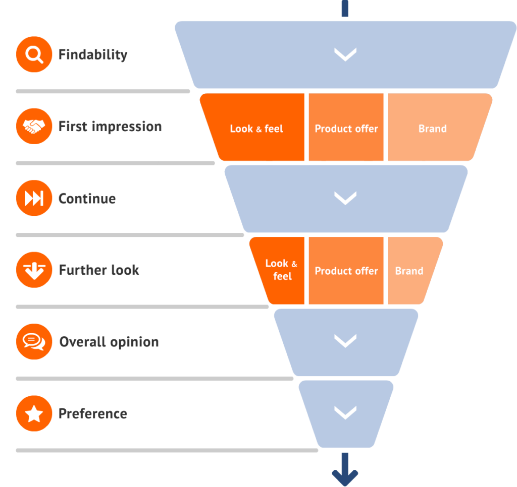
The WUA! Digital Sales Scan Model
1 Everything stands or falls with findability!
If a consumer is unable to find a health insurer during the orientation process, it is impossible for that health insurer to get the consumer’s preference. On the topic of findability, mainly the speed with which the consumer is able to find a healthcare provider is important. The WUA! benchmark shows that the more top of mind a health insurer is, the more often this health insurer’s website will be visited. And the sooner this is the case, the more likely it is that your website will get the ultimate preference.
This Health Insurance study shows that the top five health insurers that are found most frequently and quickly take as much as 44 percent of the total market preference. That means that the other half (56 percent) has to be shared with 24 health insurers: that means a much smaller piece of the (preference) cake!
How do the four fast climbers do it?
If you look at the four fastest climbers in this study, it turns out that mainly Univé.nl, DeFriesland.nl and CZ.nl have made great strides in the area of findability. In the previous study, Univé.nl was also found by 30 percent of the respondents, and in the latest study this figure has risen to 34 percent. At CZ.nl we see an increase of 36 percent to no less than 40 percent, whilst DeFriesland.nl wasn’t found often enough in the previous study whereas currently 6 percent (= 42 respondents out of 700) managed to find it.
The speed of findability
When it comes to the speed with which the providers are found, we see that CZ.nl has made the biggest strides. Last year, 10 percent of respondents managed to find the provider first, and now this percentage has risen to 17 percent.
Univé.nl is also performing a lot better in this area: the provider is found more quickly as the first (5% 6%), second (7% 8%) and third (6% 9%) provider. For Menzis.nl, findability has decreased slightly (35% 34%), but the speed with which Menzis.nl is found has increased compared to last year’s study.
2 Look&Feel
On to the next topic: Look&Feel. Just like all the other topics after the findability phase in the WPS model during the study, this topic is composed of a first impression and a deepening phase.
First impression
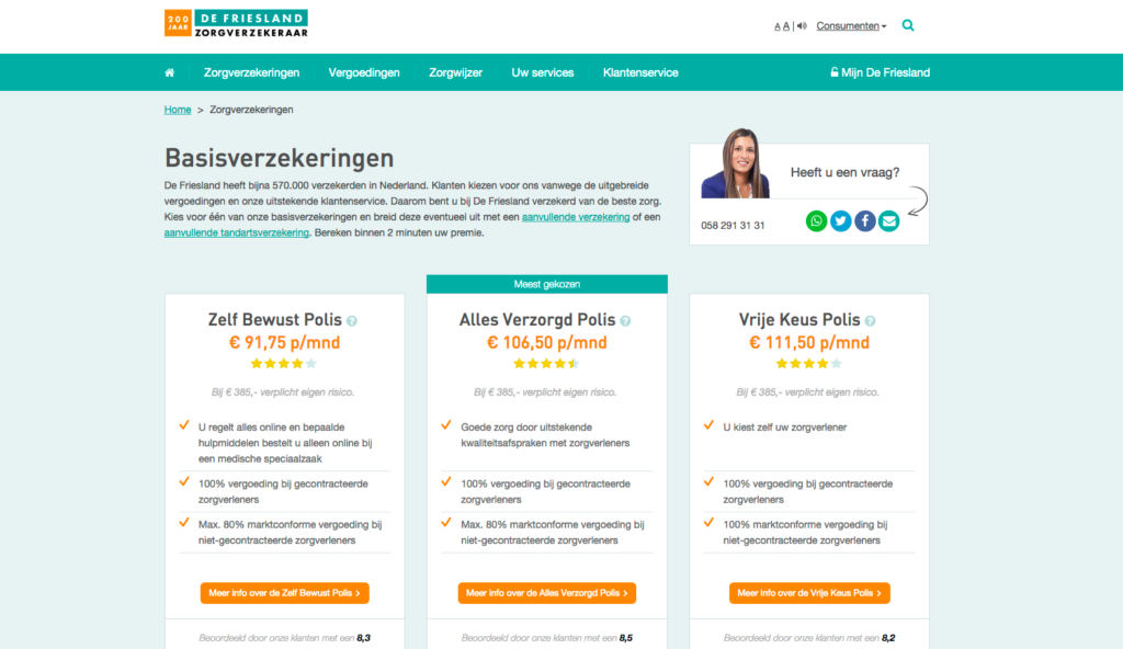
On the topic of Look&Feel we see that the fast climbers DeFriesland.nl (17th 1st) and CZ.nl (13th 2nd) have made significant progress when it comes to the first impression. DeFriesland.nl succeeds in immediately showing its relevance by offering information at a glance. Relevant content is divided into three clear blocks, and it’s very hard to miss the monthly premium. CZ.nl has mainly made progress with visuals and the photographs used. For example, one remark by one of the respondents about CZ.nl during this phase was: “Positive, healthy, sportive appeal”.
Deepening
In the deepening phase, DeFriesland.nl (22nd 2nd) and Menzis.nl (15th 3rd) made the greatest strides. Other health insurers have something to learn from DeFriesland.nl when it comes to readable texts and objective, honest information on the website. A remark from one of the respondents in this phase about DeFriesland.nl: “Organised, with a clear goal”. Menzis.nl is very good at leaving out unnecessary information. The website consists of brief texts and clear overviews where the products on offer are explained.
3 Offerings
On to the next topic: Offerings. Just like all the other topics after the findability phase in the WPS model during the study, this topic is composed of a first impression and a deepening phase.
First impression
All four providers are taking a great leap forward this year when it comes to the first impression of the offerings. DeFriesland.nl has made the most progress, gaining 12 places (14th 2nd). Menzis.nl gains five places (9th 4th), CZ.nl conquers 5th place (11th last year) and Unive.nl has gone from 15th to 6th place. DeFriesland.nl treats respondents to a very clear set of offerings. This immediately makes people feel like they’ll be able to find a suitable offer. Respondents are very clear about this: “The offer is clear, there aren’t hundreds of options to choose from”. Also Menzis.nl, CZ.nl and Unive.nl performed a lot better in this area compared to last year’s study.
Deepening
Amongst respondents who delved deeper into the health insurance offerings, DeFriesland.nl is also making solid gains compared to last year (19th 3rd). The other three are also doing much better. Compared to the top 3 (DSW.nl, Independer.nl and DeFriesland.nl), there is still room for improvement on several fronts. DeFriesland.nl makes the choices very clear and obvious, both in volume and method of presentation. As a result, visitors will feel like they have been given all the necessary information, which makes it easier for them to make a choice. Naturally, the price also plays an important role here. That’s also the reason why DSW.nl is doing so well: this provider explains in a very transparent way how they arrive at their price levels (“Good explanation of their premium calculation, no unnecessary costs”) and they also have a very competitively priced premium. A learning point for the other providers!
Want to know more about the study, or would you like to receive a preview? Don’t hesitate to contact us!
