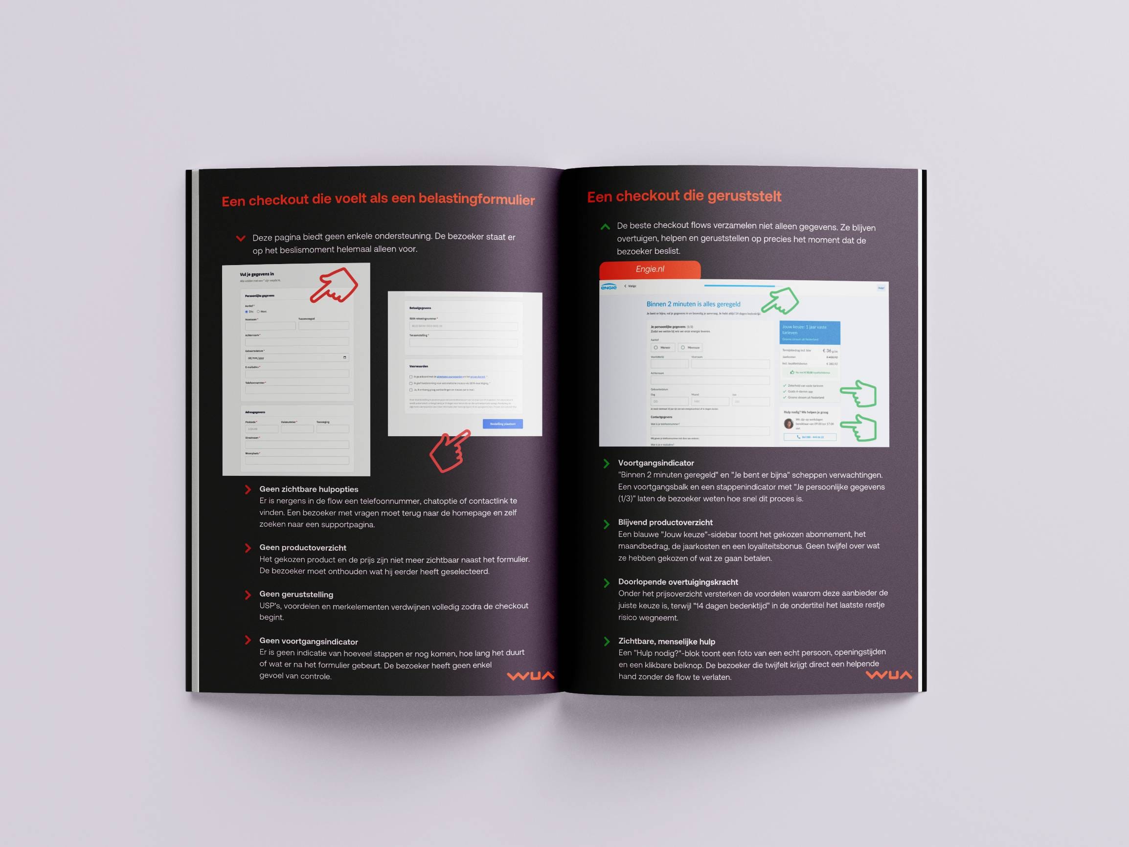
What if you could see what your competition was doing and outsmart them at every turn? WUA's experts spend considerable time measuring and analyzing the best customer experiences in every industry. From this vantage point, they can see exactly what delivers optimal sales results and which tactics are consistently successful. In collaboration with Arjen Hanssen, owner of Online Overtuigen, and based on thousands of websites and studies, we identified 6 tactics that we see winning time and again:
-
Positive emotion
-
Directing attention
-
Show your unique benefits
-
Building trust
-
Help with choosing
-
Lower price perception
By using these 6 tactics yourself, you can create more persuasive online experiences that delight customers and capture greater market share. Let's take a closer look at how you can do this, with examples from market leaders.
Tactic 1: Positive emotion
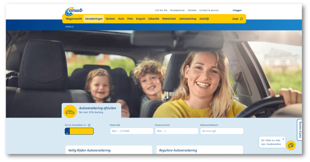
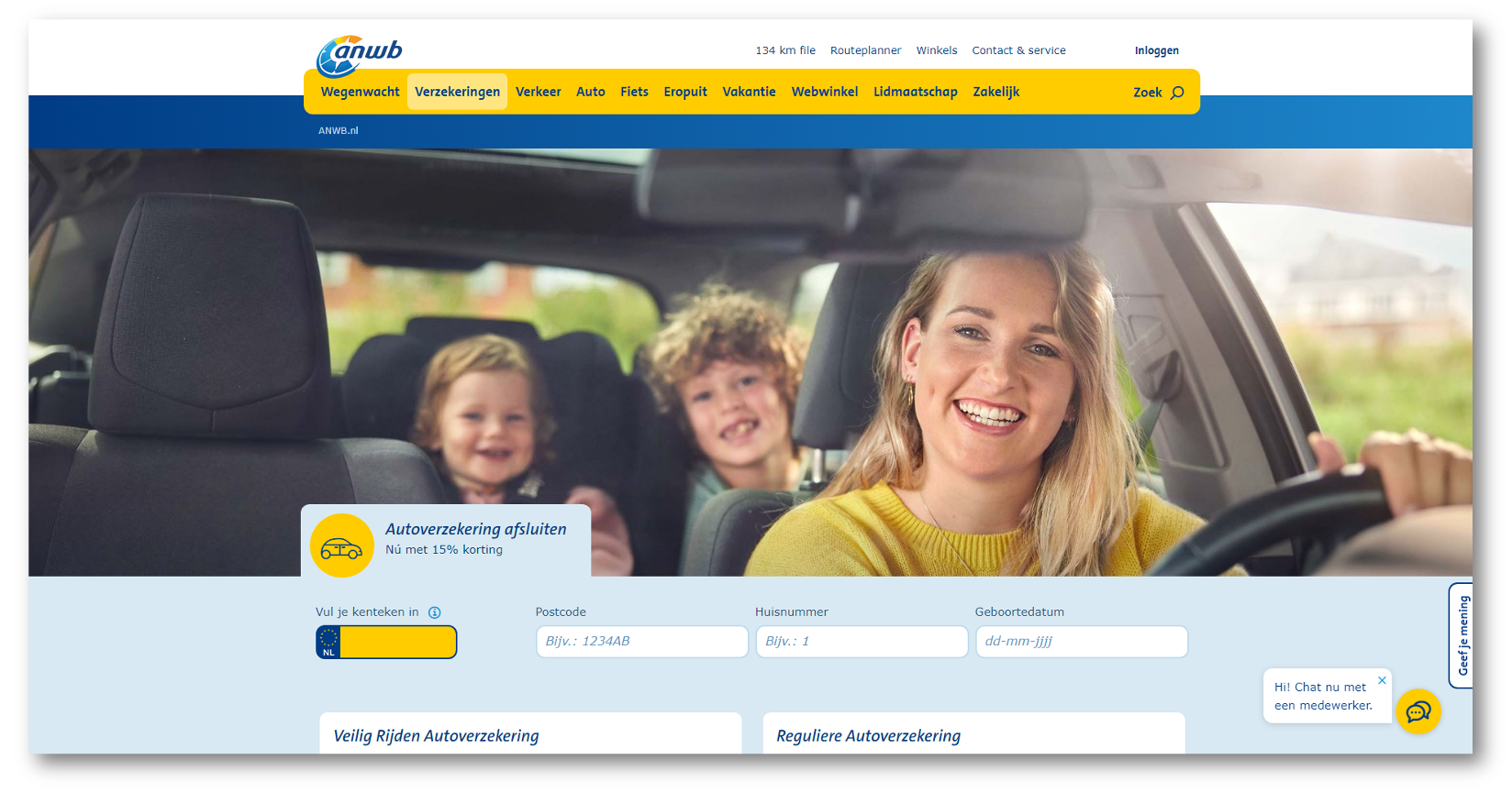
You want your customer to feel at home when they visit your website. This means creating a positive feeling from the start. This "feel good" factor can easily be achieved by using images that convey positive feelings. The ANWB website does this perfectly, with prominent positive images right at the top of their page. These include happy situations, people laughing and smiling, and enjoying time together. This positive feeling can be further reinforced with quotes from satisfied customers.
To achieve more targeted effects, we can use specific techniques that elicit predetermined responses: Sympathy, Associative Priming, Unity, and Self Relevance.
Sympathy
This is a powerful way to create positive emotion and trust. Sympathy means that when we see someone we like and also find 'like us', we tend to trust that person. It's not logical, but it works.
Example:
Online bank Knab uses sympathy by using images that depict a wide variety of nice and relatable people. All these people represent the demographics of their ideal customer.
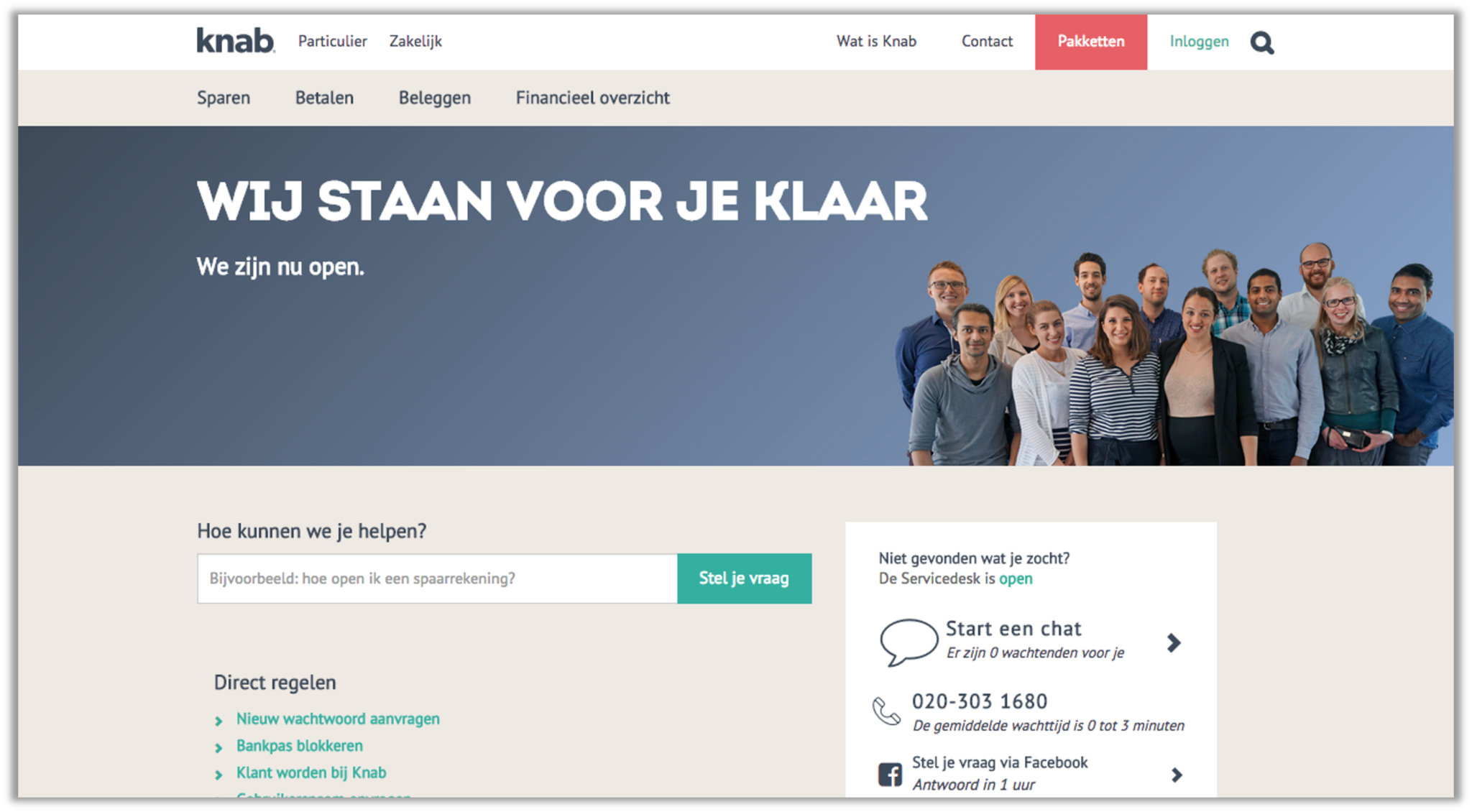
These images are very diverse, so there's a good chance you'll see someone who looks like you - and whom you trust.
Associative Priming
Another powerful technique to evoke positive feelings. Using powerful imagery, you can associate positive emotions with your products or services in action.
Example:
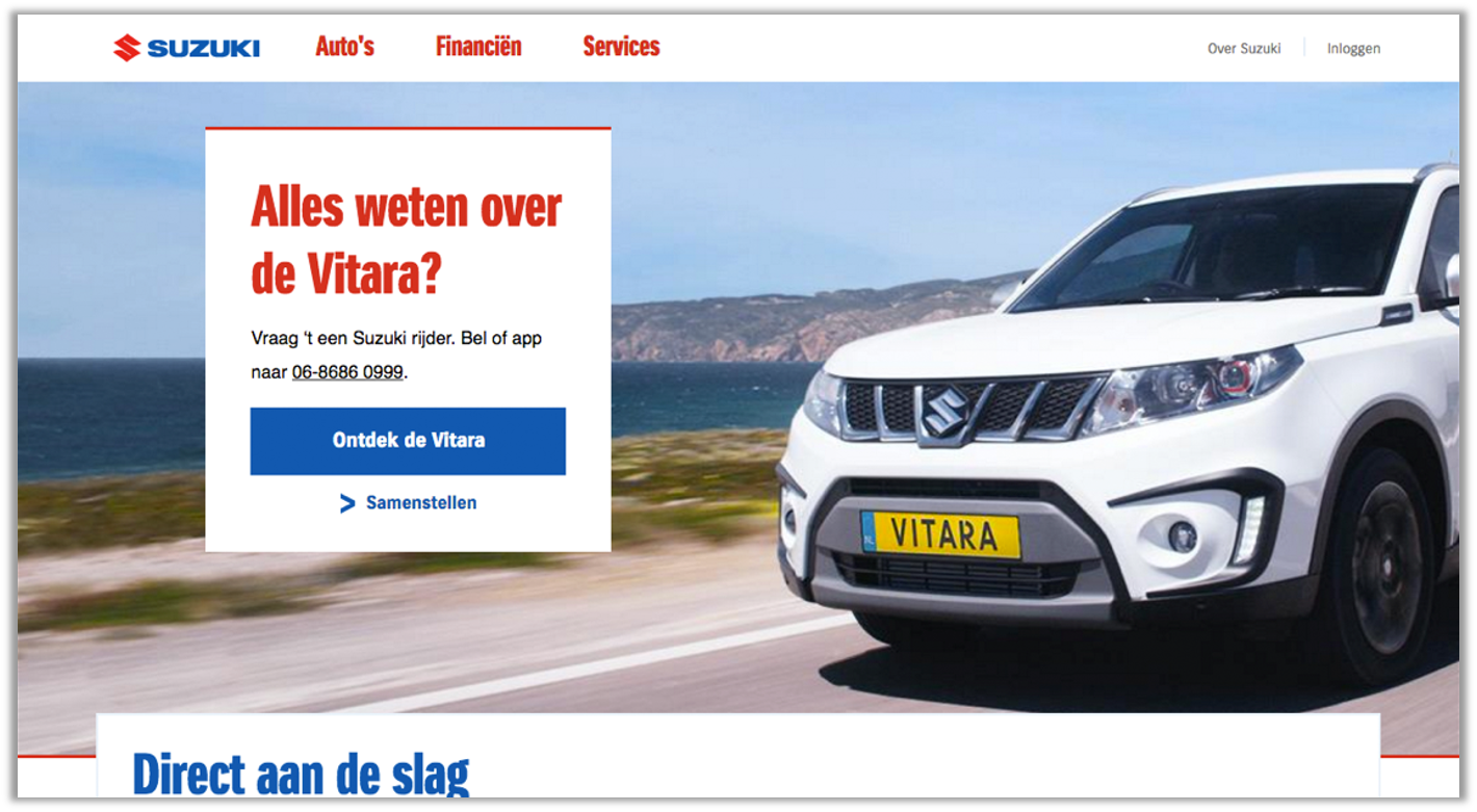
Suzuki's website uses bold images that connect their cars, motorcycles and boats with a sense of adventure and freedom. By doing this, they have successfully created a positive emotion that resonates with their customer as they continue their journey through the website. Before they even get behind the wheel for a test drive, the customer is already anticipating the positive emotions that come with embarking on a new adventure.
Unity
The newest edition of professor Robert B Cialdini's famous book, Influence: Science and Practice contains a new, seventh influence principle:
Unity.
Unity describes the way people like to identify as belonging to a group. If the customer is one of us, they trust us more. This is different from sympathy (a purely emotional response), because Unity is based on a factual basis of membership. People from your group can be very different, but you share one characteristic, such as a hobby, profession or special interest. In practice, this principle can be applied by addressing the group to which the customer belongs.
Example:
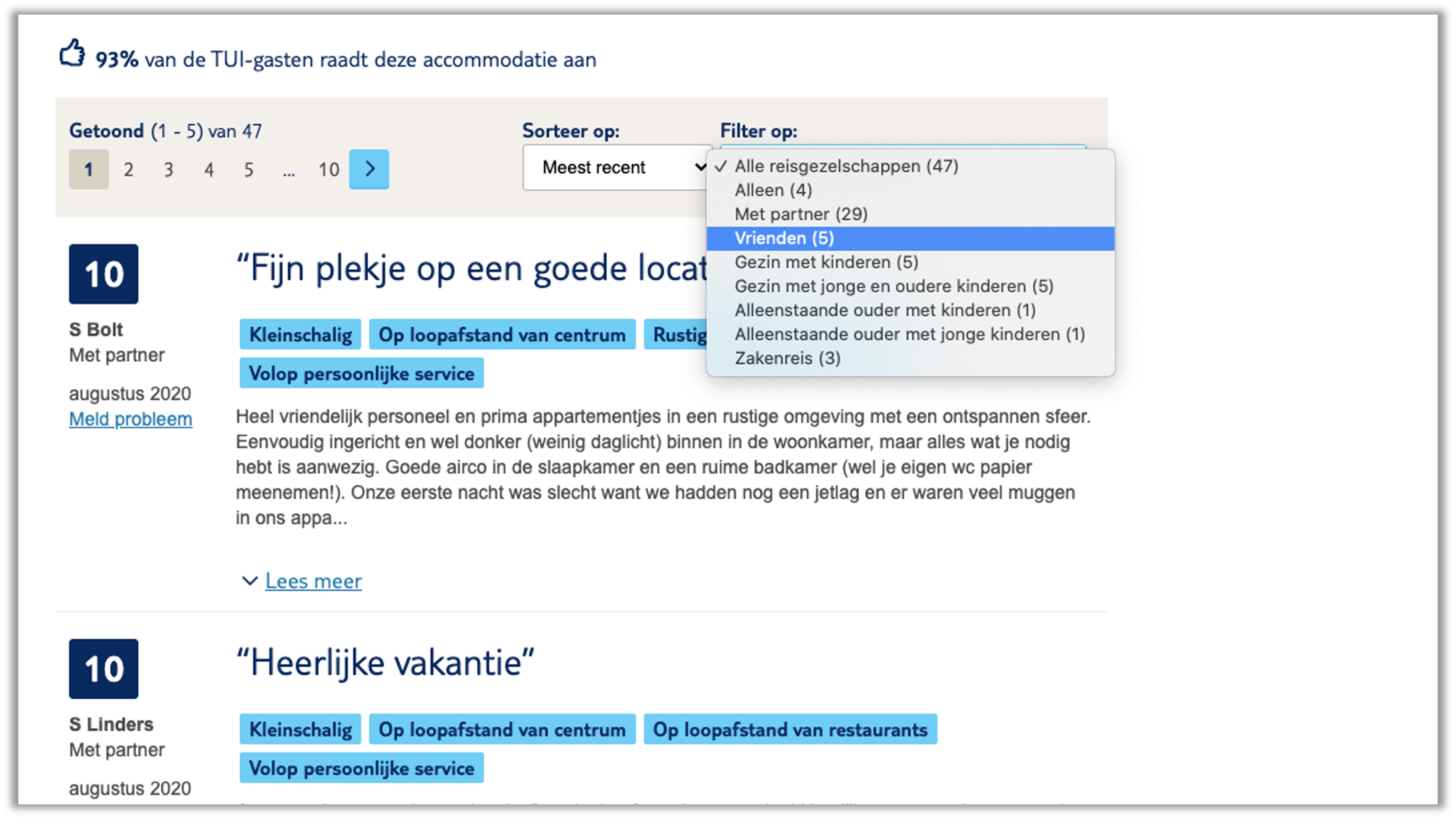
TUI does this very well: they group customer reviews based on the type of holiday people are looking for. This means that people looking for a family vacation see reviews from families like them, or couples looking for a romantic vacation get feedback from similar people. With this technique, you can immediately create a sense of unity for the website visitor.
Self relevance
A final technique you can use to create positive emotion is self-relevance. This psychological phenomenon describes how we have a much stronger emotional response to seeing something that is directly relevant to us. The idea here is to address the visitor directly, so they see that you are relevant to them. Here too, imagery can be a powerful tool; photos with direct eye contact naturally invite a better emotional response.
Example:
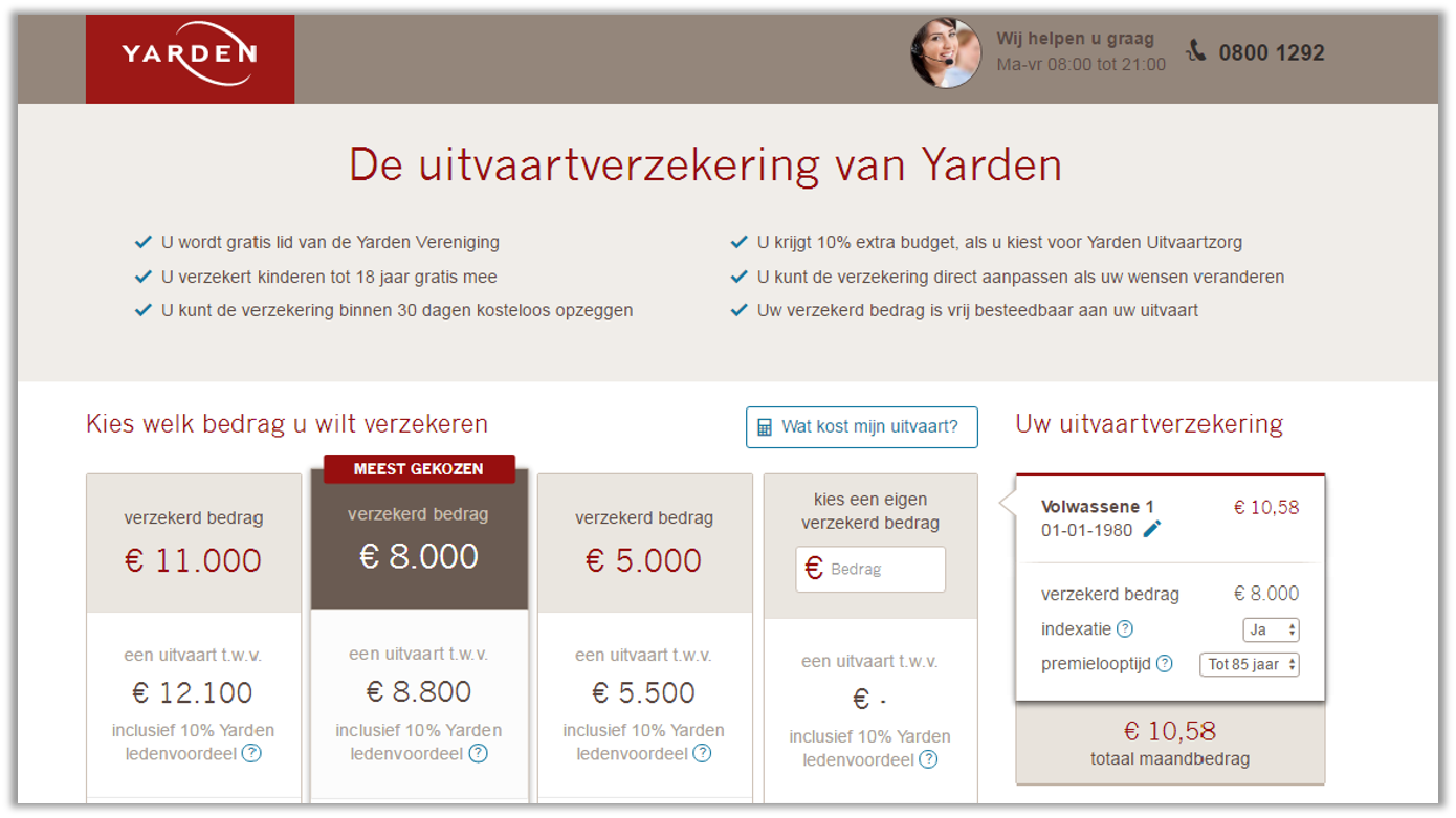
You can also apply this with your text, as Yarden demonstrates. Funeral services are not a natural arena for positive feelings, but by directly addressing the customer with 'you' or 'your' in the very first sentence of each paragraph, Yarden successfully puts the customer in the driver's seat, and in control of their final destination.
Tactic 2: Directing attention
Attention is hard to achieve and easy to lose. The customer is constantly bombarded with messages and images, and that can make it difficult to win the battle for attention. However, you can make it easier by creating a relaxed design, with clear information that doesn't overwhelm.
Example:
HBOMax.com manages to capture website visitors' attention with a simplified design that keeps everything visible and simple.
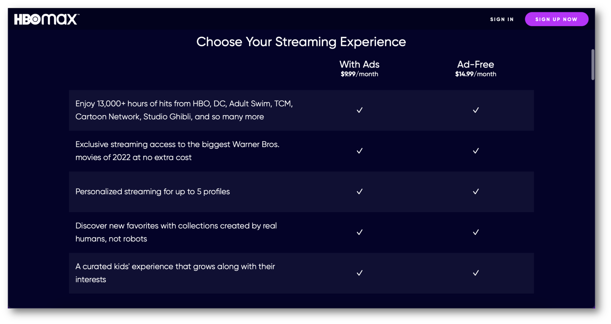
Because it requires little effort, the customer can maintain their attention much longer.
Gaze Cueing
People are naturally drawn to where other people are looking. This is an echo of the "Self Relevance" discussed above: we want to know where someone else is looking in case it's important to us. There's a good evolutionary reason for that. In practice, you can use this to direct website visitors' attention to important information or calls to action, simply by using a well-chosen image of someone looking at that space on the page.
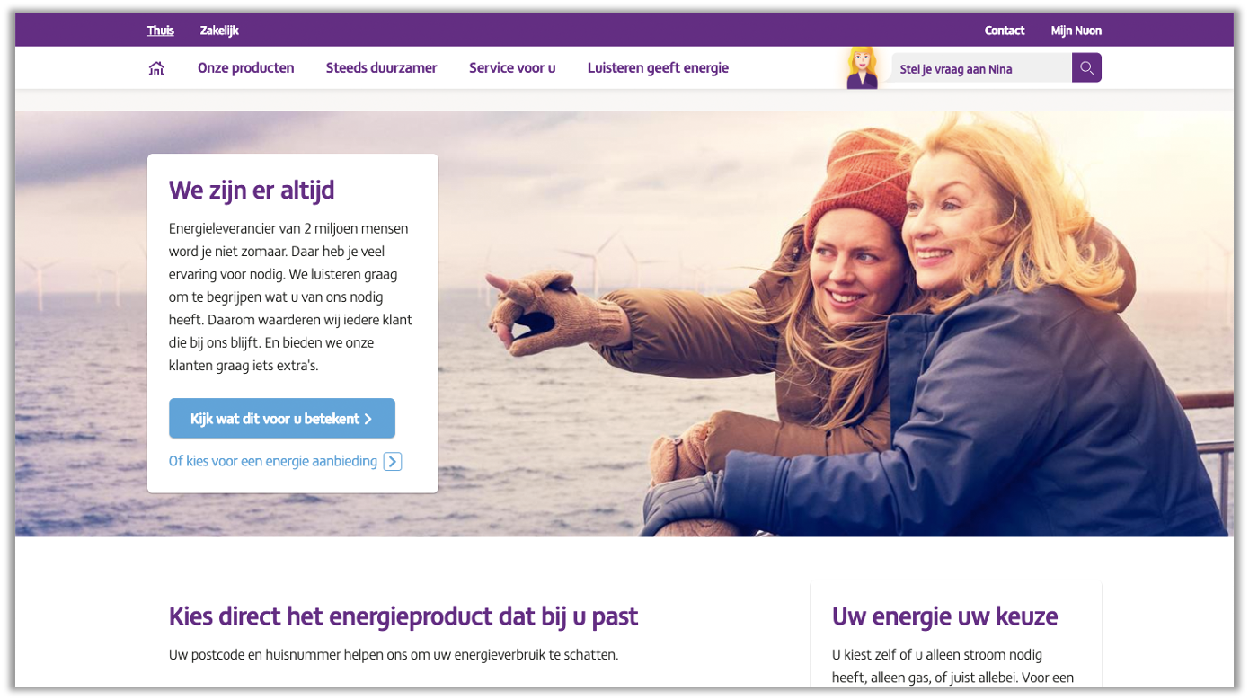
Visual guidance
This is similar to Gaze Cueing, but instead of using people's faces and gazes, you can use shapes and animations. With a well-placed arrow, you can guide the customer to the next step in their journey - so they don't have to think or make an effort to figure out what to do next.
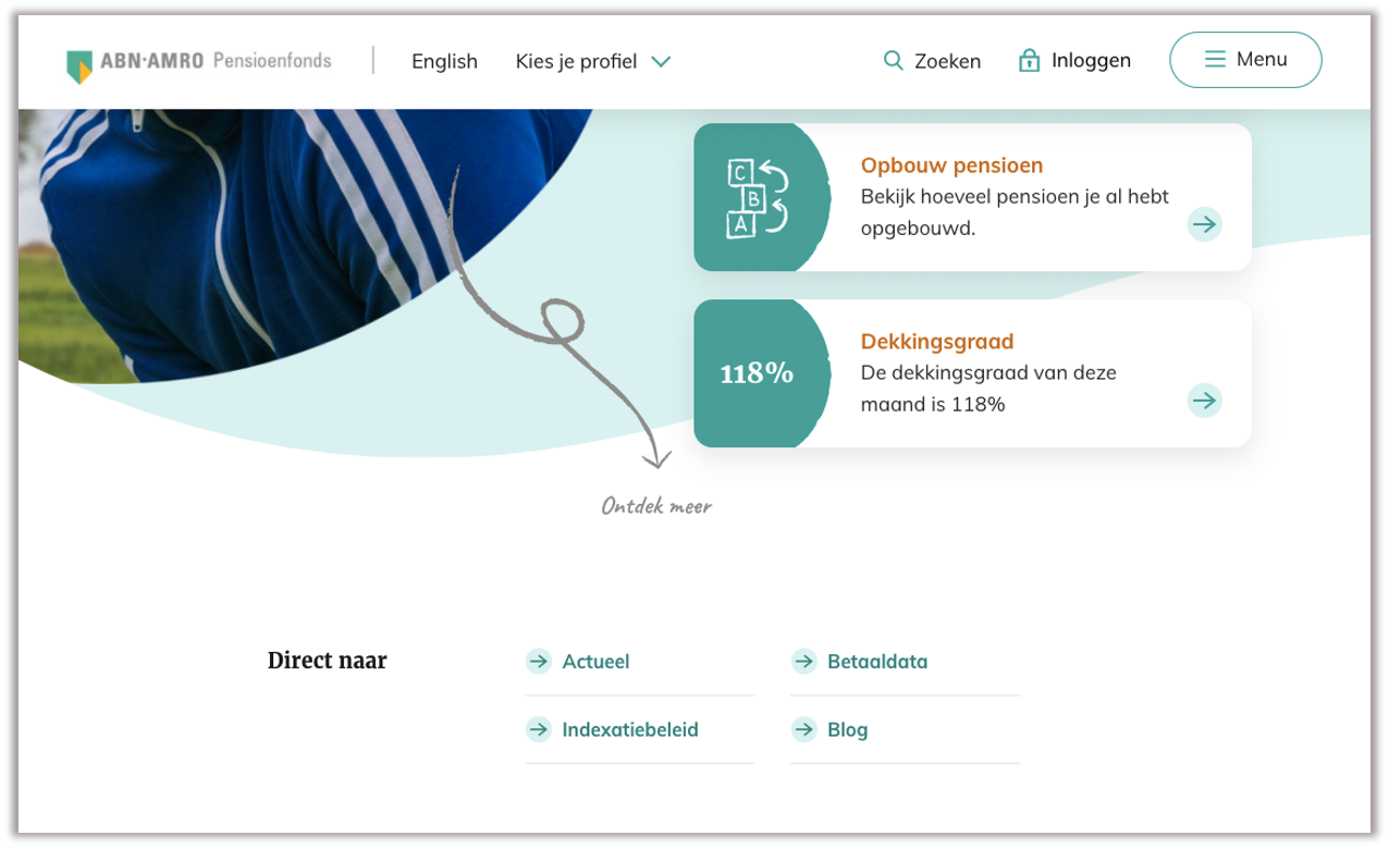
The contrast principle
A final technique for directing attention is the Contrast Principle. This allows you to quickly put your customers on the right path. In fact, it's the same fundamental principle that plants use when they produce colorful fruits. These are immediately recognizable to the birds that spread the seeds inside.
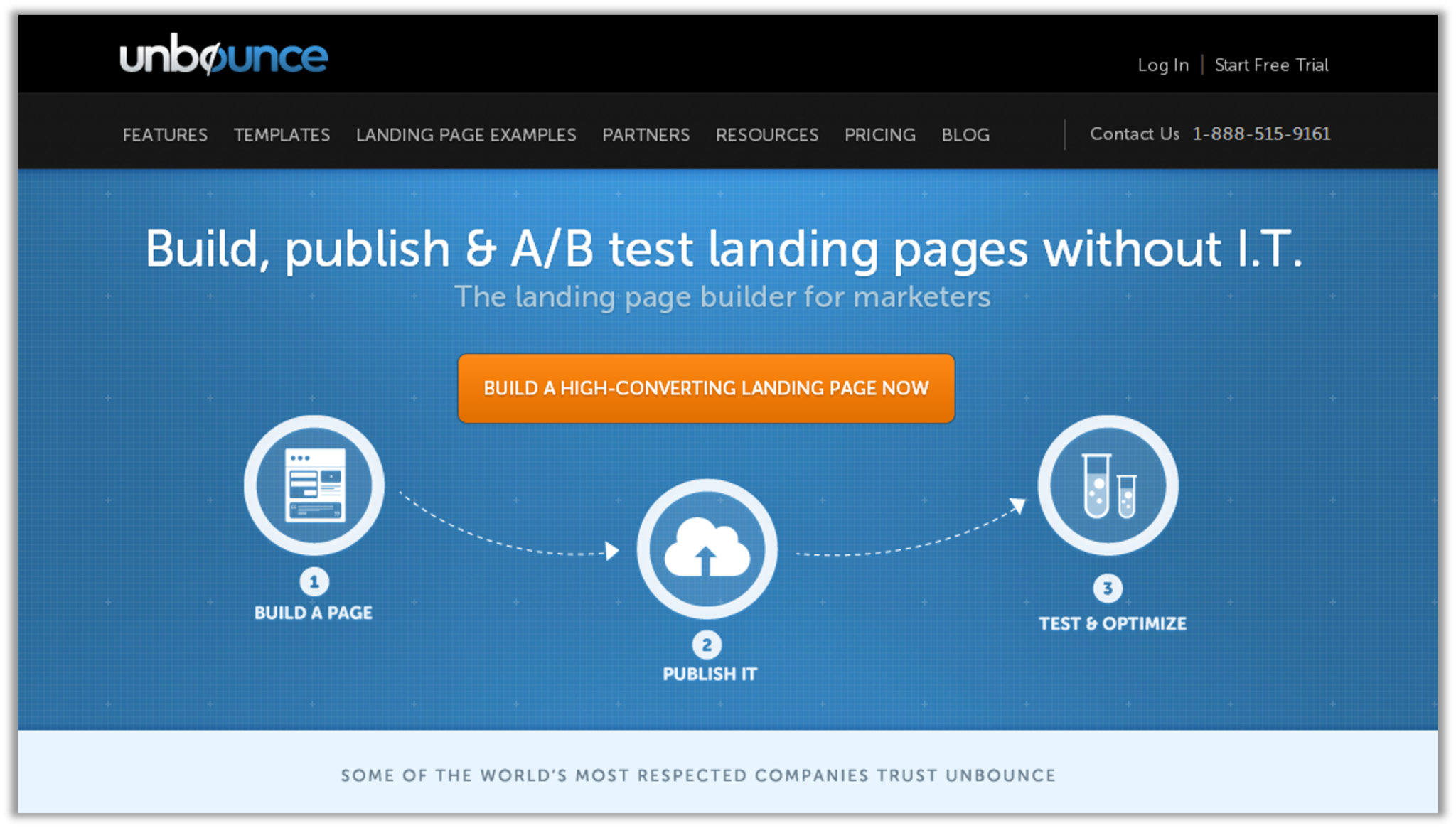
Contrast Cueing Your website can leverage the contrast principle by using contrasting colors that clearly indicate which button to click for the next step. Without extra effort, the customer is easily guided in the right direction.
Tactic 3: Show your unique benefits
It's not just about comparing technical specifications - you need to show your customers how unique you are. It must be completely clear that you can offer them something the competition cannot. Without a clear advantage over the competition, your customer has no particular reason to choose you.
Example:
ABN AMRO does this very effectively, with clear benefits for their investment products that are completely unique. These cannot be compared with other investments because no technical specifications are used:
-
200 years of experience
-
Award-winning products
-
Ease of use, and
-
Positive impact
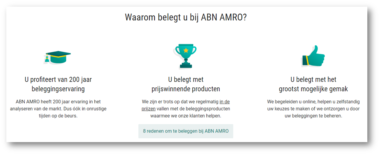
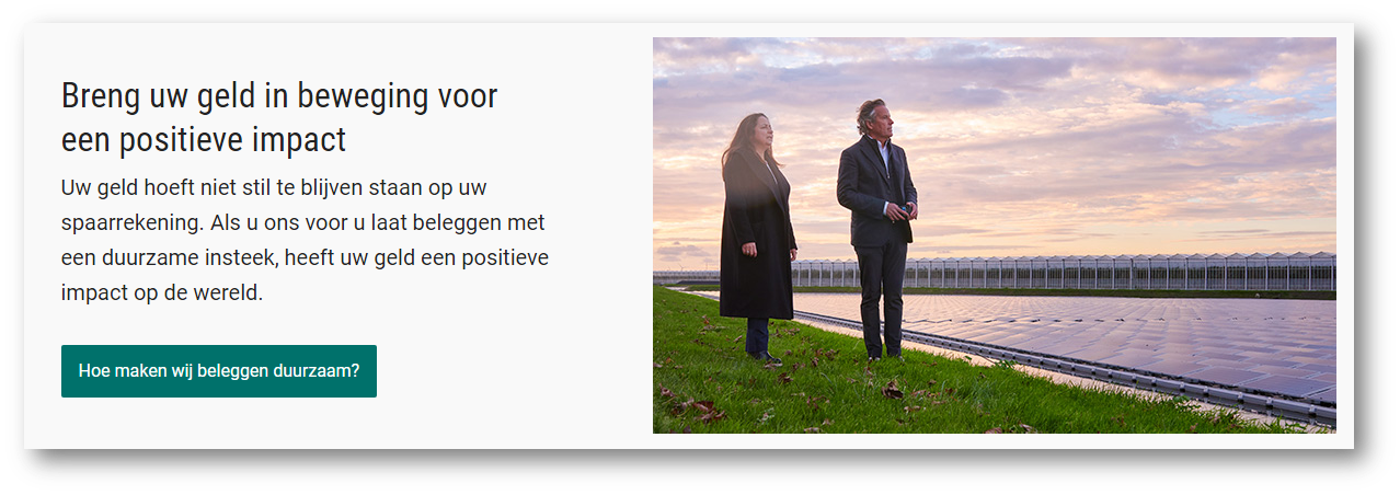
When you use this tactic on your website, make sure you address your customers with unique features that set you apart from the crowd.
Tactic 4: Building trust
Every purchase decision is a commitment based on trust. The higher the price, the more trust is needed - especially for longer-term commitments like subscriptions.
Example:
An example of a product with both high costs and a long commitment is a mortgage. Dutch mortgage provider Florius.nl successfully communicates their trustworthiness throughout their website experience, using a combination of authority and social proof.
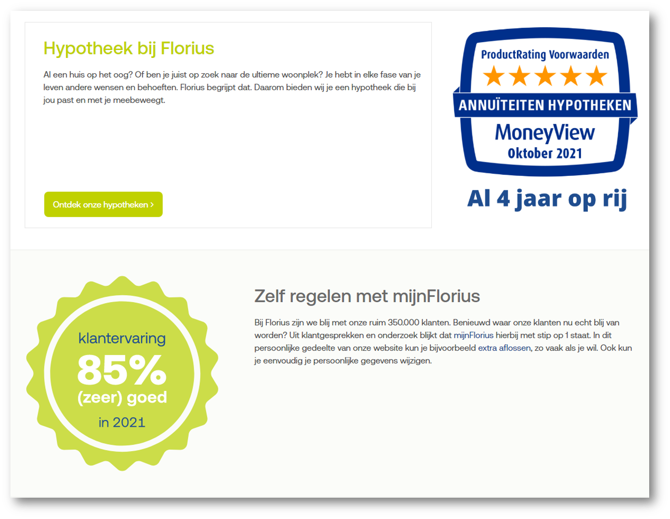
By proudly displaying badges, awards and customer reviews, they create a powerful vision of a company that can be trusted.
Tactic 5: Help with choosing
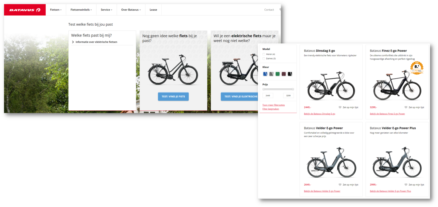
Choice overload is a well-documented phenomenon. When faced with an abundance of options, people tend to postpone decisions and find it much harder to choose the "right" one. This feeling of being overwhelmed can lead to frustration, abandoned searches or hasty purchase decisions that result in high customer service costs. By intelligently guiding customers through a series of smaller selections, you help them make decisions with more confidence based on fewer options. This tactic is very successfully applied by Batavus.nl, which beats the competition by helping customers find the right bike for their needs based on menus that quickly filter their huge range down to just a few relevant options.
Hobson's+1 Choice
Give your customers more than one way to say yes. Time and again, adding just one option next to a 'Buy now' button helps the customer make the purchase decision. This "second option" isn't really another option at all, but just another way of buying - by adding to cart, viewing extra details, or adding to a saved "shopping list". This is sometimes called the Hobson's+1 choice, but it's also known by other terms. And it works.
The (reverse) paradox of choice
The choice paradox describes the inverse relationship between the number of available options and the number of purchase decisions: when customers are given more options, they buy less. This is "choice overload" in action.
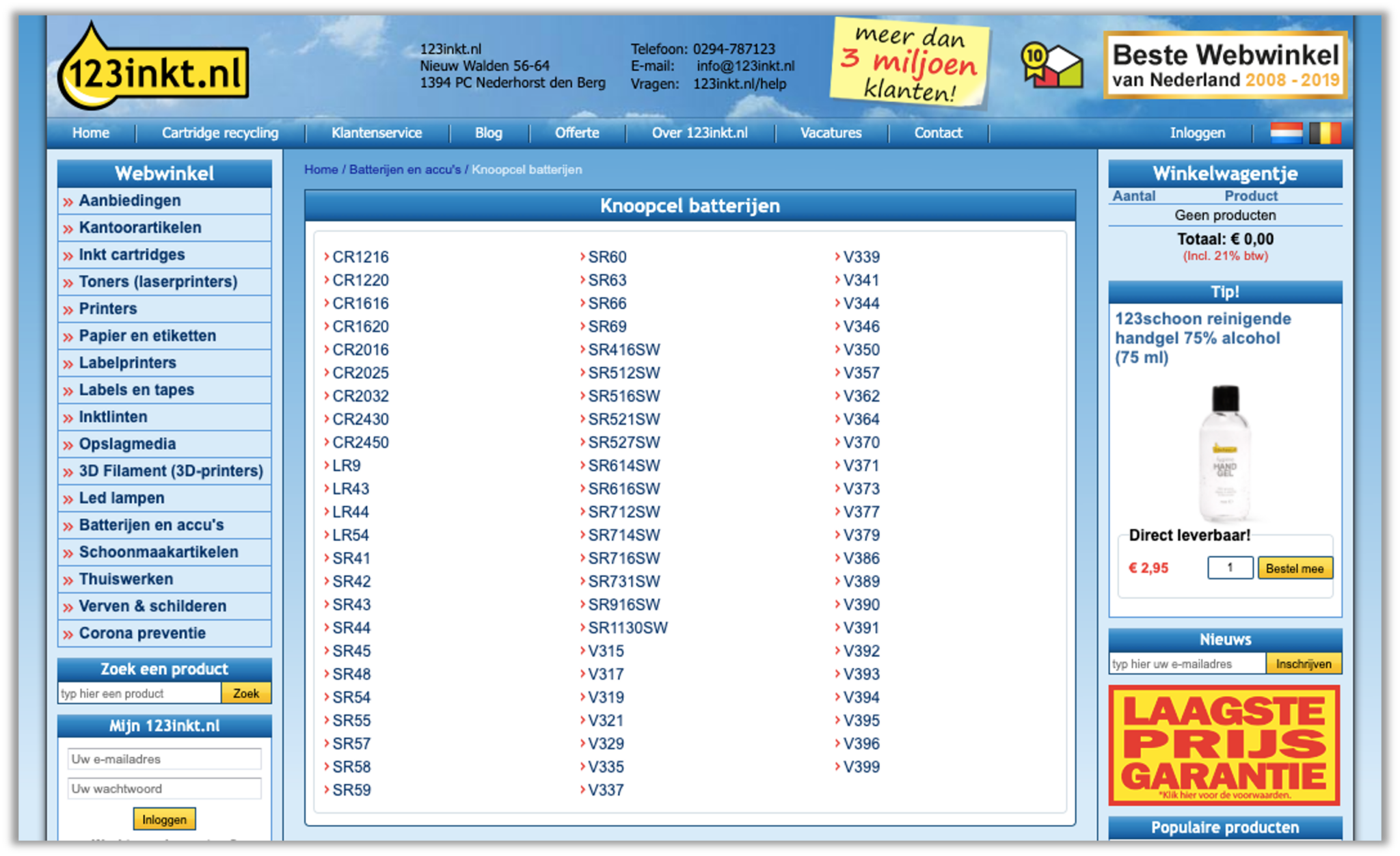
Using this in reverse can be an effective way to help customers make the decision to buy. By simply presenting fewer options - just 3 or 4 at a time - they can see things more clearly.
The decoy effect
By adding carefully selected "alternatives", the seller's preferred product can be cast in a more positive light.
Example:
Gall & Gall uses the decoy effect very successfully, by showing "comparable" wines with a wider price range. If you only have two options, one at 7 euros and one at 10 euros, the 10 euro bottle might seem a bit expensive. However, by adding a "decoy" - that is comparable but costs €16 - the other two seem more reasonable.
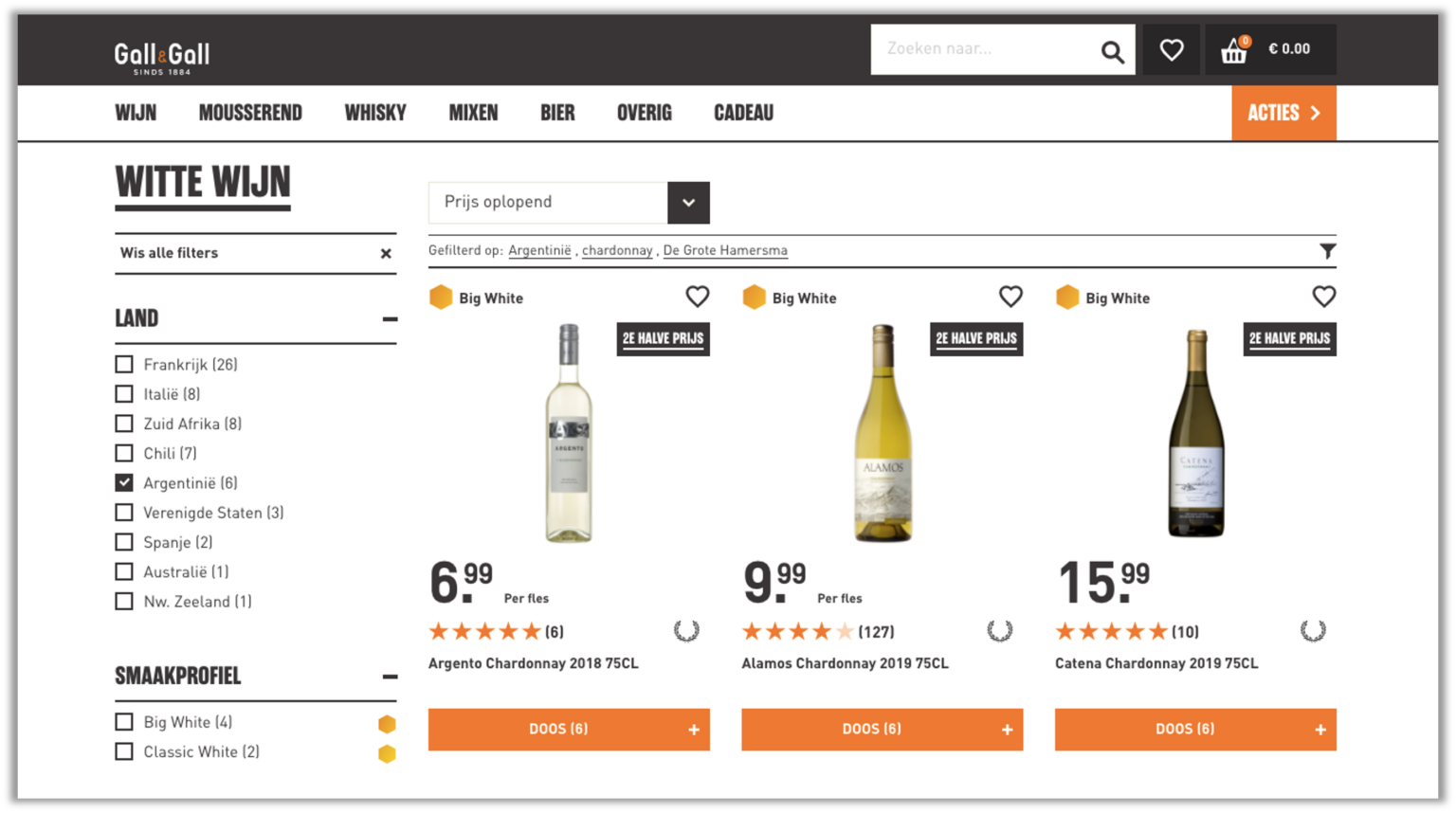
Customers who would have previously chosen the 7 euro bottle might now find 10 euros a reasonable price.
Tactic 6: Lower price perception
The actual price and the perceived price are not always the same. By showing products in different contexts, you can change how the customer experiences the value and price of a product or service. There are a few ways you can determine how the customer experiences your prices - without changing your prices.
Anchoring
"Anchoring" is a measure that helps customers determine what a "reasonable" price is. The decoy effect can also be used in this context by giving the customer an impression of what the "normal" price should be.
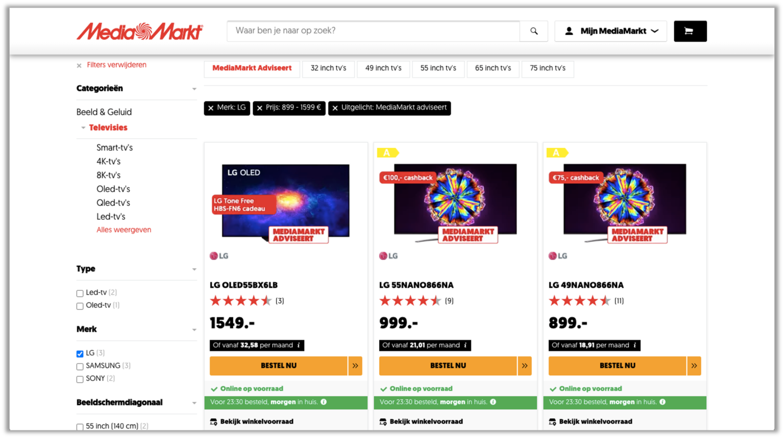
We know from research that most website visitors look at options from left to right, so by putting a more expensive option first (far left) the customer will see all subsequent options as more attractively priced.
This technique is very effectively used by MediaMarkt, to help customers choose a reasonably priced TV by showing them a more expensive option at the beginning.
Based on solid research and thousands of customer experiences
All of these techniques and tactics have been proven to have an incredible impact on creating more persuasive customer experiences.
They can be found time and again in the best digital customer experiences - in fact, your competition might already be using them.
When used well, you can deploy these tactics to create positive customer experiences that help customers by guiding them to the best choices with minimal effort.
Beyond our research services, Customer Experience Benchmarking, we also offer a consultancy service that can help analyze which tactics and techniques will have the greatest impact for each individual customer.
Want to know more? Book a demo, or get in contact.
