5 best practices from the ultra-competitive consumer energy sector
Customers always shop around. It’s so easy today to whip out your phone and do a quick internet search to see how the offer in front of you compares to all the others on the market. You can probably relate this to your own online shopping experiences, where you check you’re getting the best deal before making a commitment.
When it comes to energy contracts, the need to check the competition becomes super-charged. Serious money is at stake, especially if you’re searching for a fixed contract with the best rates, or thinking about finding a cheaper supplier so you can afford rent too. In these situations, customers are primed to jump ship and find a better option at the slightest sign.
In practice, this means that your brand’s website visitors are always just one click away from leaving, to see what else is out there. And once they leave, they’re unlikely to return. After all, something made them leave in the first place.
The problem is it’s not always clear what those reasons are.
Vision over the entire customer experience
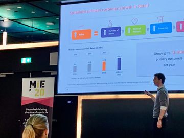
At WUA, we study thousands of customer experiences across every sector, including the highly-competitive energy sector. By analyzing how they beat the competition, we’ve uncovered best practices you can use. This can be a short-cut to achieving better conversion rates, before embarking on more targeted optimizations.
For any market with high competition, the only way to succeed is with wider, deeper market intelligence. This must encompass the entire journey your customers make whenever they search for a product that you (and your competition) offer.
We conduct studies that track the digital experiences of 400+ customers for each product journey. We measure how they experience your website; plus all the others they visit during their search. Their entire experience is analyzed, generating valuable insights about their priorities, must-haves, and turn-offs. These are insights you can use.
By ranking these digital experiences, we see which websites are offering superior, deal winning CXs for each sector. Then, by analyzing these, we can formulate best practices that mirror the winning tactics of the very best CXs in every industry.
The winning CXs from this industry have a lot to teach all of us – these best practices can help you close the gap.
Best practice #1: Scannable structure
When customers are orienting themselves with a new provider, they’re looking for signs that they’ve found the right place. This can be measured by a ‘blink test’, which shows if visitors understand the offer within a few seconds. The easier it is to understand, the lower the bounce rate. With a scannable structure, it’s easier to pass the blink test.
Two tactics are highly successful for this: minimal text and plenty of whitespace.
Saying more with fewer words
A company that does this well is Dutch energy provider Essent. They ensure that every piece of text is informative to customers in a direct and efficient way.

With just a few words they explain what they do, and how they can benefit customers. The effect is very positive; a handful of words that tell a story about who they are.
With the scene already set, the consumer can put each additional piece of information into this picture, building confidence in the brand and a knowledge of the USPs.
This is evidenced by qualitative feedback from consumers:
“The homepage was oversightful and clear’
“Clear first page. Everything you need to know is right there”
“Looked real nice with the first image and colors, inspires interest”
Plenty of whitespace
Ample whitespace complements a minimalistic approach to text by making it clear where the visitor must look for information. It’s especially important for mobile visitors.
Just think of a stereotypical target, just like the ones people shoot arrows into. It’s a big red dot surrounded by whitespace. It could not be clearer where you need to look – and this is what whitespace can achieve on a website.
Again, Essent uses this tactic to its advantage. Their webpage layout makes the structure clear, with each component highlighted by a ‘frame’ of whitespace.

This tactic works because it avoids cognitive overload. Online customer journeys involve sifting through a lot of information, which leads to consumers feeling overwhelmed by it all. This is cognitive overload – an excess of information that makes it harder to understand or compare different offers.
Best practice #2: The rule of 3
When it comes to sharing ideas, remember the holy trinity. After all, good things come in threes. In fact, a lot of things do.
Because people find it easier to remember ideas when they consist of three parts.
For this reason, storytellers have used the ‘rule of 3’ for millennia to make information easier to remember. From the 3 little pigs, to Macbeth’s 3 witches, and every other triptych, triad, or triple; the rule of three is everywhere.
But is it on your website?
Essent presents their USPs in easy-to-digest groups of 3, which avoids cognitive overload and makes it easy to recall.
We can see this at work as well with another energy provider, Engie. Engie organizes their USPs into a single block with 3 main USPs at the top, including social proof. There’s lots of whitespace around the text, and this makes it easier to understand at a glance.
Once you start looking for it, you’ll see that the rule of 3 is widely adhered to throughout the digital experiences of both energy providers, as a way of setting out steps in a process, or key pieces of information.
And trigger action with micro copy
As a bonus, Engie erases potential doubts about the information they present with ‘micro copy’. This gives reasonable expectations, and addresses specific objections to taking the next step.
Essentially, micro copy creates an immediate context for understanding and processing the information provided. For example, saying it will ‘just take 1 minute’ to calculate your new monthly payment, set just below the 3 USP. The customer thinks, “Ok then, 1 minute is nothing, I’ll do it.”
It might be small, but micro copy can help your ‘rule of 3’ deliver better results.