Small screen, big conversion potential: How retailers Coolblue, Marley Spoon & Philips optimize the digital journey for mobile
Some mobile shopping customer experiences stand out above the rest. They’re winning customers with intelligent navigation and economical use of vital product information.
Use the winning tactics from the best CX in mobile. We’ve extracted the most valuable strategies and methods used by the leaders in mobile shopping experiences. Keep reading to learn more.
Smartphone CX challenges
Smartphones are becoming the #1 way for customers to connect with your brand. Yet we’re not using them so much for shopping. Research by Google and RuigRok NetPanel highlights this problem.
In 2016, only 20% of Dutch consumers shopped online with their phone. In 2020, that doubled to 49% – yet many still found the smartphone digital experience disappointing.
This problem is especially acute for high-value products, which require more research, social proof, and information to convert to a sale.
To win mobile sales, your digital CX must be good. Really good.
Learning from winning customer experiences in mobile
Our in-depth customer experience surveys uncover the details behind winning digital customer journeys.
We can see exactly what differentiates a standard mobile shopping experience into an exceptional one. Leaders in this area are Coolblue, Marley Spoon, and Philips.
They use proven and effective methods for creating trust and winning sales on mobile.
We’ve picked out the most valuable tactics and strategies, so you can turn your mobile customer experience into a conversion machine.
Lesson #1 Prevent unnecessary scrolling with efficient navigation
It’s a small screen. Shoppers hate scrolling through multiple pages to find what they want. The experience feels monotonous, time-consuming, and boring.
Unnecessary scrolling makes it likely a customer will leave without making a purchase. Beat this by providing content and information that is complete, saving effort for the consumer.
Coolblue scored very high in our October 2020 study, based on customers searching for a new TV. They achieved the highest score – 74 out of 100 – among all websites studied. The secret is their prominent and efficient navigation, which keeps scrolling to a minimum.
Coolblue’s 3 essential navigation elements
- Main Menu (the ‘hamburger’ icon)
- Search Bar
- Extended Filter option
In addition, Coolblue uses a ‘sticky’ menu design for their mobile customer experience, so these options are always visible and accessible. Even when the user scrolls down.
As a result, the user can always find the most relevant TVs and other consumer electronics – within a ‘thumb’s reach’.
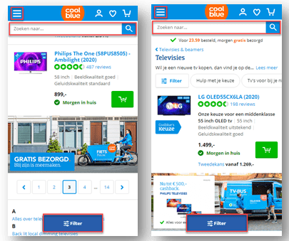
Image 1: Coolblue.nl keeps the navigation options visible and available at all times for the smartphone user. This prevents unnecessary scrolling.
Lesson #2 Provide an easy overview by making elements scannable and minimalistic
You haven’t got a lot to work with. It’s a challenge to present information effectively on a small screen.
A big mistake many retailers make is trying to show a lot of elements – all at once – on a single screen. According to UX Planet this typically overwhelms and confuses the shopper, and causes them to lose interest fast.
You must make choices about what content and related elements to display.
Marley Spoon achieved the highest score in our June 2020 study of food box providers. Their mobile website scored an impressive 71 out of 100 for its clean, clutter-free design.
Customers are given a relaxing user experience that invites the user to explore content further. They use colors carefully – opting for low saturation, which is more calming and less overwhelming.
Each content block is also differentiated by background color, making it easy to see the separate elements and topics on-screen.
Easy to see, with short blocks of information, and clean images. These keep cognitive load to a minimum.
With such a minimalist design, Marley Spoon draws more attention to their call to action: “Start now.” This CTA moves along with the user as they scroll, gently guiding them into the funnel without any pressure or overwhelm.
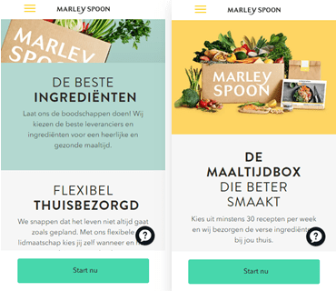
Image 2: Marleyspoon.nl uses a smooth, relaxing smartphone design which directs focus to the most important elements.
Bottlenecks in Mobile Customer Experiences
Smartphone users need an optimized CX to convert them into customers. This is a challenge. The limitations of the format, size, and context of use lead to bottlenecks in the customer experience.
The winning CXs in mobile succeed because they overcome these bottlenecks and turn them into successful, enjoyable shopping experiences.
Lesson #3 Bring products to life with rich visuals
With such a small screen, it’s hard to instill trust in the consumer. How can you make them feel confident that the product they see on the screen is what they’re looking for? How can you optimally display products on a smartphone screen?
First, it’s essential that your product pages are optimized for viewing on a mobile device.
Philips ranked #1 in our January 2020 study, examining the customer experiences of consumers searching for an airfryer. They scored an incredible 78 out of 100, thanks to their winning strategy for displaying visuals.
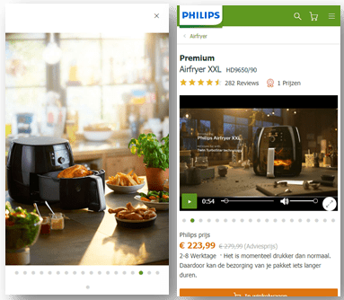
Image 3: Philips.nl uses full-screen images and informative videos of its air fryers in realistic settings to give mobile shoppers a better sense of orientation.
Philips uses rich media to present their products. For each product page, Philips gives smartphone users all the information they need. They use a smart combination of text and visuals.
Their mobile customer experience provides abundant, near full-screen images, from various angles. These make the product design crystal-clear – even on a smartphone.
Products are arranged in realistic settings – giving the consumer a clear impression of size and context.
Lastly, key product feature information is shown in short, informative videos. These can be viewed on a smartphone with one tap. Instead of becoming an obstacle to smartphone users, information is wrapped up in visual material that is used as an orientation aid.
Their industry-leading smartphone CX wins customers by building trust and confidence with clear information that doesn’t ‘get in the way.’
Conclusion: Boost your mobile conversion by overcoming common CX challenges
Smartphone users are easily put off by common CX challenges. These issues prevent many retailers from creating a seamless mobile journey.
As a result, mobile users with high intent can become easily frustrated with a website experience, and turn to a competitor instead.
More about our in-depth retail customer experience studies
Each year, WUA conducts numerous online retail customer experience studies.
Our research model provides reliable and accurate insights on customer experiences. We measure 400+ consumers as they navigate freely to find and buy a defined product.
We followed customer journeys for all kinds of products, including TVs, Food Boxes, and Airfryers.
Our key findings:
- Coolblue offers an excellent navigation experience on smartphones that wins sales.
- Marley Spoon scored highest by far for its low-burden smartphone experience
- Philips came out on top for clearly presenting products – which builds confidence.
Retailers like Coolblue, Marley Spoon and Philips have all found ways to turn CX challenges into CX strengths.
Coolblue offers efficient navigation options that are always within thumb reach. Marley Spoon uses an easily scannable, clutter-free layout to create a relaxing shopping experience. And Philips uses visuals wisely to bring its air fryers to life on the smartphone screen.
As more and more consumers turn to mobile shopping, optimizing your site for smartphone viewing is the key to winning them over and boosting your conversion.
Sources
Google – 5 ways retailers can improve mobile CX and their bottom line.
RuigRok NetPanel – What’s Happening Online – 2020.
UX Planet – 10 Key Mobile Usability Issues.