In our Health Insurance Service Scan (August 2019), insurance provider CZ led the pack with an average score of 77. It was ranked highest among consumers in different tasks including filing claims, finding an approved physical therapist and checking your current health insurance. Here are some key takeaways on how CZ (within my CZ) appeals to its customers on the functional, rational and emotional levels.
Getting a grip on service
The number of people who call customer service as well as their average hold time and handling time are all figures that can be measured. The online service process is also quantifiable. The Digital Service Scan measures the service experience of various websites. By assigning tasks to real customers of a given provider, we measure how easily tasks are performed and what customers encounter along the way. Our Digital Service Model divides services into three aspects: functional, rational and emotional elements.
The functional aspect refers to whether the path from question to approach exists at all on the website. The rational aspect covers how easy the path is. The emotional aspect relates to the feeling customers have during the process of solving a service question and the extent to which their feelings are positively influenced during their journey.
Functional: Clear service paths, without unnecessary information
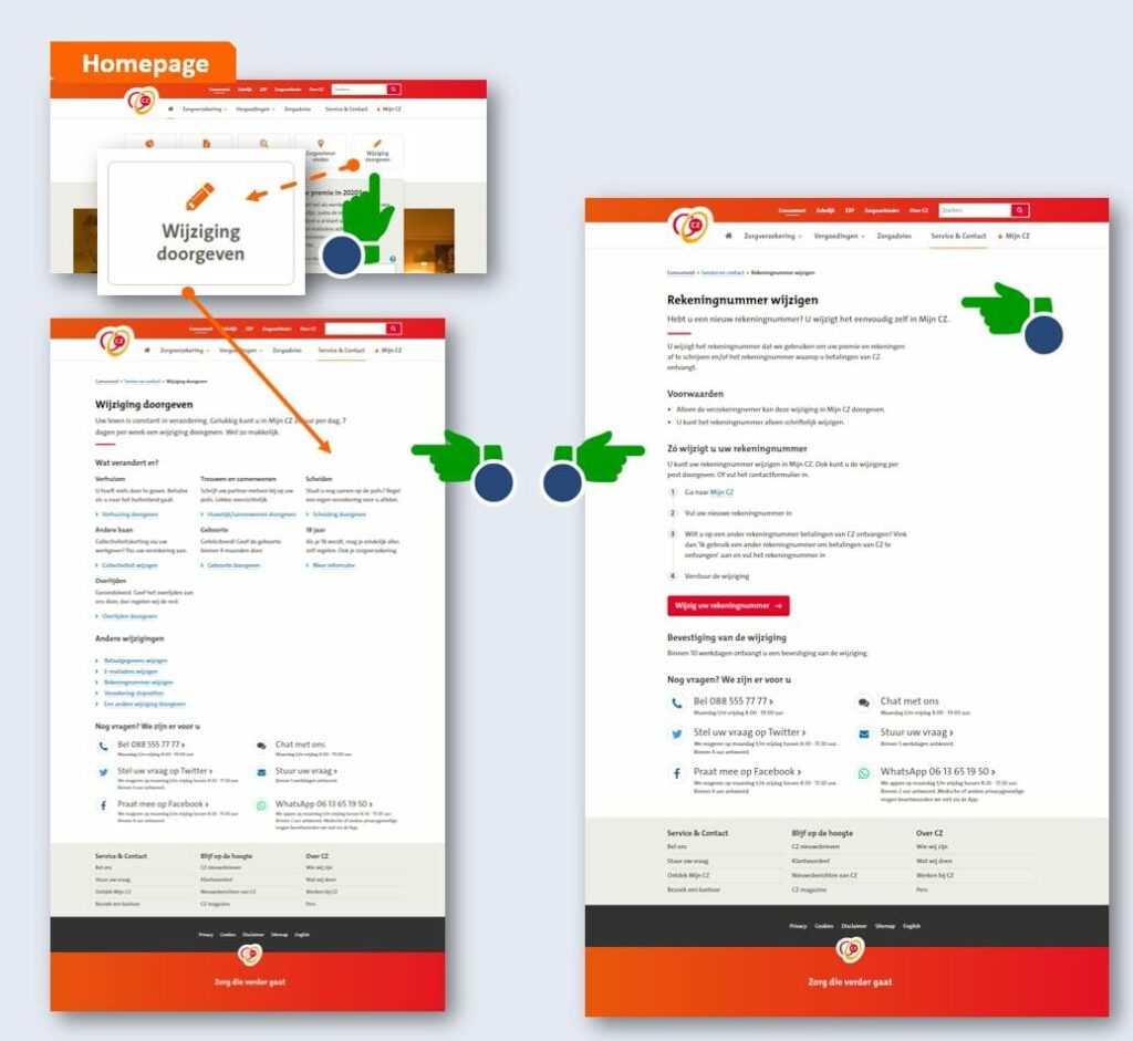
CZ makes it easy for customers to change their bank account numbers within its online service environment. On the home page under “My environment,” CZ immediately displays a “Submit changes” button. This makes it easier to navigate. The search bar is no longer necessary, and the user does not need to scroll through the menu to find what they are looking for. After clicking the button, the user is redirected to a clearly designed page showing all the options that can be changed. This page also gives a step-by-step guide for how to change the bank account number.

Emotional: Making the customer journey personal
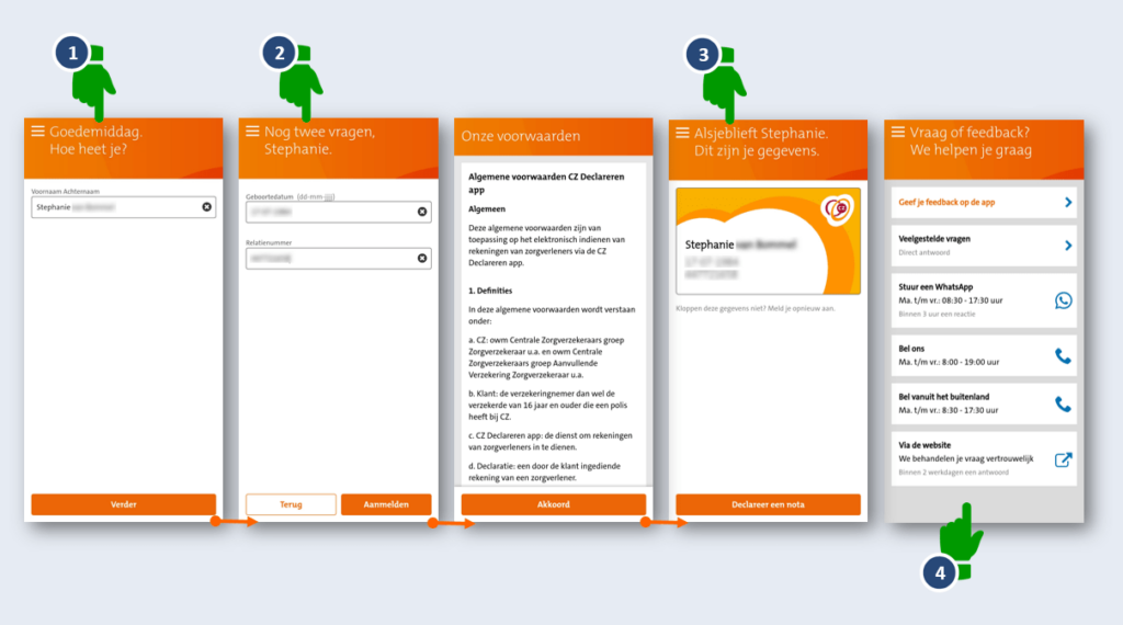
CZ welcomes the customer and immediately starts a dialogue by asking the question: “Hi, what’s your name?” They then focus entirely on the customer, whom they address on a first-name basis while letting them know that the process of filling in information is almost finished.
After the legally required terms and conditions, CZ makes every attempt to make the customer journey as pleasant as possible, with friendly responses like: “Here you go, Stephanie. Here’s your information.” CZ displays the customer’s information on screen in the form of a familiar insurance card, which makes it highly recognizable, so the customer can easily check their details.
If the customer runs into any issues, there’s always the contact page, which offers multiple channels for getting in touch. The customer is also given tangible information to manage their expectations (an immediate answer, a response within three hours, etc.).

Rational: Easily finding a nearby physical therapist
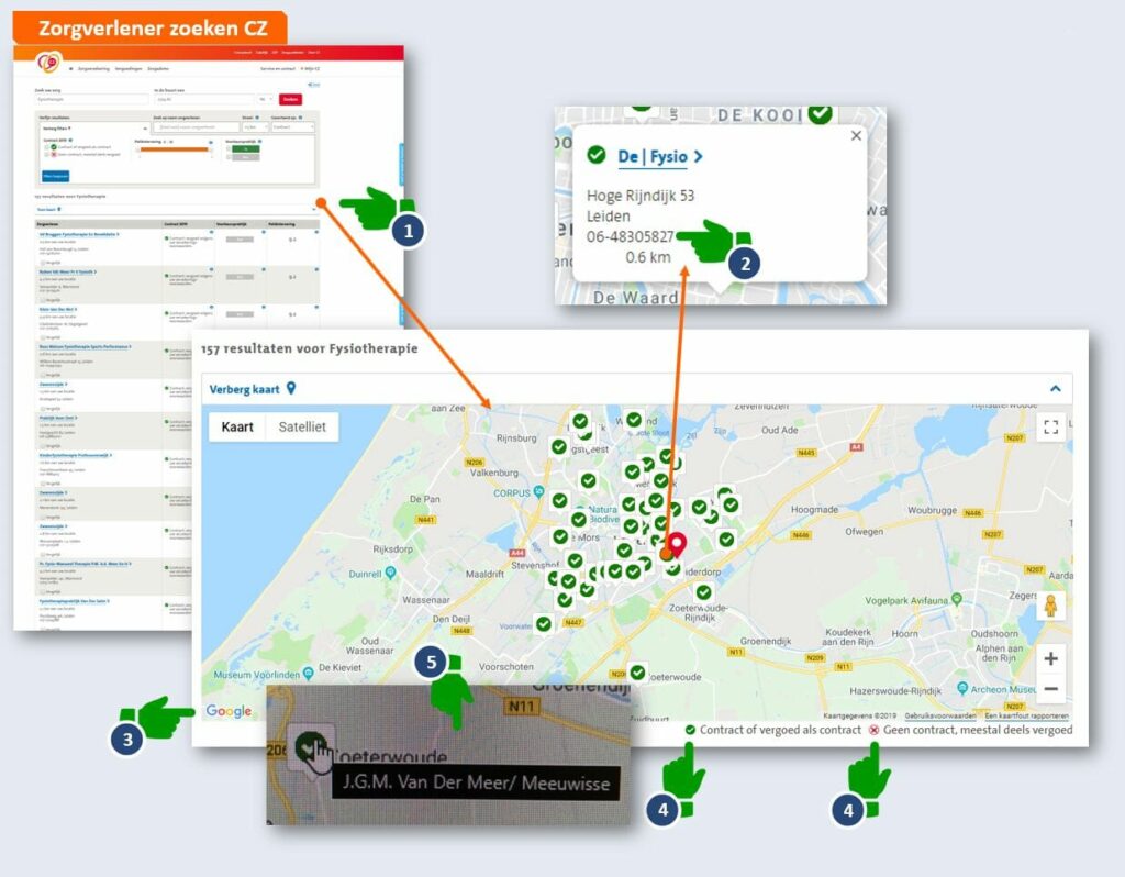
Customers value extra support when searching for an approved healthcare provider. CZ provides a simple map (accompanied by a list) to help customers find physical therapists near them.
There are other useful features for helping customers find the information they need:
-
Icons inside the map indicate which physical therapists are approved and which are not, and provide their telephone numbers.
-
CZ uses Google Maps for its map feature, which is a familiar format for many users.
-
The pictograms are clearly clickable. When you hover over one of the pictograms, information about the healthcare provider appears. The information boxes that pop up provide the customer with a link, in case they want to learn more.
-
The little “i” symbols offer more information in case the customer needs help.

Digital excellence in the health insurance market stays as important as ever
An excellent website can service customers without the need for them to call customer service to get answers. This increases loyalty and reduces calls to your company. With the end of the year (the season for switching insurers) quickly approaching, it’s more important than ever to offer a great service experience online.


