Differences in the Desktop & Smartphone customer experience: The case of Honda
Shopping for cars has changed over the past few years. Instead of going off to the local dealership to see what’s new in the showroom, many people now browse the web to find their next ride. For automakers, the shift to the digital world poses a difficult challenge: How do you best present your car online? Without having a crafty car salesman present to convince drivers, automakers have to display all aspects of their cars, from specs to price, in an easy-to-understand manner. To make things even more challenging, car companies have to design webpages to present their automobiles for both desktops and smartphones.
In the latest Digital Sales Scan, WUA instructed respondents in America to hop online and search for a car and a lease contract to go with it that best suits their needs. Half the respondents set off to do some car shopping on a desktop computer while the other half searched using their smartphone. The results revealed the best practices that automakers can utilize to improve the digital experience of potential customers. Here, we specifically look at Honda, and the tricky challenge of displaying cars on both desktops and smartphones
Honda makes ordering a car on a desktop a breeze
One of the more remarkable findings from our study was the experience our respondents had with Honda. The Japanese automaker finished atop the list for best digital experience for desktops with a score of 83, but finished seventh for smartphones, receiving with a more modest score of 73. The main reason for this difference deals with the way Honda designed their ordering process. Let’s take a look at desktops first.
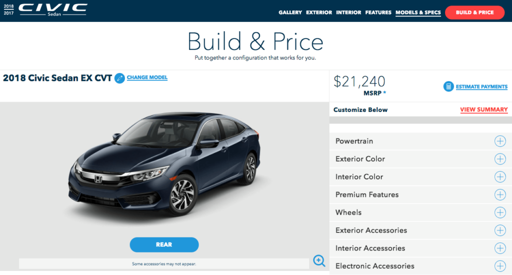
Here we see the standard desktop page Honda displays after a customer selects their car of choice. The page is clean, simple, and all the information fits on one page. On the right side, Honda lists all the features that the customer can select for their car. A click on any of these features, such as “Exterior color,” will unfold and reveal more details. From that unfolded page customers can select the color of their car and move onto the next choice. After selecting all the features they want for their car, the customer can click on “view summary” to see how all the features add up in costs, or they can take a look what the cost of leasing the car would be by selecting “Estimate payments.” In short, Honda has used the space allotted to by the desktop to create a simple platform for ordering a car, which is why the Japanese automaker received the highest ranking along with Toyota for ordering process on desktops.
What works for desktops doesn’t always work for smartphones
While Honda was able to please customers with their neat ordering process on desktops, they weren’t able to do the same for smartphone users. The main problem was that Honda uses a nearly-identical design for their smartphone webpage, which has far less space to work. With a lot of information to deliver, as well as photos of the automobile, Honda’s smartphone webpage forces users to scroll endlessly.
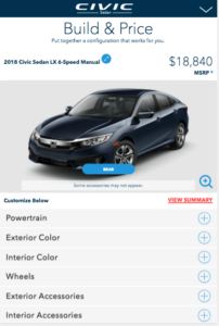
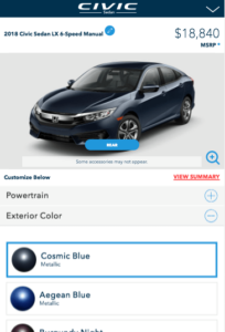
As you can see, the smartphone page looks very similar to the desktop page. The problem is once you unfold one of the options below the image of the car, you no longer can see the other options, removing the ability to maintain a clear overview. The ordering page is also fitted on the same page as the rest of the information for this car, meaning that if you scroll upwards you will find more information that doesn’t necessarily pertain to the car your selecting. And if you click on the “Estimate payment” tucked below below all the options for your car, you will be redirected to a different tab. The per-month costs of leasing the car is not mentioned anywhere on a page that’s named ‘Build and Price,’ which is perhaps why some respondents described Honda’s page as ‘cluttered and confusing.’
What the competition can learn from Ford’s smartphone design
When it comes to ordering a car via a smartphone, nobody makes it easier than Ford. Whereas Honda’s ordering page prompts customers to scroll endlessly, the American automaker manages to make all the necessary information and options easily accessible on a single smartphone page.
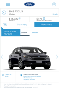
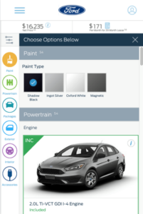
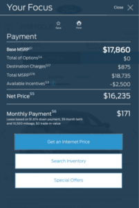
Respondents of our study gave Ford a score of 84 for the ordering process on a smartphone, and a look at the images above show just why. First off, Ford never hides the pricing of the car. Both the total price and the per-month leasing price is displayed clearly atop the page, giving potential customers a sense of transparency. Second, the options on the page are foldable. If customers want to select different features for their car, they simply select the ‘slider’ icon located next to summary and it unveils the different options for the car. The icons on the left side show the progress customers are making when selecting different features, as seen in the image centered above. And if customers want to see the how the costs of the car add up, they can “select” summary and list of the costs unfolds. Ford makes it so that there is no need to open extra tabs, and makes it easy for customers to maintain a clear overview over the whole ordering process.
Optimize for both desktop and smartphone
As more and more people start to use their smartphones for online shopping, it’s becoming increasingly important for companies to design their smartphone pages carefully. From this study, we saw the pitfalls that come with taking the design for a desktop and using it for the smartphones. This was just one of the fascinating takeaways from this study, but there is much more that our data tells us about the private lease market within America’s automotive industry.
WUA’s Digital Sales Scan
WUA independently measures the customer journey of online markets to discover who provides the best online customer experience and the best practices across industries. Based on this data, WUA’s digital experts can create a custom-tailored report for your website to improve the customer journey step-by-step. Each Digital Sales Scan report includes market best practices both inside and outside your industry, recommendations and customer feedback on each step of the customer journey, and screenshot analysis to help your team create a better website and drive conversion. Read more about the Digital Sales Scan here.
Want to know more about how the Digital Sales Scan will work for you? Contact Bo-Peter Laanen to find out, and initiate expert analysis for your website.
