The Best of The Best: Who Delivered The Supreme Website Experience in 2022 (and How?)
Which websites offered the best experiences over the past year, and what made them stand out above the rest? Beating your competition is one thing, but the digital experiences that stand out as the winners – across all sectors – have something particularly valuable to teach all businesses.
Who decides the winning digital experiences?
During 2022, WUA conducted 100 benchmark studies in The Netherlands. These studies give us a deep understanding of real customer experiences across a wide range of customer journeys.
It’s important to understand that WUA’s methodology relies on analyzing hundreds of real customer experiences. For this reason, WUA tasks 400+ potential customers to shop for a target product or service. We see which websites they find, which ones they prefer for a ‘second look’, and which one they would eventually choose (when they buy).
These studies compile deep analyses for each product journey, and identify which factors drive the highest scores for Look & Feel, Brand, and Product range.
For each stage, WUA collects quantitative and qualitative data – resulting in a clear and complete picture of the whole customer journey and digital experience. From these studies, we can identify the winning experiences for each product journey or industry, and see what makes them so good.
Furthermore, looking across all sectors and industries for the whole year, WUA can measure the #1 ultimate customer experience that beats all others in that country.
In this article, we’re going to analyze the very best digital customer experience in The Netherlands during 2022, based on the combined scores from all sectors and product journeys.
So, who claimed the #1 spot this year, and how did they do it?
Well, this year, the gold medal will need to be shared, as we have a dead heat between TWO customer experiences. Both of these are strides ahead of their competition – let’s see why.
Winner 1: NS International’s crystal-clear booking process

For most travelers, booking an international train ticket can be somewhat stressful. There are a lot of details to consider: “How does it work?”, “How expensive is it?”, and “What details do I need to know?” – to name a few. Novice travelers may find these issues especially pressing, so it’s important to offer the best digital experience to avoid a high bounce rate.
The complexity of international travel products can be difficult to manage, and the flow of information must be carefully managed.
Presenting information without becoming overwhelming
Despite the challenge of creating great customer experiences in this sector, NSinternational.com stands out for achieving consistently high scores across each stage of the product journey. They received a very high score for Clarity (76 vs. market average of 64) for the product journey ‘Train journey to Berlin’ – and this is also a very good score when compared to other markets. The website booking process is also highly rated by consumer feedback.
With a lot of information to relay, it’s important to be clear. NSinternational.com scores very highly for having a clear and ‘scannable’ booking process. It achieves this by breaking the booking process down into digestible ‘bites’.

The qualitative feedback from this process shows why this is so effective: “You immediately see clearly what you click on, step by step. It speaks for itself.”
By giving a clear overview, the consumer feels more in control and better informed. This is enhanced by a streamlined booking process that removes unnecessary elements, such as the main menu for navigation and thematic pages, which disappear once the booking process begins.

Understanding the customer perspective
NS International knows that price is often a deciding factor, and a strong motivator for making a choice. NSinternational.com’s score for price perception is also relatively favorable. For the ‘Train journey to Berlin’ product journey, consumers give them a score of 61, compared to a market average of 54. Their website intelligently responds to this factor by giving departure days a color-indication (red, yellow, or green), which gives a traffic-light indicator of price ranges available on those days. After selecting a departure day, the customer gets a more in-depth view of the exact times and prices for that day.

Using this simple trick, the visitor is given an instant snapshot of the best-priced departure date and time for each trip. This is backed up by qualitative feedback from consumers:
“You can see in advance whether you are booking on an expensive or cheap day. This way you can see beforehand when you must book, so you can travel as cheaply as possible.”
How you can apply these lessons to optimize your digital experience
Being aware of the biggest decision-drivers for your market can help inform which areas to pay most attention to. For NS International, it’s clear that price is a driving factor, so they make it easy to decide based on price. They also understand that having an overview is important, so they provide this to ensure an order isn’t abandoned. Using a smooth and intuitive customer experience, they guide the consumer, step-by-step, to their desired destination station.
All companies can learn from this: give your customers the path of least resistance.
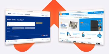
Winner #2: Coolblue’s selection assistance

Sharing 1st place is Dutch electronics retailer Coolblue.nl. This retailer is consistently at the top of the leaderboard in our benchmark studies. Consumers regularly give this company’s customer experience very high scores, including our semi-annual digital journey for ‘Television’.
Offering an ‘in-store experience’ online
For many consumers, buying electronics online isn’t an easy task. These products can be highly technical, with many specifications to compare. They are often ‘big ticket’ purchases as well. These two factors mean the journey can become fragmented or abandoned due to uncertainty about the deal or information overload. Many consumers are also concerned about the affordability of their purchase (or getting the best deal), and the expertise or reliability of potential suppliers.
How can they be certain of making the right choice? It’s easy enough to give personal advice to a customer in-store, but this just isn’t as easy with online sales.
Helping to narrow down the options
By overcoming this ‘distance selling’ challenge, Coolblue.nl has taken a clear lead over their competition. This is reflected clearly in the consumer feedback and scoring: Coolblue.nl’s selection assistance component scores 78 points, compared to a market average of 70. This high score comes from the fact that Coolblue.nl guides customers through the selection process, thereby eliminating uncertainty by giving them a ‘feel good’ choice.
When we look at the detailed responses from WUA’s benchmark studies, it’s apparent that consumers love the selection assistance (aka ‘Keuzehulp’) feature. It’s one of the most persuasive elements of their digital experience, and this is indicated when consumers cite this selection assistance feature when answering the question: “What is the main reason you choose this website (after orientation on multiple different websites)?”
Pointing the way with labels
Before using this feature, the selection process starts with Coolblue.nl displaying a selection of products, some of which are given the recognizable ‘Coolblue’s Choice’ label.
According to one consumer, “Coolblue’s choice helps very well in making your choice, because the range on this site is really huge”.

This label is helpful for pointing consumers in the right direction, but it also doesn’t lose any detail. With one click, the consumer gains a transparent overview of what the label means for each product, giving a clear set of reasons why it’s the ‘best choice for you’. This helps translate dry product specifications into a motivation to buy.

Coolblue leverages its expertise effectively, but it also prominently wields the mighty power of customer reviews. This kind of social proof is incredibly persuasive, and Coolblue.nl uses customer reviews as part of its ‘Coolblue’s Choice’ label criteria. By stacking multiple kinds of persuasive elements, the website creates added value for consumers, who can feel confident about their choice. With such a broad selection of products, it’s essential to simplify these into a narrower range of options, and Coolblue.nl does this exceptionally well.
Selection assistance tool
Let’s look more carefully at how their selection assistance tool works. Coolblue.nl knows that most people are not technical experts, but they want to feel like one. They overcome this by speaking the language of the consumer. The questions used to narrow-down the options are based on real-life situations, like ‘Do you want to use your TV for gaming, or watching shows?’.

How you can apply Coolblue’s methods to improve your digital experience
The data shows just how effective their customer-centric approach is. According to one consumer from the WUA benchmark study,
“The selection assistance tool is the deciding factor here. I can indicate very specifically what I want to do with the TV and thus choose the right TV for my needs.”
Think about what’s holding your customers back
By asking questions that follow a similar path to an in-store conversation with a salesperson, the gulf between online and offline starts to seem smaller, and it becomes much easier to commit to a purchase.
Not all customers will find the selection assistance tool an attractive option. Many consumers feel the need to physically touch or hold an object before they can commit. We see this often in our studies, with feedback such as “Once I have made my choice, I will go to the physical store.” Coolblue is very aware of these ‘touchy-feely’ customers, and accommodates this by highlighting the possibility of receiving personal advice in-store. It demonstrates that they understand the needs of this customer group, which helps to win their custom.

Using the best tactics from 2022 to offer the best customer experiences
WUA’s benchmark studies tend to focus on one market and product journey. This is because the preferences of different customer groups and the needs of consumers of these products and services can vary a great deal. Comparing ‘like for like’ is the only way to produce actionable insights.
However, when we compare all customer experiences across the year, including all the different sectors, industries, and product journeys, we can see much bigger trends that can apply to all sectors.
The overall winners this year have succeeded by creating optimal customer experiences, despite operating in difficult markets – and this means they are far ahead of their competition. We can learn a lot from them:
- Identify the biggest concerns for their customers
- Offer unique ways to overcome their challenges
- Help consumers to narrow-down choices to a manageable level
- Give information in bitesize chunks
- Make pricing options clear with color coded choices
- Using ‘Best Choice’ labels and social proof to highlight suitable products
- Focus on which options meet their essential needs
Bridging the gap between the online and in-store experiences
For Coolblue.nl, their greatest victory is closing the gap between the online and offline (in-store) market. They offer multiple options for consumers to help choose the right item, and offer information in a familiar (useful) context. Likewise, NS International gives a clear indication of where the cheapest tickets can be found and simplifies the information being presented at any one stage.
Empowering the customer
It’s clear that both of these winning customer experiences empower consumers to decide. They offer tools that assist the selection process, and find ways to show the most relevant information without overwhelming the visitor. Both experiences offer a narrow range of ‘best options’ and deliver important information in bitesize chunks.
These elements are a key part of a winning digital customer experience strategy – doing them well can have a huge impact, whichever sector you’re in.