Four lessons from ANWB about the power of images
It’s harder than ever to grab people’s attention. Our brain is constantly on the lookout for new triggers to satisfy our drive for mental stimulation. As a result, web designers have to try harder and harder to direct the visitor’s eyes in the right direction.
So, how do you succeed in locking your visitor’s eyes on your website?
In this article, we’ll show you the answer. First, we’ll look at the importance of making the right first impression. After that, we’ll look at how the Royal Dutch Touring Club (ANWB), an insurer and roadside assistance provider, uses images on its site to grab the visitor’s attention and hold it.
Why first impressions matter
As described in our article “A picture is worth more than 1,000 words”, people form their first impression of a website within 0.05 seconds. To win the battle for attention, images are essential. That’s because it takes our brains 0.013 seconds to determine what a picture is about. That’s 60,000 times faster than it takes us to find meaning in text, according to neuroscientists from MIT.
This means that consumers rely solely on visual cues to form their first impression. In other words, pictures are the gateway to the user experience.
As we all know from everyday life: it’s hard to change a first impression. One of the reasons for this is known as the “consistency effect.” This effect is about that humans have a desire to be consistent with their previous actions. This means that once a person has formed an opinion about something, they tend to act according to that opinion in the future. Another principle that makes it hard to change a first impression is the “halo effect”: if someone has one positive characteristic, then we assume that they have other positive characteristics as well.
Our own benchmark data shows just how important first impressions are. In fact, the first impression determines 80% of a consumer’s final assessment. That means that before the consumer even reads a single letter of text, they’ve already reached their conclusion about your website.
Lessons from the ANWB: The right way to use images
If you want to understand the power of images, take some inspiration from the ANWB. They have often topped our rankings when it comes to their site’s appearance and use of images. As they won our latest WUA research on car insurances. The ANWB’s use of images is a major driver behind its top ranking in our Digital Sales survey.
Images can improve the user experience by using images that are functional, relevant and emotionally impactful. As a follow-up to our previous article, we want to show you four lessons about how the ANWB uses functional, relevant and emotional elements in their images. Above all, it’s important to remember that pictures are not just a “decoration” for your site. They are important tools for sharing information and hooking your visitor’s attention.
Lesson 1: Set the right mood for the consumer
We like to think of ourselves as rational beings. But our decision-making process is almost completely driven by emotions. In his book Thinking, Fast and Slow, Daniel Kahneman explains that about 95% of our decisions take place on the subconscious level. Photos have the power to trigger an emotional response and control the consumer’s mood. That means they can be used to evoke certain emotions and spur the consumer to take action. There are two strategies for this:
Strategy 1: The “current feeling” technique
The “current feeling” technique is used to remind the visitor of the problem with which they are currently confronted, and the importance of solving it. In other words, it puts the visitor face to face with their existing problem. For example, if your product is an online co-working platform, then you can use images that clearly shows the inconveniences of working remotely.
Strategy 2: The “desired outcome” technique
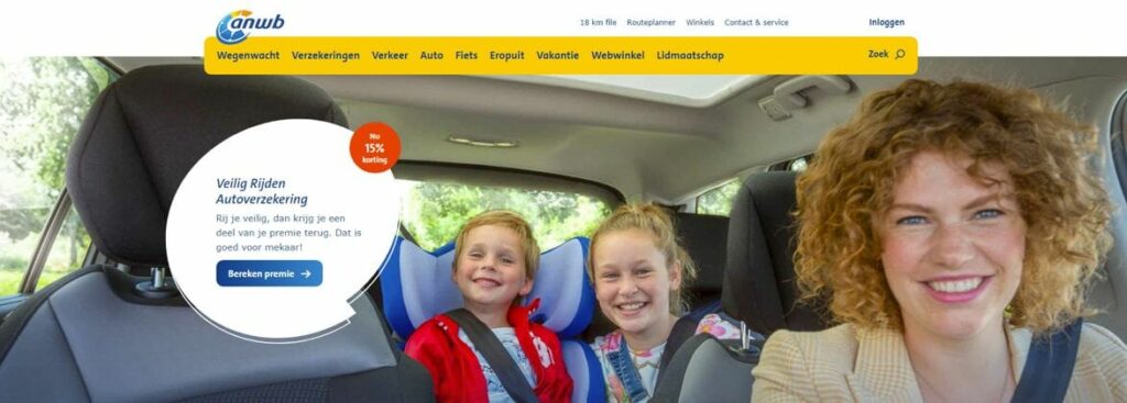
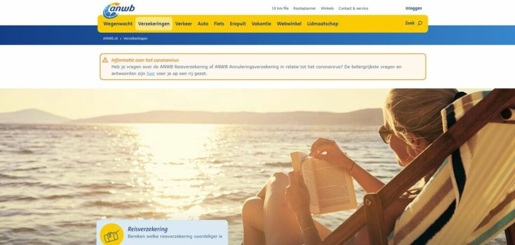
In contrast to the “current feeling” technique, the “desired outcome” technique focuses on what the visitor hopes to achieve. If we look at the pictures on the ANWB site, we see a clear focus on the personal benefits of becoming one of the organization’s customers. For example, image 1 shows the desired outcome of having car insurance. The visitor associates this image with purchasing an car insurance policy that lets them take to the road without any worries. Image 2 shows the same outcome, except for travel insurance. It’s all about enjoying your vacation without a care, thanks to your ANWB travel insurance. Throughout the website, “happy, sincere and identifiable” are the recurring themes.
Lesson 2: ANWB clearly matches images with its content
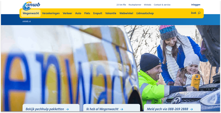
For an image to be relevant, it has to provide information to the visitor. A relevant image shows how the product works and which problems it solves. On the ANWB’s page about roadside assistance (image 3), you can see a picture of an ANWB rep solving the consumer’s problem (a breakdown on the road).
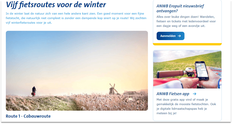
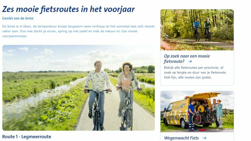
The ANWB also makes sure that its images match the time of year. For example, on their page about cycling routes, they use images of wintry landscapes during the winter (image 5), and springtime images during the spring (image 6). The images add impact to the text. Nothing brings a story to life better than a relevant photo.
Lesson 3: Direct the consumer’s gaze
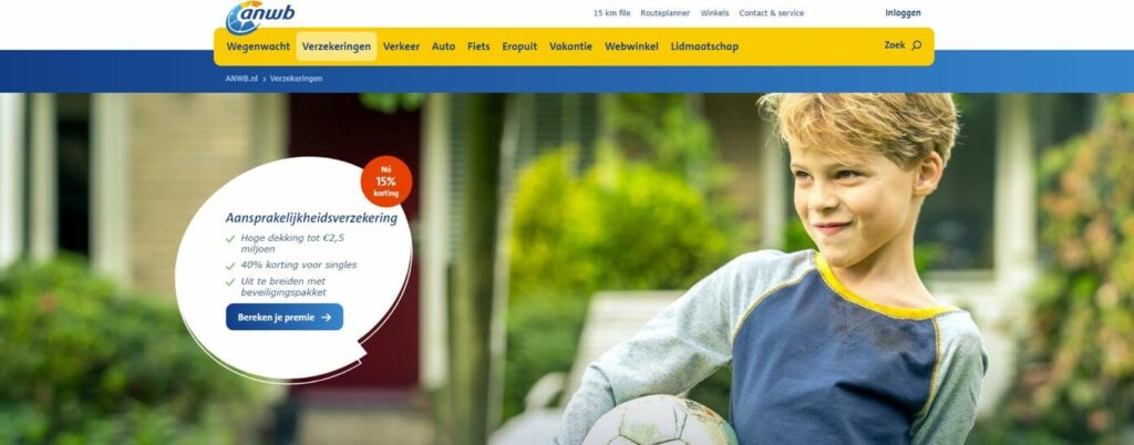
An image is considered functional when it triggers an action in the viewer. Functional images might be interactive, or they might direct the viewer’s gaze. The ANWB achieves this through so-called “gaze cueing,” as seen in image 7.
This technique plays into our unconscious tendency to automatically look in the same direction as other people are looking. Gaze cues work not only with images of people but also with images (including drawings) of animals or avatars. These help direct the user towards the call-to-action button or other elements that you want them to look at.
Lesson 4: The same rules apply for mobile
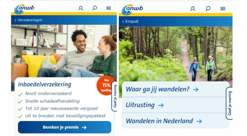
The limited space on a smartphone screen makes it harder to show consumers the information you want them to see. Many websites choose to make the images smaller on their mobile sites to create more room for text. But remember: people are visual beings who find images more important than text. The ANWB has chosen to make plenty of room on its mobile site for images. This has proven to be a winning strategy. According to our car insurances survey for March 2020, the conversion rate for their mobile site was even higher than that of the desktop version.
Images build trust. It’s no coincidence that we say “a picture is worth more than a thousand words.” Images can make all the difference. They display your product and illustrate your brand’s values. An ANWB spokesperson says that their company focuses on images that are inviting, exciting, helpful and engaging. Whether on a desktop or on a smartphone, images make the first impression. And the first impression is what really counts.
The ANWB puts careful planning into the images it uses on its site. As a result, it ranks high in image-related components of our surveys at WUA. To get the most out of your images, make sure they put the visitor in the right mood, they match your content and they help direct attention towards your call to action.


