How price transparency builds trust and drives conversion
Picture this: Your visitor is almost at the end of the calculator flow. Everything’s filled in. They’re ready to convert. Then suddenly the price changes without explanation. Or the total jumps higher than expected. Or worse, there’s no total price at all, just vague monthly costs with no breakdown.
What happens next? Doubt. Frustration. Distrust.
Price transparency makes or breaks the customer journey
Our research shows that a lack of transparency around pricing is one of the biggest conversion killers. People hate surprises when money’s involved, and rightly so. Especially for complex or long-term contracts like insurance, energy, mortgages, or leases, being upfront about costs is key to building trust.
We often hear users say things like:
- “I can’t tell what it’ll actually cost me per month, only the total.”
- “It’s unclear how my choices affect the price.”
- “I just want to know what I’ll pay and what’s included.”
Why unclear pricing destroys trust
Price is the moment of truth. If it feels confusing or inconsistent, the rest of the experience stops mattering. You can have the most beautiful design and seamless flow, but if your pricing feels off, visitors will drop off — and they won’t come back.
And it’s not even about the amount itself. It’s about the feeling of control, fairness, and freedom of choice.
What to do instead
Make pricing transparent, predictable, and easy to understand. Show users exactly how their choices affect the total and give them confidence that nothing is hidden.
Here’s what works:
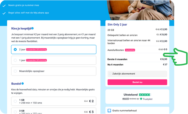
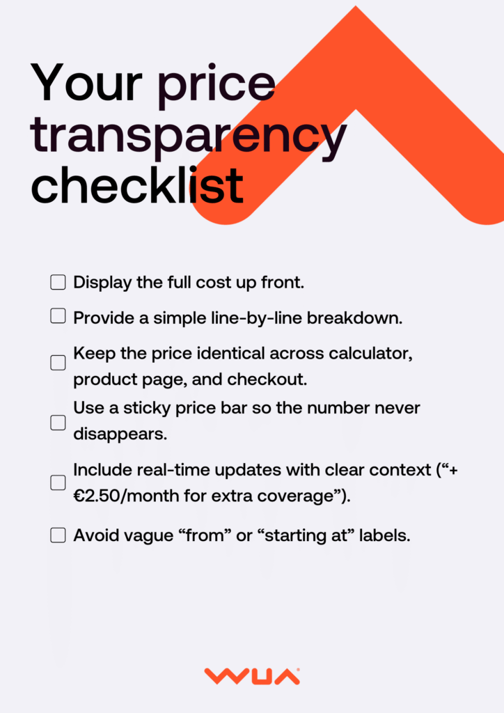
- Show real-time price updates for every relevant choice. For example: “+ €2.50/month for extra coverage.”
- Keep the price visible at all times, especially on mobile — for example, with a sticky price bar.
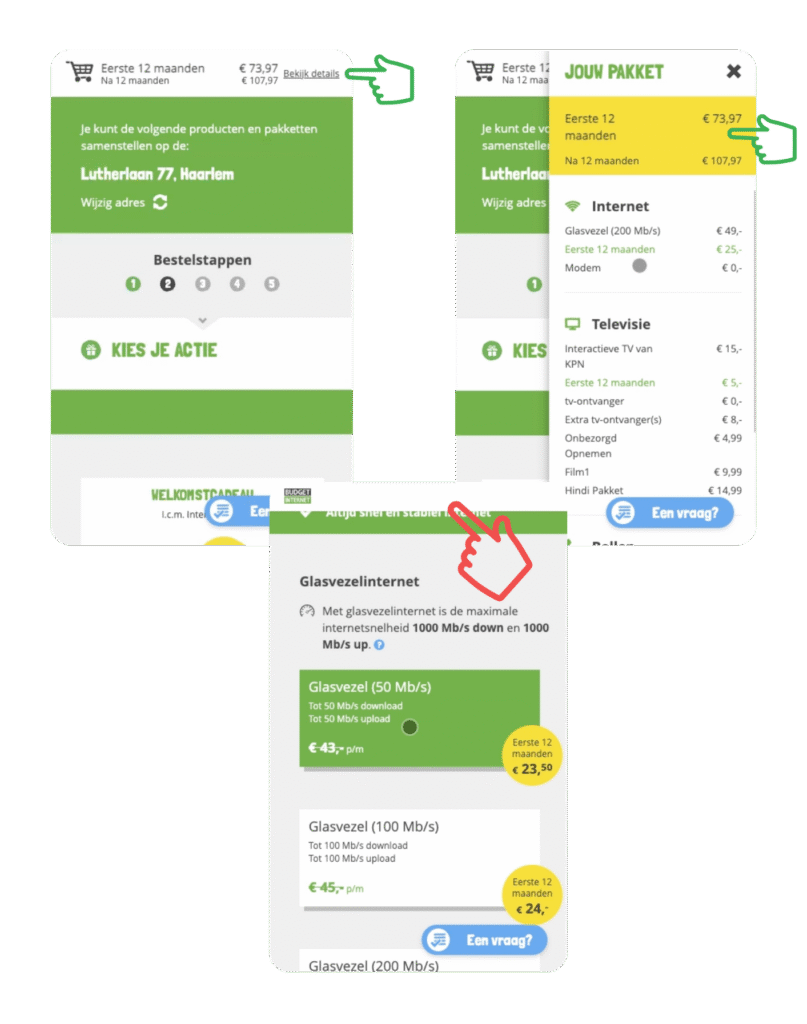
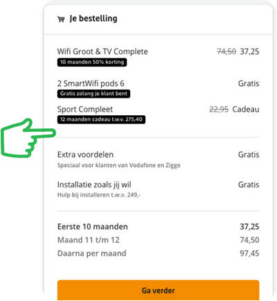
- Provide a clear summary before checkout. Show what’s included, what it costs, and why.
- Visualize how options impact cost with sliders, color cues, or “most chosen” labels.
- Avoid pricing tricks. No hidden fees, no vague “from” prices. Transparency builds trust and increases sales more than clever copy ever could.
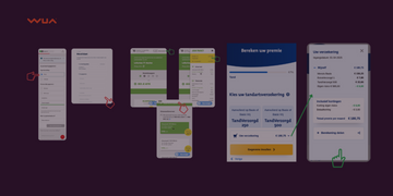
Example: a calculator where the price summary disappears as you scroll, making it impossible to keep track of costs.
An example where the summary disappears during the checkout flow.
Clear price communication isn’t optional
A strong pricing experience is built on four pillars: transparency, a clear total, constant visibility, and easy adjustments.
In practice, that means:
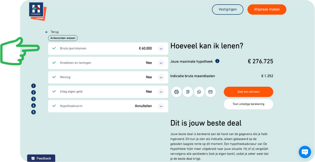
- Always show the latest price: on every device, ideally in a fixed position.
- Make the breakdown visible by default or with a simple click.
- Show exactly how each choice affects cost (“+ €3.50/month for extra coverage”).
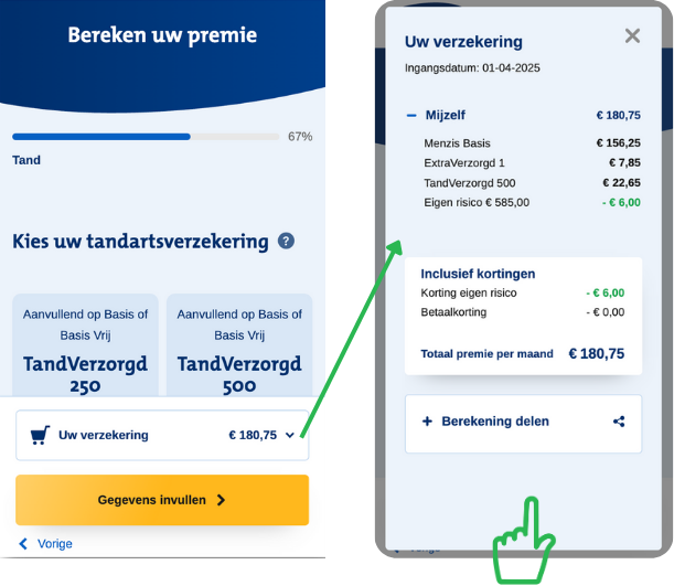
Make it easy to change choices
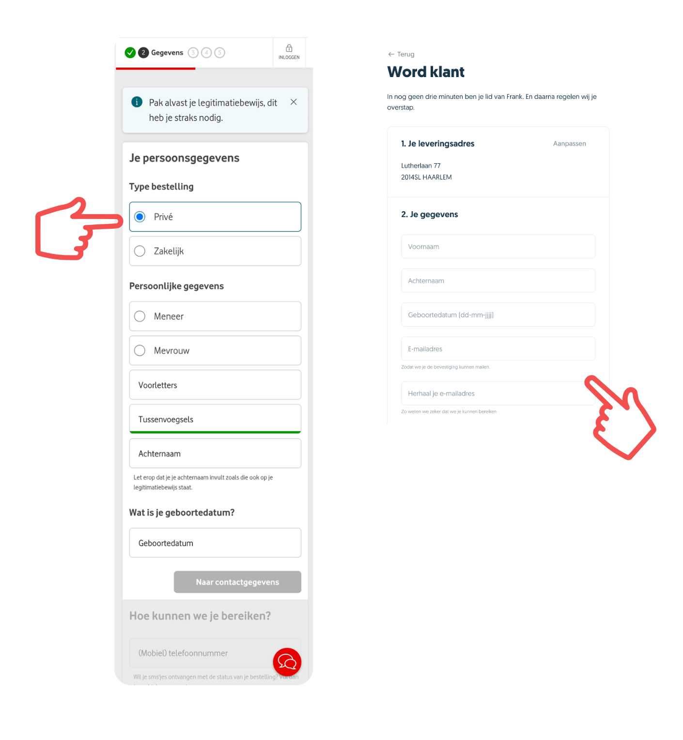
In many calculators, users have to click back through every step just to change one option. It’s tedious and it kills momentum.
A better approach: let users jump straight to any step, edit what they need, and move on without losing progress.
That sense of control prevents frustration and keeps them moving toward checkout.
The bottom line
When prices are clear and predictable, people buy with confidence. They complete purchases more often and see your brand as fair and trustworthy.
Our research shows that real-time updates, a fixed price bar, and a clear cost breakdown reduce doubt and increase completion rates.
Keep your pricing consistent, visible, and easy to follow from the first click to the final confirmation, and you’ll get the most out of every customer journey.
Win the battle for the customer
Are you curious to which competitor you lose the most customers and what you have to do to win these customers for you? Contact us today.