Your visitors don't weigh every option on your website rationally. They rely on cognitive biases: shortcuts the brain uses to process information quickly.
Biases are already active in every customer journey. They influence which price feels fair, whether a visitor finishes a quote flow, and how many options is too many.
Below are five biases that show up in almost every customer journey, with examples from Dutch brands and concrete things you can check on your own pages today.
| Bias | The mechanism | Where it shows up online | What to change |
|---|---|---|---|
| Framing | The same facts feel different depending on the reference point | Pricing, coverage, claims, included features | Lead with the gain, not the exclusion |
| Anchoring | The first number calibrates every number after it | Plan pages, pricing tables, hero sections | Choose the first number deliberately |
| Zeigarnik effect | Unfinished tasks stay active in memory | Quote flows, calculators, multi-step forms | Let people start before you ask for commitment |
| Hick's law | Decision time grows with the number of options | Filters, product ranges, tiers, add-ons | Narrow the field on the visitor's behalf |
| Curse of knowledge | Experts can't imagine not knowing | Product pages, FAQs | Test with people who have never used the product |
Framing: presenting the same information in a different way
In 1981, Amos Tversky and Daniel Kahneman published the study now known as the Asian disease problem. They described a disease expected to kill 600 people and offered participants a choice between two treatment programs. When the programs were described in terms of lives saved (90% survival), 72% chose the safe option. When the identical outcomes were described in terms of lives lost (10% mortality), only 22% did.
With framing, you present information in a specific context to influence perception and decision-making. This involves emphasizing a particular perspective or fact to steer the recipient in a specific direction.
A few ways you can apply it:
-
Present outcomes as gains, not limitations: "90% of claims approved" instead of "1 in 10 rejected"
-
Frame included features as something the customer receives for free, rather than something baked into the price. €10.00 plus €2.39 shipping vs. €12.39 with free shipping come to the same total, and they don't feel the same
-
Pick the unit you quote the price in. €12 a month and €144 a year are the same money, but the monthly figure feels like a smaller decision
Example:
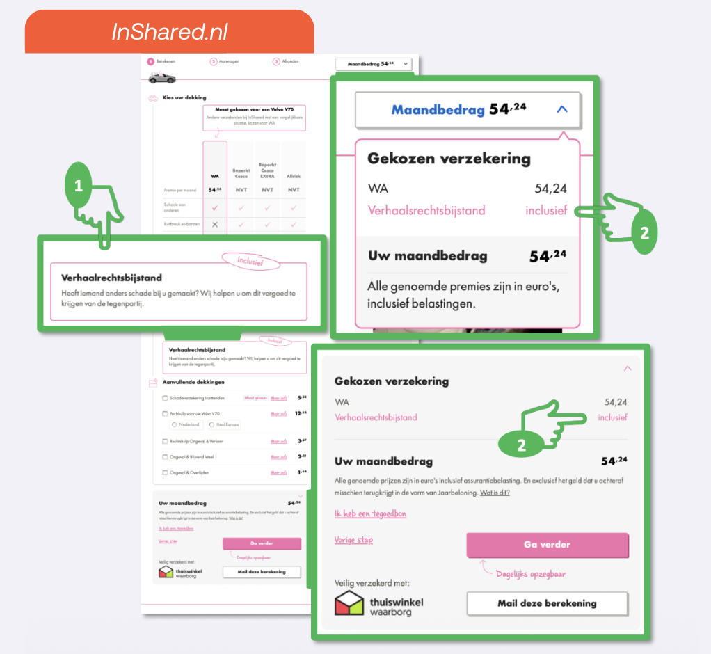
On its coverage page, InShared presents legal recovery assistance as a little bonus included at no extra cost. That reframe turns a standard policy feature into something that feels like a gift.
Anchoring: the first number sets the scale
Tversky and Kahneman demonstrated this in 1974, in the study known as the wheel-of-fortune experiment. They spun a wheel that was rigged to stop at either 10 or 65, then asked participants to estimate what percentage of African countries were members of the United Nations. The group that saw 10 guessed 25% on average. The group that saw 65 guessed 45%. A completely irrelevant number moved their estimate by twenty points.
In practice, you can't avoid setting an anchor. The first number on your page does the job whether you planned it or not. If you don't choose it deliberately, the visitor brings their own, often from the competitor they just came from. That makes the anchor you set a strategic choice: it determines whether your price feels high or fair before the customer has read a single line of what's included.
A few ways you can apply it:
-
The order you list your options matters. Choose your anchor number deliberately
-
Put a specific price on the page early, before the visitor reaches plan details, so they're already calibrated
-
Anchor on features, not just price. Use labels like "most chosen" or visual highlights to justify the price of the more expensive tiers
Example:
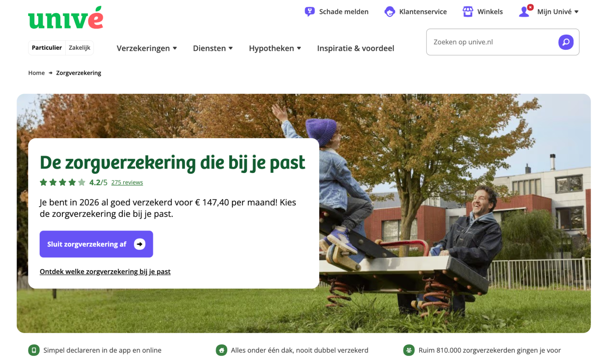
Univé leads with the number: the first thing visitors see on the health insurance page is "insured for €147.40 a month" anchoring the price before they've looked at a single plan.
The Zeigarnik effect: unfinished tasks stay on the mind
Kurt Lewin noticed that waiters in a Vienna café could recall the details of orders that had not been paid for yet, and forgot them almost as soon as the bill was settled. His student Bluma Zeigarnik took the observation into the lab, where her experiments confirmed the pattern: people recalled interrupted tasks roughly twice as well as tasks they had finished. An open loop holds its own place in memory.
This is why a half-finished quote for health insurance pulls harder than one never started. Once a visitor has entered their postcode and their registration, the calculation is no longer something they might do, it is something they have begun and not completed. Progress indicators work on the same principle. A flow marked step 2 of 4 makes the remaining steps feel owed rather than optional.
A few ways you can apply it:
-
Let visitors start the journey before asking for commitment. A postcode field or a single selection is enough to open the loop
-
Show a numbered progress indicator so the process feels partly done, not optional
-
Break longer flows into clearly labeled steps so each completed step increases the pull to finish
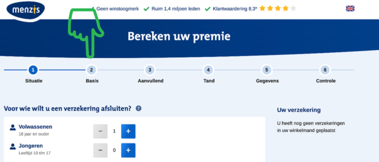
Example: Menzis splits its health insurance quote flow into six named steps, displayed in a visible progress bar across the top. By the time the visitor has selected the number of adults in step one, they've already started. The remaining five steps feel like something to complete rather than something to begin.
Hick's law: every option you add taxes the choice
William Hick (1952) and Ray Hyman (1953) established that the time it takes to make a decision grows logarithmically with the number of options available.
Sheena Iyengar and Mark Lepper showed what that costs you commercially. In a supermarket, they set up a tasting table with 24 jams on some days and 6 on others. The larger display drew more visitors, but only 3% of them bought a jar. At the smaller display, 30% did.
Adding a new filter, an extra payment option or one more package might feel like the right thing to do. But every extra option is one more thing to read, compare and rule out. You don't want to overwhelm the visitor with choices, because confusion leads to the loss of conversion. That doesn't always mean you have to reduce the number of products. You just have to be smart about how you present this information.
A few ways you can apply it:
-
Reduce the number of plans, add-ons, or CTAs visible at any single step
-
If you have a lot of products, group them into clear categories so visitors orient themselves before choosing within a category
-
Use guided flows that ask one question at a time, narrowing the field on the visitor's behalf
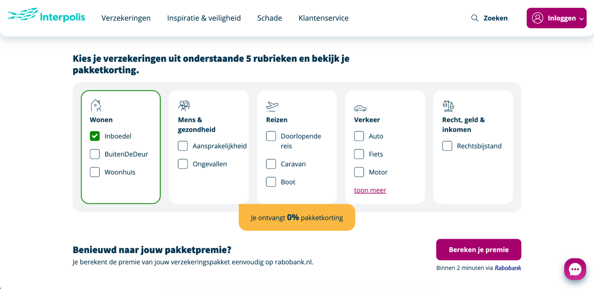
Example: Interpolis organizes its full insurance range into five visual categories, each containing just two or three products. The visitor picks a category first, then selects within it.
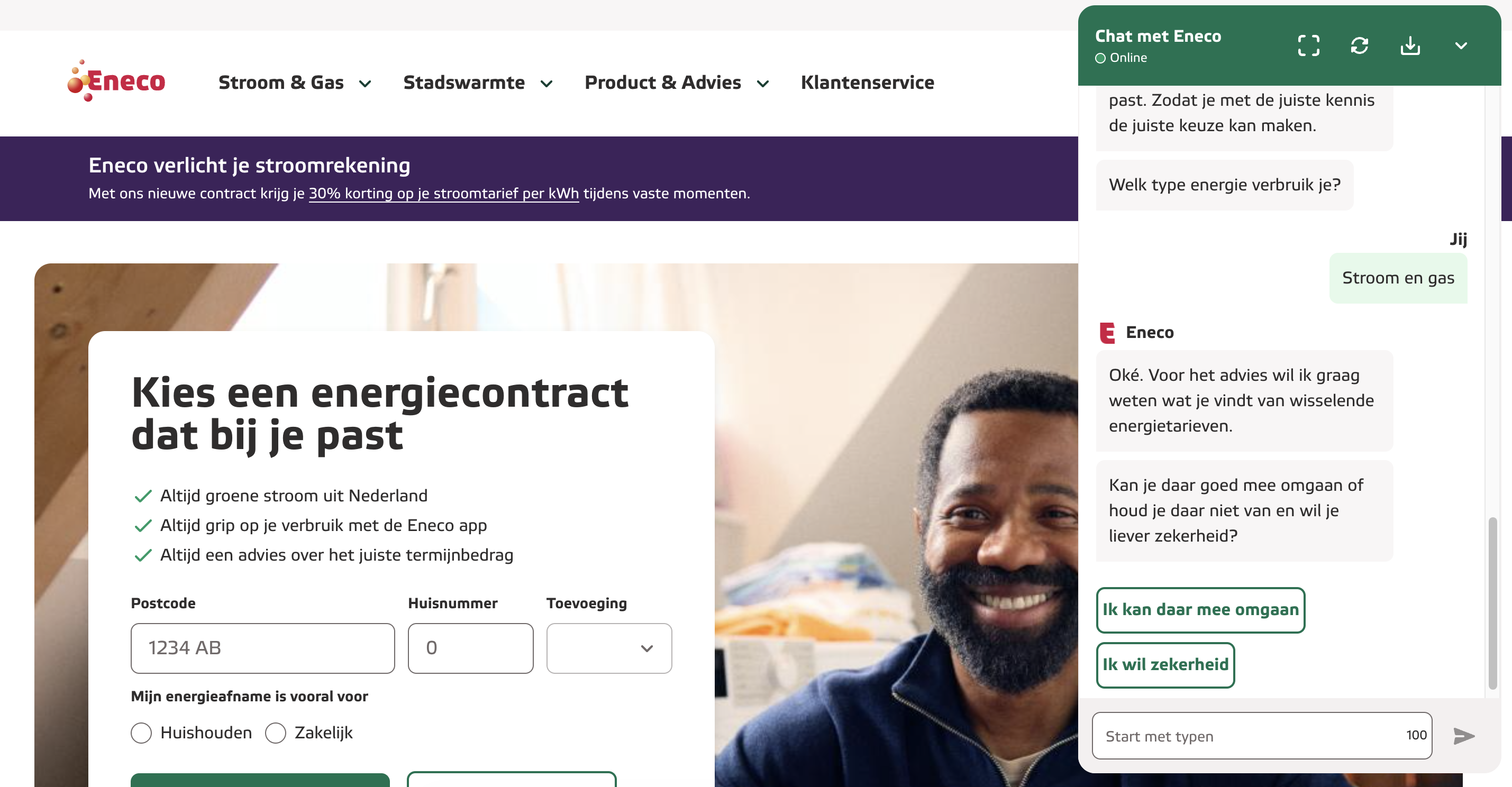
Eneco's chatbot acknowledges that there's more choice than ever, then asks simple questions one at a time to filter down to the right energy contract, so the visitor never faces the full catalog at once.
The curse of knowledge: you know your product too well
In 1990, Elizabeth Newton ran an experiment at Stanford in which participants tapped out the rhythm of a familiar song while a listener tried to name it. The tappers expected around half to be guessed correctly. Listeners only managed 2.5%, three out of 120. The tappers could hear the melody in their heads, but all the listeners heard was knocking.
That is your product team looking at your own customer journey. Once you know something well you can no longer imagine not knowing it: the product names that only mean something inside the company, the terms you assume everybody knows because everybody in the room does (like a no-claim discount, for example,) and the FAQ that answers the questions your team finds interesting rather than the ones customers keep asking.
How to leverage it:
-
Test your pages with people who have never used your product. What feels obvious to your team is often invisible to a first-time visitor. This is why benchmarking is so valuable
-
Replace internal terminology with the plain language your customers actually search for
-
Add contextual help, like FAQs, tooltips, or live chat, at the exact moments where drop-off data shows people getting stuck
How you can use these biases to design a better customer journey
Cognitive biases are already shaping how visitors experience your website. The question is whether you're using them deliberately or leaving them to chance. Small adjustments to the order of your pricing, the framing of a feature, or the number of options on a page can shift conversion without changing the product itself.
Start with the bias that's closest to a known friction point in your customer journey, run an A/B test, and see what changes.
Working out which of these biases is costing you conversion in your own journey, and how that compares with the rest of your market, is the kind of thing we do at WUA, so get in touch if you would like us to look at your journey.
FAQ
Is it ethical to design with cognitive biases for CX?
Yes, as long as you're helping customers get where they already want to go. The ethical line sits between guiding and manipulating. Ask yourself: if the customer found out exactly how you designed this moment, would they feel helped or tricked? Anchoring your pricing page so the mid-tier plan looks like the obvious choice genuinely serves people, because decision fatigue is real. A fake countdown timer that pressures someone into buying is exploitative.
Where in the customer journey do these cognitive biases matter most?
Anchoring and framing dominate evaluation and comparison, shaping how customers perceive pricing and feature tiers before logic kicks in. Hick's Law matters most during onboarding and navigation, where too many choices stall momentum. The Zeigarnik effect drives engagement and retention, because incomplete tasks (progress bars, unfinished profiles) pull people back. And the curse of knowledge is the silent killer across every touchpoint, because the teams designing the experience always overestimate how much the customer already understands.
Can you A/B test a cognitive bias?
You can test a specific implementation of one rather than the bias itself. In practice, this means testing two designs that lean on different bias principles and measuring which one drives the outcome you care about. For example: test a pricing page with a high anchor against one with a reframed value statement and measure conversion. Or test a simplified checkout (Hick's Law) against your current version.
A few things to keep in mind. Sample size matters more than usual here, because bias effects can be subtle and context-dependent. And always pair your quantitative data with qualitative feedback. A bias-driven design might convert well while eroding trust, and your A/B dashboard won't catch that on its own.