How to structure information so visitors never feel lost
When someone lands on your website, they arrive with a goal in mind and very little patience to reach it. They scan, click, and decide within seconds whether the path ahead feels promising or confusing. If the journey takes too much work, they leave.
This is exactly where the bite-snack-meal model helps. It’s a simple way to structure information so every visitor gets the right depth at the right moment.
Here’s how it works in practice, why it matters, and what you can learn from brands using it well.
Why information needs layers
Not every visitor wants the same amount of detail. Some are just exploring. Others know what they want and need specifics before making a decision.
A well-structured website respects these differences by giving people the option to skim, browse, or dive deep. The bite-snack-meal model is the framework behind that layering.
It helps you answer three questions quickly:
- What should someone see first?
- What extra context should follow?
- Where does the full explanation belong?
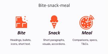
The bite, the snack, and the meal
Bite: the quick taste
This is the first impression. It gives visitors a fast sense of what a page or section is about.
Bites include:
- Headings
- Short text
- Icons
- Bullets
- Clear entry points
Think of this as: “Tell me in one glance what I’m looking at.”
Snack: the light exploration
Once the bite has convinced someone to continue, the snack adds some depth without overwhelming them.
Snacks include:
- Short paragraphs
- Visuals
- Small context blocks
- Accordions with brief explanations
This section helps visitors decide whether they’re on the right track or need something else.
Meal: the full detail
Some visitors want everything: specifications, terms, explanations, conditions, or comparisons. This is where the meal comes in.
Meals include:
- In-depth text
- Detailed breakdowns
- Technical specs
- Terms and conditions
- Extended explanations
This supports decision-making. Visitors who reach this layer want clarity.
Where these layers belong
The model doesn’t live on one page. It flows across the full customer journey:
- Homepages and index pages (transition pages): Mostly bites, with a few snacks
- Detail or product pages (destination pages): Snacks and full meals
When the layers connect smoothly, people always know where they are and what to do next. The experience feels calm and intuitive instead of chaotic or fragmented.
Real examples from user research
Here are several examples showing how companies use the bite-snack-meal model successfully.
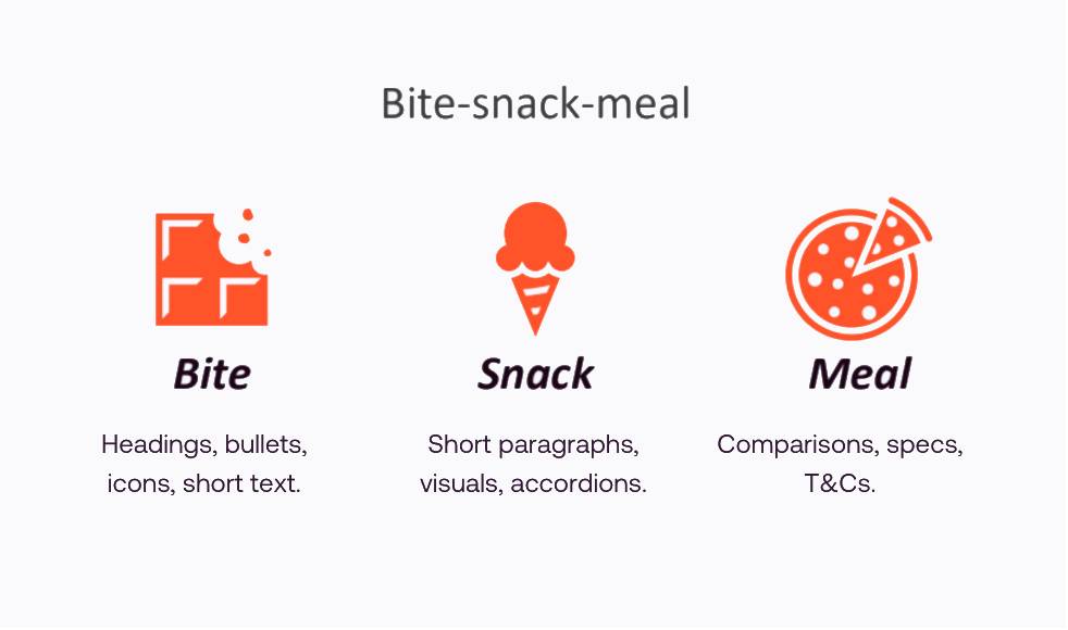
FBTO.nl: clear structure from bite to meal
FBTO combines short, relevant text (bite), clear context (snack), and detailed breakdowns (meal). The sticky menu helps visitors jump to what matters without scrolling endlessly.
What users said:
- “Very pleasant and clear thanks to its minimalist structure.”
- “Short and concise, yet provides a clear overview.”
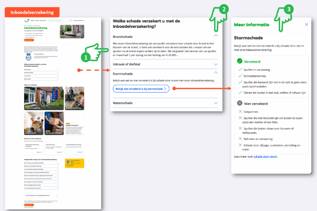
CentraalBeheer.nl: letting people zoom in
Although the page contains a lot of information, the use of accordions keeps the experience compact. Someone can skim, then open just the parts they care about.
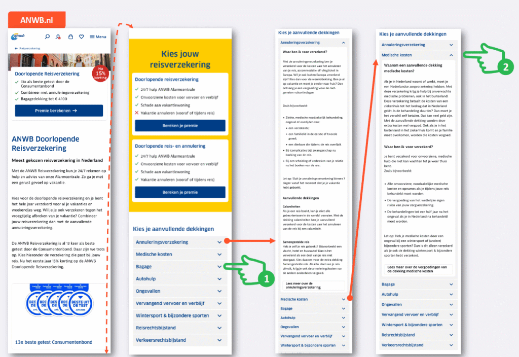
ANWB.nl: clarity through grouping
Additional coverages are grouped in an accordion menu, which keeps the structure mobile-friendly and easy to navigate.
ABN AMRO: layered explanations
Interest rate info starts with simple icons and calculations (bite), then links to a more detailed explanation (snack), and finally provides a full technical breakdown (meal).
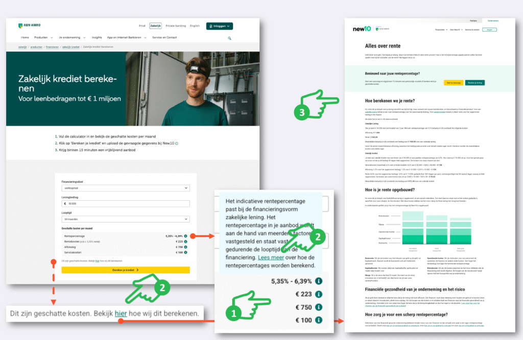
This layering builds trust, because visitors never feel forced to read more than they want.
Common pitfalls the model helps avoid
In the research, five issues came up again and again. Each one becomes easier to fix when you think in bites, snacks, and meals:
- Overcrowded landing pages: Too much “meal” content at the start overwhelms visitors.
- Poor navigation: People can’t find the next bite or snack.
- Difficult comparisons: The “meal” information is unclear or scattered.
- Too much text: Snacks and bites are missing, so everything feels like a meal.
- Fragmented information: The content isn’t grouped logically, so visitors lose orientation.
These problems may seem small, but together they create drop-offs, frustration, and lost conversions.
How to apply this model to your own site
Here’s how to bring the bite-snack-meal structure into your pages:
Start with the bite
- Use clear headings that match what people are looking for
- Give each page a simple intro that explains what’s inside
- Use bullets and icons to create fast scannability
Build strong snacks
- Add short paragraphs or visuals to support the bite
- Use accordions to keep pages compact
- Keep context relevant, not decorative
Serve the meal for those who want it
- Put in-depth info deeper in the flow or behind links
- Use structured sections so the meal is easy to navigate
- Ensure detailed content answers the real questions people have
Key takeaways
When you structure information the way people actually search, scan, and decide, your website becomes much easier to use.
The bite-snack-meal model creates a natural flow that meets visitors where they are, whether they’re skimming or looking for specifics. It keeps homepages and overview pages light and welcoming, while allowing detail pages to deliver the depth needed to convert.
The result is a website that feels clear, logical, and trustworthy. And that sense of clarity often determines whether someone stays, explores, and ultimately chooses you.
Win the battle for the customer
Are you curious to which competitor you lose the most customers and what you have to do to win these customers for you? Contact us today.