general2 min•MasterclassFrom mobile visitor to customer: five UX mistakes that cost conversions daily
 general
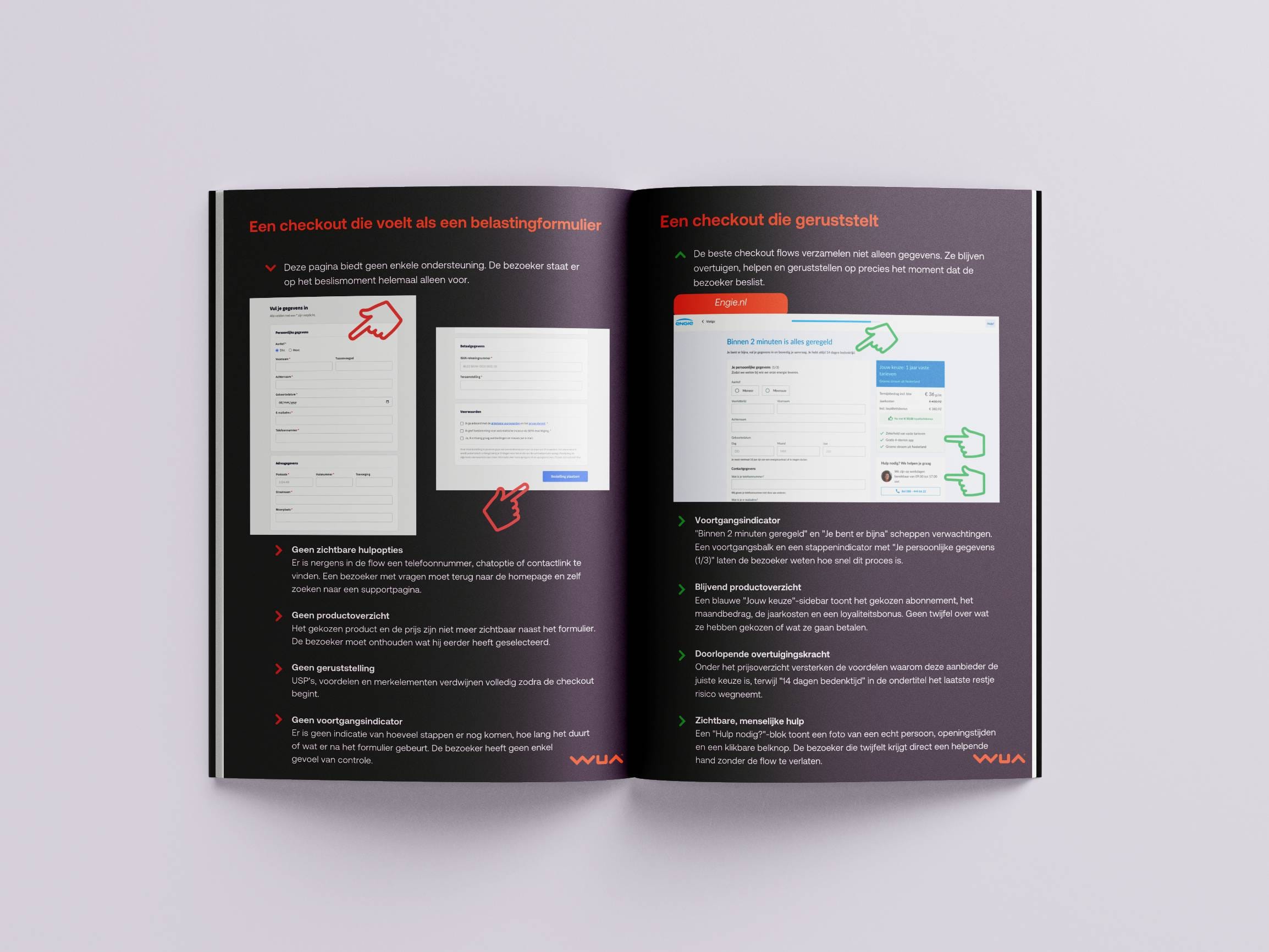