general
2 minwebinar
Discover why clinical checkout forms kill conversion and how the best flows keep selling, reassuring and guiding visitors through the decision moment.
By Linda
The checkout flow represents the critical moment where visitors commit. They're sharing personal details, making financial decisions, and trusting they've chosen correctly. Yet many companies make a fatal mistake: they drop all persuasion the instant the funnel begins, replacing warmth and guidance with cold, clinical forms.
The checkouts that drive conversions don't just collect data. They continue selling, reassuring, and supporting throughout the entire process. Research shows that the best-performing flows maintain four key elements:
Persistent product visibility: Selected products, prices, and configurations stay visible throughout, eliminating the need for visitors to remember what they picked.
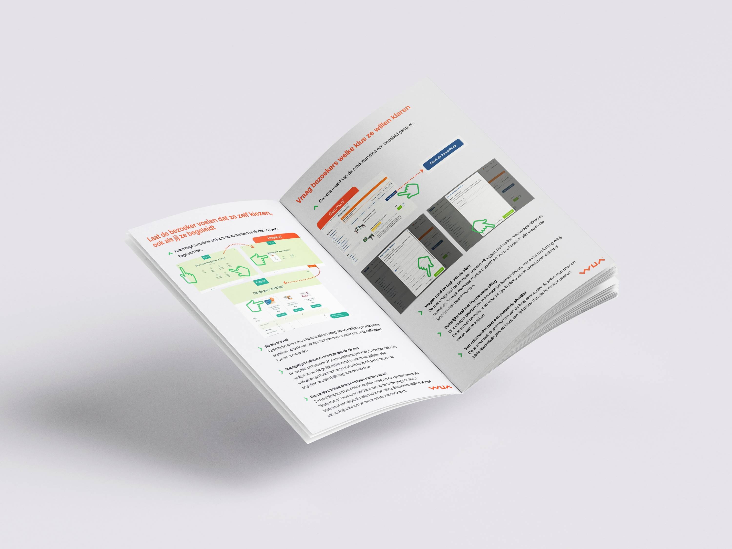
Proactive help options: Phone numbers, chat buttons, and contact links appear at every step, providing a path forward when hesitation strikes.
Ongoing benefit reinforcement: USPs, trust signals, and brand benefits continue to convince rather than disappearing after the landing page.
Clear progress indicators: Time expectations and step counters give visitors control and reduce the uncertainty that leads to abandonment.
The Engie.nl example demonstrates how implementing these principles transforms the checkout experience. Their "All done in 2 minutes" messaging, persistent blue sidebar showing plan details, benefit reinforcement below pricing, and visible human help option all work together to guide visitors through commitment rather than leaving them isolated with a bureaucratic form.
Every element that vanishes from your checkout creates a micro-moment of doubt. Every missing reassurance point is an opportunity for drop-off. The companies winning at checkout understand that the sale continues until the final confirmation screen.

The checkout flow represents the critical moment where visitors commit. They're sharing personal details, making financial decisions, and trusting they've chosen correctly. Yet many companies make a fatal mistake: they drop all persuasion the instant the funnel begins, replacing warmth and guidance with cold, clinical forms.
The checkouts that drive conversions don't just collect data. They continue selling, reassuring, and supporting throughout the entire process. Research shows that the best-performing flows maintain four key elements:
Persistent product visibility: Selected products, prices, and configurations stay visible throughout, eliminating the need for visitors to remember what they picked.
Proactive help options: Phone numbers, chat buttons, and contact links appear at every step, providing a path forward when hesitation strikes.
Ongoing benefit reinforcement: USPs, trust signals, and brand benefits continue to convince rather than disappearing after the landing page.
Clear progress indicators: Time expectations and step counters give visitors control and reduce the uncertainty that leads to abandonment.
The Engie.nl example demonstrates how implementing these principles transforms the checkout experience. Their "All done in 2 minutes" messaging, persistent blue sidebar showing plan details, benefit reinforcement below pricing, and visible human help option all work together to guide visitors through commitment rather than leaving them isolated with a bureaucratic form.
Every element that vanishes from your checkout creates a micro-moment of doubt. Every missing reassurance point is an opportunity for drop-off. The companies winning at checkout understand that the sale continues until the final confirmation screen.

Log in and get instant access to all our content: 250+ articles, case studies, masterclass recordings, and whitepapers.
Log inWant to automatically stay up to date with our latest best practices, whitepapers and masterclasses? You can opt in after logging in.
Discover how WUA can help you outperform the competition.
Get in touch