
In Q4 2020 organiseerde WUA gesprekken met onze dierbaarste klanten over "The New WUA": de product- en organisatieshift die WUA doorvoert met het Digital Experience Dashboard in een hoofdrol. In deze editie: Didy Bos, senior online marketeer bij Nederlandse energieleverancier Greenchoice.
Hallo Didy, bedankt dat je deze case mogelijk hebt gemaakt! Laten we beginnen met een korte intro: Wat houdt jouw baan in bij Greenchoice? Kun je ons iets meer vertellen over je rol en de organisatie waar je werkt?
"Greenchoice is een Nederlandse groene energieleverancier. We zeggen niet alleen dat we 'groen' zijn, we ZIJN het ook echt. Al ons gas is bosgecompenseerd, de elektriciteit die we leveren is voornamelijk Nederlandse windenergie en we leveren ook zonne-energie. Een feit over Greenchoice dat heel interessant is in dit licht: we zijn een van de grootste bosbeschermers ter wereld, en daar ben ik ook persoonlijk trots op.
"We zeggen niet alleen dat we 'groen' zijn, we ZIJN het ook echt."
"Mijn rol is dus senior online marketeer. Ik zit in het marketingteam en we hebben drie subteams. Het eerste subteam richt zich op brand en communicatie, het tweede op propositie, verlenging en loyaliteit, en ik zit in het derde subteam: Digital and Customer Experience. We richten ons op de digitale platforms, op online customer experience en op advertising. Customer experience is een van de belangrijkste aspecten van marketing bij Greenchoice. Het zit in bijna alles wat we doen. Mijn kernfocus ligt op website-optimalisatie voor user experience, sales en retentie."
Wat zijn de grote digitale uitdagingen waarmee jij en de teams bij Greenchoice moeten omgaan om digitale groei te versnellen, en hoe ga je daarmee om?
"Er gebeurt zo veel in het digitale landschap, maar ik denk dat een van de grote uitdagingen bij Greenchoice voor ons is om efficiënt te zijn. Tegelijkertijd willen we geweldige klantwaarde leveren met uitstekende klantenservice en een soepele algehele customer experience. We zijn de grootste groene energiespeler, maar onze concurrenten hebben grotere budgetten. We willen ons budget besteden aan duurzaamheid in plaats van marketing, dus we zijn behoorlijk doordacht over onze uitgaven en we richten ons echt op input versus output.
"Laat me je een kort voorbeeld geven van hoe we de efficiëntie-uitdaging aanpakken: Vorig jaar hebben we onze website herbouwd met een componentbibliotheek, wat betekent dat onze front-end code is opgebouwd uit afzonderlijke componenten. Elke component kan worden gecombineerd om een nieuwe pagina te maken. Je kunt vrij snel nieuwe pagina's opzetten, en de code is heel consistent, dus het is makkelijker om de website te onderhouden.
"We willen geweldige klantenservice en soepele customer experience bereiken door data-driven te zijn. Daar komen WUA en het Dashboard om de hoek kijken. We doen ook veel usability research en klanttevredenheidsonderzoek. Dit geeft ons verdere begeleiding over wat we wel en niet moeten doen."
Bij Greenchoice werk je nu al een tijdje met het Digital Experience Dashboard. Kun je je aanpak toelichten? Hoe werk je hier samen met het team/de teams aan?
"We zijn begonnen met het Digital Experience Dashboard in mei 2020. We hadden geweldige ondersteuning en backup van WUA's research-afdeling en we hadden een uitgebreide kickoff met jullie consultants over alle ins en outs van het Dashboard. Dat heeft ons echt geholpen om te beginnen!
"We plannen Dashboard-sessies om de drie maanden. Het is een online brainstormsessie, waar ik de leiding neem. Tijdens deze sessie identificeren we websiteproblemen of funnel-hiccups, en het Dashboard is het belangrijkste startpunt daarvoor. Onze data-analist is betrokken bij deze sessies. Zij wordt begeleid door onze Team Coordinator CX en onze CX-marketeer. De teamcoördinator kan ons helpen om de inzichten binnen het bedrijf te verspreiden, vooral als een onderwerp of inzicht breder is dan alleen digitaal. Als we verbeteringen vinden op een propositie, bijvoorbeeld, kan zij contact opnemen met mijn collega's die verantwoordelijk zijn voor proposities. We gebruiken het Dashboard veel voor onze a/b-test input. Sommige optimalisaties implementeren we gewoon, en sommige veranderingen testen we graag eerst a/b."
"We gebruiken het Dashboard veel voor onze a/b-test input."
Hoe en op basis van wat besluit je om je online omgevingen direct te veranderen en aan te passen, en wanneer neem je de beslissing om a/b-tests op te zetten?
"Het hangt af van de pagina, of misschien is het gebaseerd op buikgevoel, moet ik toegeven. Maar... we hebben ook een ongeschreven regel. Als een optimalisatie de homepage, pricing of de abonnementspagina betreft, dan testen we het altijd. Als een optimalisatie een bug betreft, of als het door consumenten als een fout wordt ervaren, veranderen we het direct.
"Als het probleem groter is, dan testen we. Bijvoorbeeld, we hebben veel contentpagina's. Die pagina's zijn moeilijk te testen, omdat het volume niet zo hoog is. Op contentpagina's veranderen we op basis van data en onderzoek. Soms testen we de contentpagina's ook via een snelle usability test."
Welk specifiek onderwerp of feature van het Dashboard heeft de meeste waarde/vind je het meest nuttig of interessant?
"Wanneer ik het Dashboard gebruik, focus ik op de open antwoorden: daar vind je de problemen die consumenten hebben en de context. En, meer recentelijk toegevoegd aan het Dashboard, vind ik de Prioritization feature heel nuttig en we gebruiken het steeds meer (bekijk deze productvideo). Met deze feature kun je makkelijk vinden wat je eerst moet verbeteren, ook op vraagniveau en theme scores. Er is zo veel data in het Dashboard, dus ik denk dat je echt moet weten waar je je op moet richten. Deze feature gaat ons veel tijd besparen!"
"Ik vind de Prioritization feature heel nuttig en we gebruiken het steeds meer."
Op welke resultaten en verbeteringen ben je het meest trots, met gebruik van het Digital Experience Dashboard?
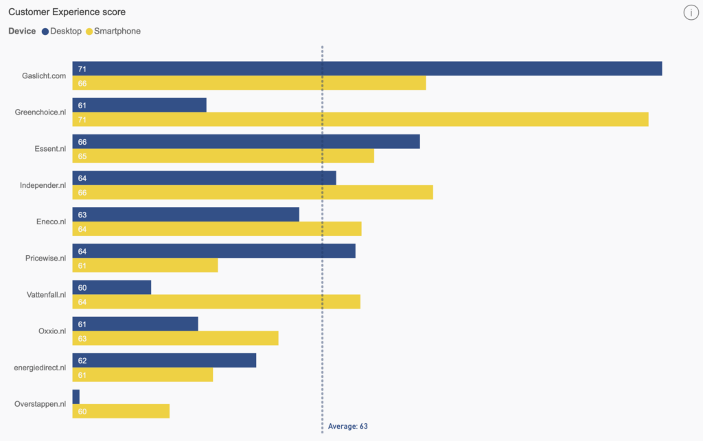
"Een van de problemen waarmee het Dashboard ons heeft geholpen, was het identificeren dat we een 'zigzag-probleem' hadden op onze contentpagina's. Onze informatie- en contentpagina's zijn behoorlijk speels, omdat Greenchoice een wat speelse merkstijl heeft en we hebben een zigzag-patroon op onze contentpagina's. Op mobiel hebben we de hoogste scores, maar op desktop niet. Dus realiseerden we ons dat het iets te maken moest hebben met de presentatie van de content. Het zien van het verschil tussen de apparaten heeft ons echt geholpen om dit specifieke probleem te lokaliseren. We zouden dit niet hebben gevonden zonder dit Dashboard, omdat er een splitsing is in de apparaten tussen desktop- en smartphonescores."
"Een ander voorbeeld van een mogelijke verbetering die we hebben gevonden met het Dashboard: we moeten dingen eenvoudiger maken voor onze klanten en onze potentiële klanten. We zijn behoorlijk gefocust op het uitleggen van duurzaamheid. Maar soms vinden onze bezoekers en klanten het moeilijk omdat ze info-overloaded raken.
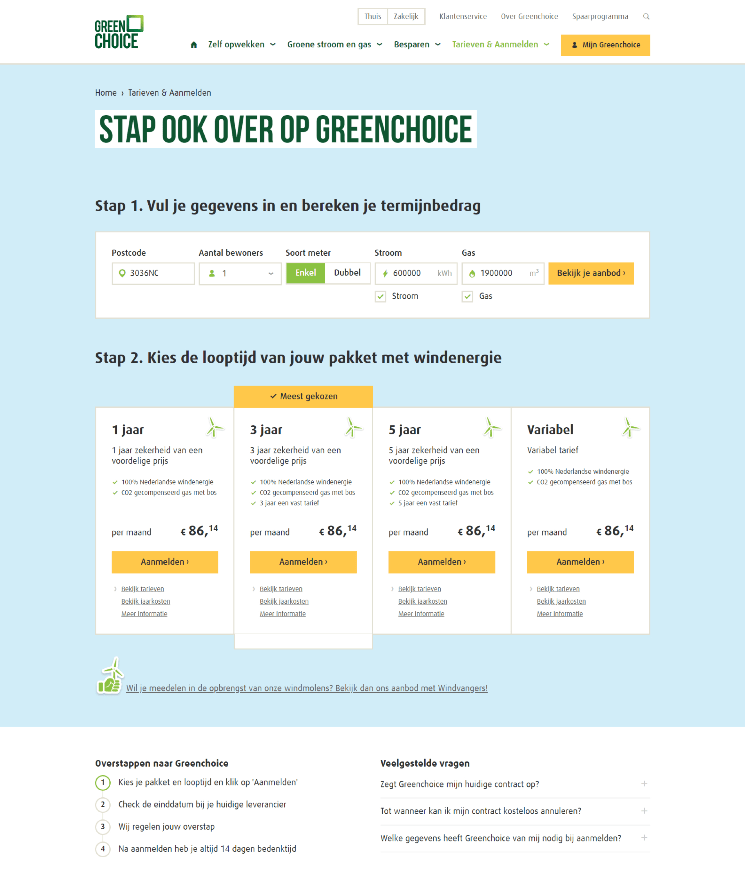
"Dus vorige week hebben we onze nieuwe pricing-pagina gelanceerd, waar we slechts één bron van groene energie aanbieden (zie de bovenstaande screenshot, MvdB). We gaan het makkelijker maken voor onze potentiële klanten: al onze energie is groen, dus waarom die groene keuze niet makkelijker maken voor onze klanten?
"We hebben in de open antwoorden in het Dashboard gevonden dat we zo veel detail gaven dat mensen soms afhaken. Dus het Dashboard heeft ons geholpen met de funnel en met het optimaliseren van de verschillende fasen in onze funnel. Het Dashboard is georganiseerd in een funnel, van Findability naar Preference en Order Process. Dit heeft ons echt geholpen om de problemen in de Greenchoice-funnel te identificeren.
"En last but not least: we vergelijken onze resultaten met de vorige metingen. Ze worden allemaal geleverd in één Dashboard, dus je kunt ze makkelijk bereiken. Dat is ook een feature die ik heel behulpzaam vind."


