 retail
2 min•Whitepaper
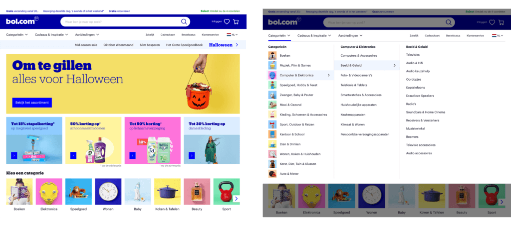
Discover how Bol.com and Coolblue guide customers through thousands of products. Analysis of 400 consumers shows how clear categories and effective filters simplify decision-making.
Discover how WUA can help you outperform the competition.

