general
2 minwhitepaper
Reduce choice overload with a well-designed product finder. Discover best practices from Pearle and Gamma, plus a practical checklist to evaluate your own.
By Linda
Choice overload isn't about too little information. It's a cognitive problem: visitors can only process so much at once. When someone lands on a page full of options, they disengage the moment they realize they have to choose. Most websites respond by adding even more content: comparison tables, extra specs, lengthy FAQs. But that only makes choosing harder.
An effective product finder does the opposite. It takes over the thinking, asks simple questions, and translates answers into a recommendation the visitor can trust.
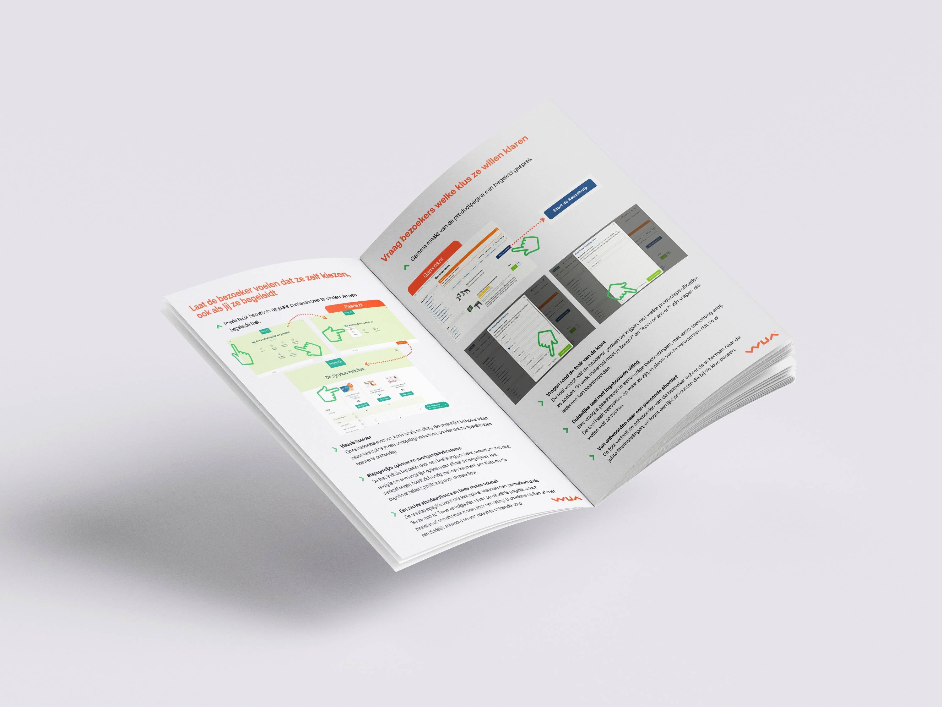
Using two real-world cases, Pearle.nl and Gamma.nl, this whitepaper shows which design principles make the difference:
The whitepaper closes with a practical seven-question checklist to quickly assess whether your product finder truly takes the thinking off your visitors' plate, or whether they're still doing too much on their own.
Want to know where your visitors are dropping off? WUA can help you find out.
Choice overload isn't about too little information. It's a cognitive problem: visitors can only process so much at once. When someone lands on a page full of options, they disengage the moment they realize they have to choose. Most websites respond by adding even more content: comparison tables, extra specs, lengthy FAQs. But that only makes choosing harder.
An effective product finder does the opposite. It takes over the thinking, asks simple questions, and translates answers into a recommendation the visitor can trust.
Using two real-world cases, Pearle.nl and Gamma.nl, this whitepaper shows which design principles make the difference:
The whitepaper closes with a practical seven-question checklist to quickly assess whether your product finder truly takes the thinking off your visitors' plate, or whether they're still doing too much on their own.
Want to know where your visitors are dropping off? WUA can help you find out.

Log in and get instant access to all our content: 250+ articles, case studies, masterclass recordings, and whitepapers.
Log inWant to automatically stay up to date with our latest best practices, whitepapers and masterclasses? You can opt in after logging in.
Discover how WUA can help you outperform the competition.
Get in touch