general
2 minwhitepaper
Learn how to reduce friction in car insurance comparison pages and guide users to convert with confidence. Real examples, checklist included.
By Linda
Car insurance represents a unique challenge in digital commerce. It's an intangible product that consumers must buy but rarely want to think about. This makes the product comparison page a critical friction point where conversions are won or lost.
Research shows that most comparison pages overwhelm users with long specification lists and subtle distinctions. Instead of supporting decision-making, they force visitors to interpret differences and translate them to their own situation. At a moment when clarity is essential, this increases mental effort and often leads to choice paralysis.
The best-performing funnels take a fundamentally different approach. Rather than presenting information neutrally, they actively guide users toward the option that best fits their needs. This shift from passive comparison to active guidance reduces cognitive load and creates confidence at the decision moment.
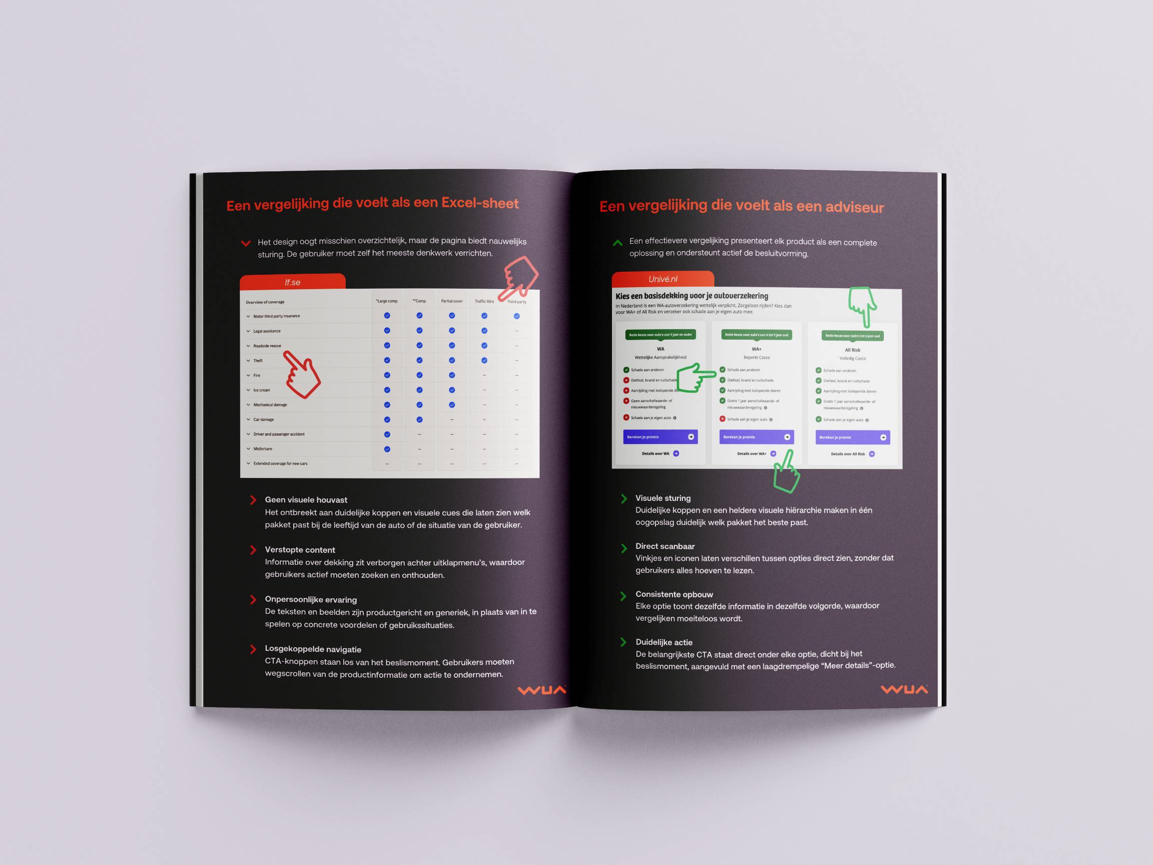
This whitepaper contrasts two real-world examples. If.se demonstrates common pitfalls: a spreadsheet-like layout with no visual guidance, important details hidden behind accordions, impersonal copy, and CTAs disconnected from the product decision.
Univé.nl shows the alternative. Their tile-based design presents each option as a complete solution with distinct headers, instant scannability through checkmarks and crosses, consistent information architecture, and CTAs placed directly below each product.
The difference between these approaches isn't subtle. It's the difference between asking users to work harder and making their decision easier. Use the included checklist to assess where your comparison page stands, and discover concrete opportunities to reduce friction and increase conversion in your funnel.
Car insurance represents a unique challenge in digital commerce. It's an intangible product that consumers must buy but rarely want to think about. This makes the product comparison page a critical friction point where conversions are won or lost.
Research shows that most comparison pages overwhelm users with long specification lists and subtle distinctions. Instead of supporting decision-making, they force visitors to interpret differences and translate them to their own situation. At a moment when clarity is essential, this increases mental effort and often leads to choice paralysis.
The best-performing funnels take a fundamentally different approach. Rather than presenting information neutrally, they actively guide users toward the option that best fits their needs. This shift from passive comparison to active guidance reduces cognitive load and creates confidence at the decision moment.
This whitepaper contrasts two real-world examples. If.se demonstrates common pitfalls: a spreadsheet-like layout with no visual guidance, important details hidden behind accordions, impersonal copy, and CTAs disconnected from the product decision.
Univé.nl shows the alternative. Their tile-based design presents each option as a complete solution with distinct headers, instant scannability through checkmarks and crosses, consistent information architecture, and CTAs placed directly below each product.
The difference between these approaches isn't subtle. It's the difference between asking users to work harder and making their decision easier. Use the included checklist to assess where your comparison page stands, and discover concrete opportunities to reduce friction and increase conversion in your funnel.
Log in and get instant access to all our content: 250+ articles, case studies, masterclass recordings, and whitepapers.
Log inWant to automatically stay up to date with our latest best practices, whitepapers and masterclasses? You can opt in after logging in.
Discover how WUA can help you outperform the competition.
Get in touch