insurance
2 minwebinar
Learn how to reduce friction in car insurance product comparisons. Discover what separates high-converting pages from ones that cause choice paralysis.
By Linda
Product comparison pages are one of the highest-stakes moments in any digital funnel. Yet most of them fail users at exactly the wrong time. Instead of guiding visitors toward a confident decision, they present dense specification lists and subtle distinctions that increase cognitive load and trigger choice paralysis.
This whitepaper by WUA examines what separates a comparison page that converts from one that frustrates — using car insurance as a case study. Car insurance is a particularly challenging product: it is intangible, mandatory, and something consumers actively avoid thinking about. When visitors reach the comparison step, they are already mentally taxed. The page has one job — make the decision feel easy.
WUA contrasts two live product comparison pages to illustrate the gap between best practice and common mistakes.
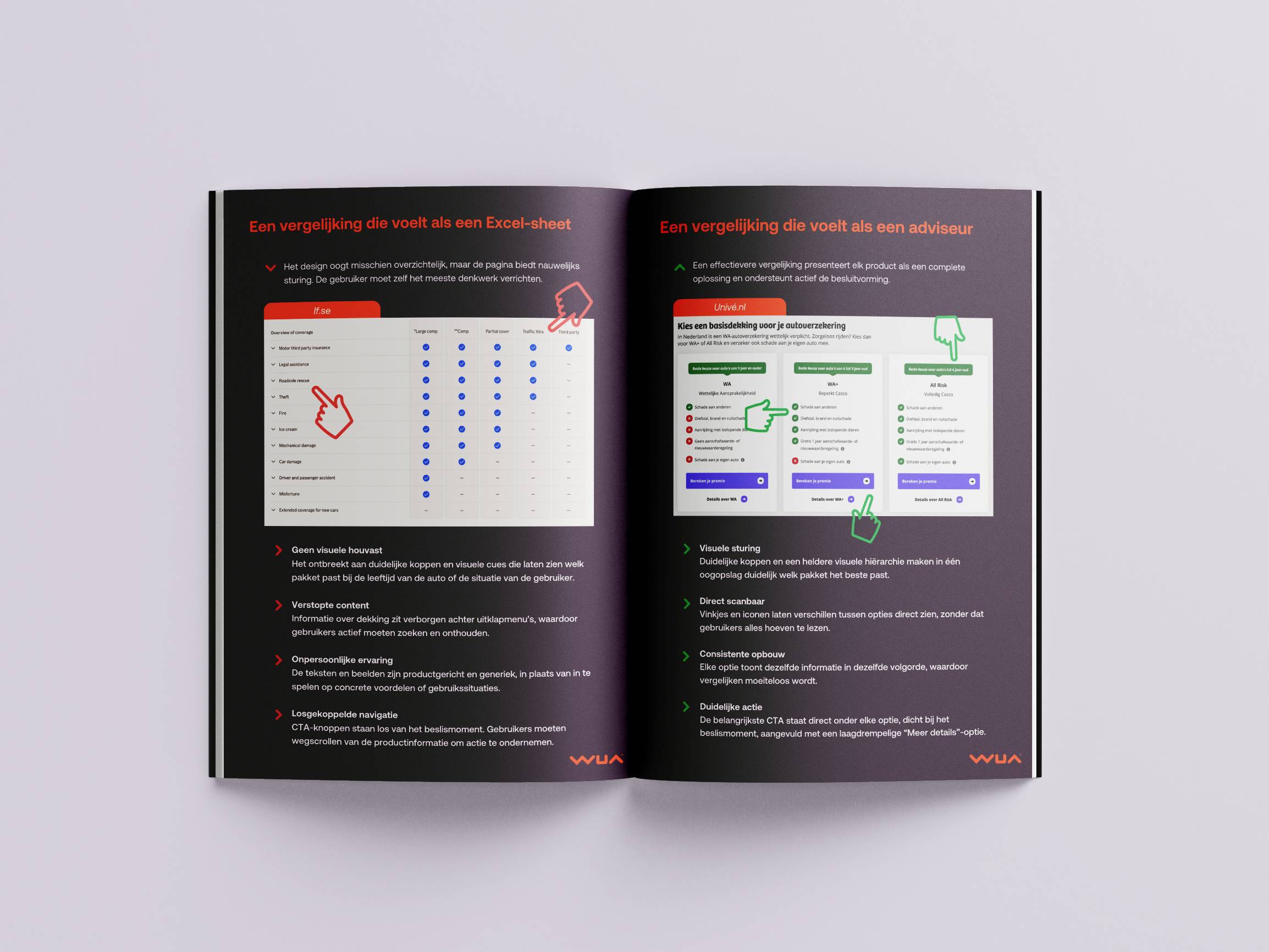
If.se represents the typical approach: a clean but passive layout that puts the burden of interpretation on the user. Coverage details are hidden behind accordions, copy is product-centric rather than benefit-driven, and CTA buttons are disconnected from the decision moment. The result is a page that feels like a spreadsheet.
Univé.nl takes the opposite approach. A tile-based design presents each product as a complete, scannable solution. Distinct headers immediately signal which option fits which situation. Green checkmarks and red crosses make differences visible at a glance. CTAs sit directly below each option, at the exact moment the user is ready to act. The result is a page that feels like a trusted advisor.
The difference between these two approaches is not cosmetic — it is structural. Pages that actively guide users by reducing cognitive load, emphasizing meaningful differences, and anchoring choices visually consistently outperform those that simply display information.
Use the included checklist to assess your own comparison page. If your layout does not highlight a recommended option, does not use visual cues to surface differences, or places CTAs away from the decision moment, you are likely leaving conversions on the table.
The opportunity is concrete and measurable. Start by benchmarking your comparison flow against the market and identify exactly where friction is holding your funnel back.
Product comparison pages are one of the highest-stakes moments in any digital funnel. Yet most of them fail users at exactly the wrong time. Instead of guiding visitors toward a confident decision, they present dense specification lists and subtle distinctions that increase cognitive load and trigger choice paralysis.
This whitepaper by WUA examines what separates a comparison page that converts from one that frustrates — using car insurance as a case study. Car insurance is a particularly challenging product: it is intangible, mandatory, and something consumers actively avoid thinking about. When visitors reach the comparison step, they are already mentally taxed. The page has one job — make the decision feel easy.
WUA contrasts two live product comparison pages to illustrate the gap between best practice and common mistakes.
If.se represents the typical approach: a clean but passive layout that puts the burden of interpretation on the user. Coverage details are hidden behind accordions, copy is product-centric rather than benefit-driven, and CTA buttons are disconnected from the decision moment. The result is a page that feels like a spreadsheet.
Univé.nl takes the opposite approach. A tile-based design presents each product as a complete, scannable solution. Distinct headers immediately signal which option fits which situation. Green checkmarks and red crosses make differences visible at a glance. CTAs sit directly below each option, at the exact moment the user is ready to act. The result is a page that feels like a trusted advisor.
The difference between these two approaches is not cosmetic — it is structural. Pages that actively guide users by reducing cognitive load, emphasizing meaningful differences, and anchoring choices visually consistently outperform those that simply display information.
Use the included checklist to assess your own comparison page. If your layout does not highlight a recommended option, does not use visual cues to surface differences, or places CTAs away from the decision moment, you are likely leaving conversions on the table.
The opportunity is concrete and measurable. Start by benchmarking your comparison flow against the market and identify exactly where friction is holding your funnel back.
Introduction: The Challenge of Product Comparisons
Complexity in product comparison pages increases cognitive load and causes choice paralysis. The best-performing comparisons actively guide users toward the right option rather than leaving them to figure it out themselves.
The Do's and Don'ts of Product Comparisons
Car insurance is an intangible, high-friction product where the comparison step is the most critical moment in the funnel. Visitors arrive already overwhelmed, making clarity and guidance essential.
Don't: A Comparison That Feels Like a Spreadsheet (If.se)
If.se's comparison page illustrates common pitfalls: no visual guidance, hidden content behind accordions, impersonal copy, and CTA buttons disconnected from the decision moment — all of which increase friction.
Do: A Comparison That Feels Like an Advisor (Univé.nl)
Univé.nl's tile-based design demonstrates best practices: clear visual hierarchy, instant scannability with checkmarks and crosses, consistent structure, and CTAs placed directly at the moment of decision.
Checklist: Does Your Product Comparison Support Decision-Making?
A practical five-point checklist helps teams assess whether their comparison page reduces friction or unintentionally creates it, covering layout, visual cues, hierarchy, CTA placement, and value clarity.
Next Step: Optimize Your Comparison Flow with WUA
WUA offers a free 30-minute call to review your comparison funnel, identify friction points, and surface concrete opportunities to improve conversion.
Enter your email and get instant access to all our content: 250+ articles, case studies, masterclass recordings, and whitepapers.
Already registered? Enter your email to get instant access again.
Discover how WUA can help you outperform the competition.
Get in touch