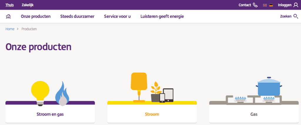
We already told you about the energy research that WUA conducted in November 2016 among 400 consumers: 200 respondents participated on desktop and 200 used their smartphone. Among the smartphone respondents, Nuon.nl stood out positively on the Brand theme. You can find more about this in this best practice.
In this article we zoom in on respondents who searched for a new energy contract on their desktop. In the orientation research, three themes are always central, namely Look & Feel, Offering and Brand. Desktop respondents were very pleased with Nuon.nl on the Look & Feel theme. The website ended up in (shared) first place among both respondents who formed a first impression of the website and respondents who delved deeper into Nuon.nl. In this article we show what Nuon.nl does well that makes the website win over respondents.
1. Nuon.nl uses clear entry points to the products
Once they arrive on an energy provider's website, it's important for respondents to quickly get a good picture of what the website has in store for them. Nuon.nl approaches this in a smart way by presenting the offering using clear icons. As soon as you move the mouse pointer over a product (for example "Gas"), a small animation follows where the gas flames move slightly. Respondents are very pleased with the Look & Feel of Nuon.nl: "The appearance of this site really appeals to me because a lot of attention has been paid to the layout of this site."

2. Imagery supporting the product
The imagery on Nuon.nl is always related to the product you are currently viewing. The overview page about gas shows, for example, two cheerful ladies, busy in the kitchen. When scrolling down, the foreground text appears to slide over the background photo, revealing the smiling heads of the characters.


3. Nuon.nl offers clear pages
Respondents who delve deeper into Nuon.nl's website are very pleased with the way Nuon informs them about the various energy approaches in clear language and easily readable letters. Informative pages are clearly structured in two columns where specific product information is alternated with compelling customer quotes. Information is presented briefly but powerfully using bullets and is supplemented where necessary with a compelling video animation. In the words of a respondent, when asked: "What do you find positive about the look & feel of this website?" the answer was: "Clean design, clear and exactly the right amount of info."


