general
5 min•Insight
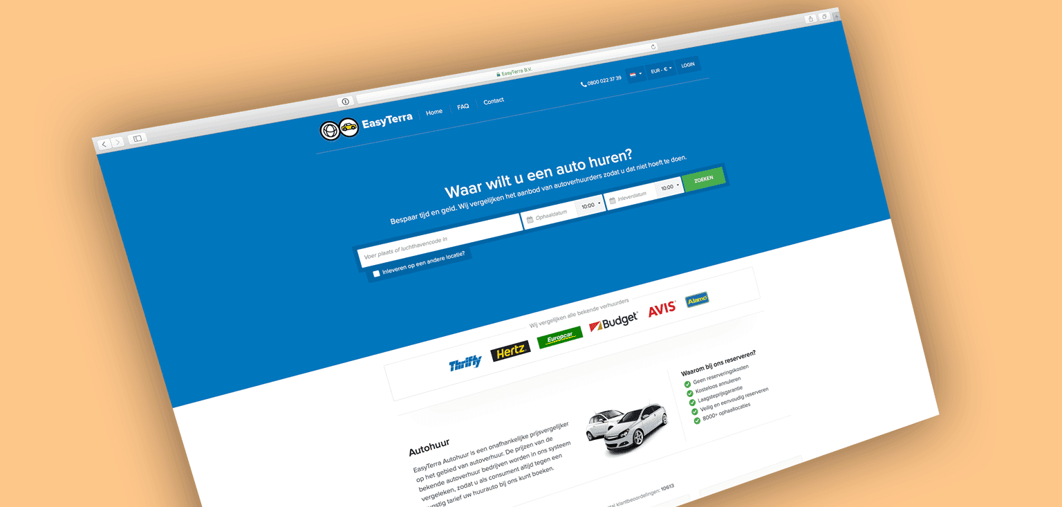
WUA research into Look & Feel of car rental websites. Rentalcars.com wins with Web Performance Score of 75. Insights into what top performers do well on usability and design.
Discover how WUA can help you outperform the competition.