general
2 minwebinar
Improve your mobile UX with this checklist. From navigation and product presentation to pricing transparency and checkout. Less friction, more conversion.
By Linda
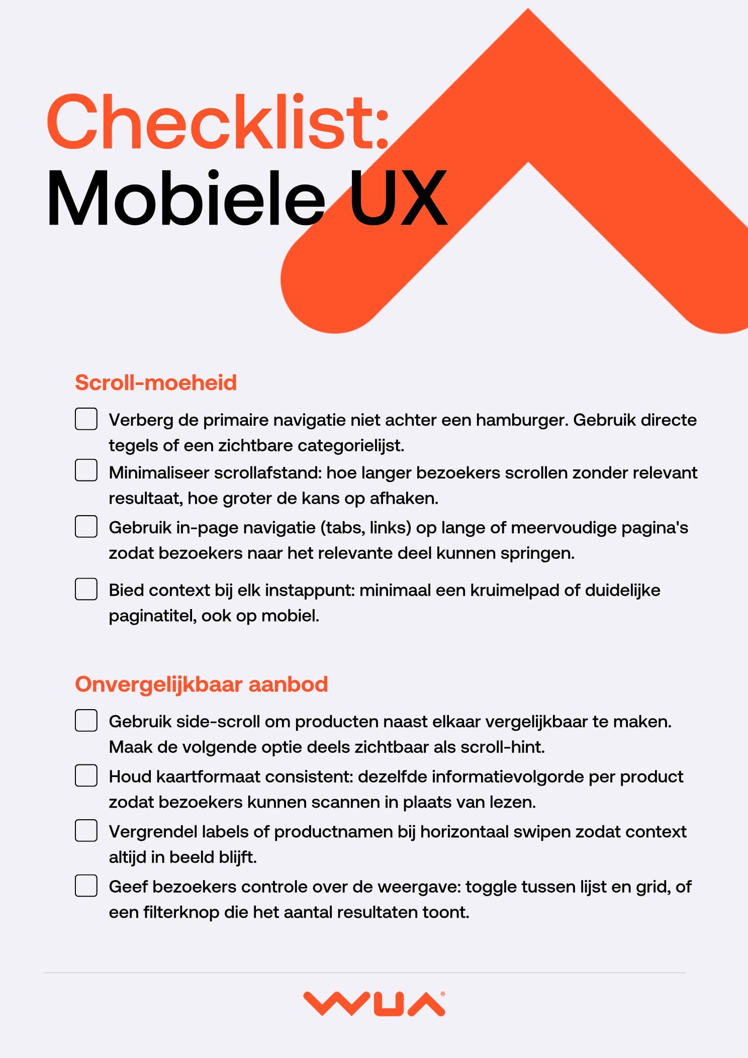
Mobile is no longer an afterthought. Yet mobile experiences are often built as a scaled-down version of desktop. The result? Visitors drop off at navigation, scrolling, comparing products, and checkout. This checklist gives you concrete actions to prevent that.
Don't hide primary navigation behind a hamburger menu. Visitors need to see their options at a glance. Long pages call for in-page navigation. Always provide context through breadcrumbs or a clear page title.
Side-scrolling makes product comparison possible on mobile, but only when done right. Keep card layouts consistent, lock product names while swiping, and make the next option partially visible as a scroll hint. This lets visitors scan instead of read.
Text alone doesn't convince on mobile. Use video and recognisable scenarios to make products tangible. Apply brand colours consistently throughout the page and choose a background colour that fits your product positioning. White isn't always the strongest choice.
Show prices early in the process, before the complex steps. Link every choice directly to a visible price change and keep the total price visible on every screen. Surprise pricing at the end kills conversion.
A mobile form deserves its own design. Use the numeric keyboard for number inputs, disable autocorrect on name fields, and enable address autofill. Structure the form by complexity: straightforward questions together, difficult choices on their own step. Show progress and remove distractions.
Treat mobile as a channel in its own right and you'll see better results. This checklist helps you remove the most common barriers.

Mobile is no longer an afterthought. Yet mobile experiences are often built as a scaled-down version of desktop. The result? Visitors drop off at navigation, scrolling, comparing products, and checkout. This checklist gives you concrete actions to prevent that.
Don't hide primary navigation behind a hamburger menu. Visitors need to see their options at a glance. Long pages call for in-page navigation. Always provide context through breadcrumbs or a clear page title.
Side-scrolling makes product comparison possible on mobile, but only when done right. Keep card layouts consistent, lock product names while swiping, and make the next option partially visible as a scroll hint. This lets visitors scan instead of read.
Text alone doesn't convince on mobile. Use video and recognisable scenarios to make products tangible. Apply brand colours consistently throughout the page and choose a background colour that fits your product positioning. White isn't always the strongest choice.
Show prices early in the process, before the complex steps. Link every choice directly to a visible price change and keep the total price visible on every screen. Surprise pricing at the end kills conversion.
A mobile form deserves its own design. Use the numeric keyboard for number inputs, disable autocorrect on name fields, and enable address autofill. Structure the form by complexity: straightforward questions together, difficult choices on their own step. Show progress and remove distractions.
Treat mobile as a channel in its own right and you'll see better results. This checklist helps you remove the most common barriers.
Log in and get instant access to all our content: 250+ articles, case studies, masterclass recordings, and whitepapers.
Log inWant to automatically stay up to date with our latest best practices, whitepapers and masterclasses? You can opt in after logging in.
Discover how WUA can help you outperform the competition.
Get in touch