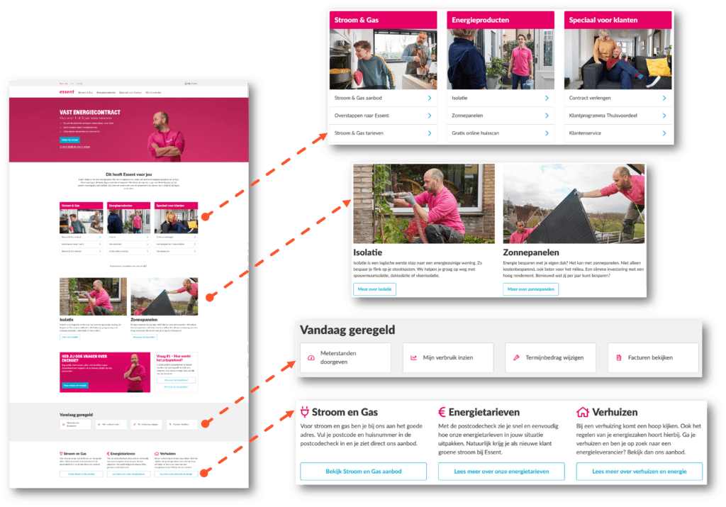
Customers always compare. It's very simple to pull out your phone and look at other offers online. This probably sounds familiar and you do it yourself too. You want to score the best deal before making a purchase decision. This need to check out the competition is even stronger when it comes to energy contracts. When signing an energy contract, serious money is at stake. Especially if you're looking for a fixed contract with the best rates. Or if you're considering finding a cheaper supplier to lower your fixed monthly costs. In these situations, customers are ready to switch as soon as something better comes along. Whatever sector you're in: in practice, this means your website visitors are always just one click away from leaving to see what's available elsewhere. And once they leave, the chance they'll return is small. There was something that made them decide to leave. The problem is that it's not always clear what those reasons for leaving are.
400 respondents searched online for an energy contract
At WUA, we study thousands of customer experiences every year. We also do this in the highly competitive energy sector. We asked 400 respondents to sign an energy contract online. We collected both qualitative and quantitative data. By analyzing how the best-performing energy companies beat the competition, we discovered best practices. These best practices are valuable for any company. They're quick wins you can use to improve your digital customer experience and increase conversion rates. Essent and Engie clearly emerged as winners from the research, both in terms of customer experience and which party was ultimately chosen to sign the contract. We'd like to take you through their best practices, so you too can become a leader in your market.
Best practice #1: Scannable structure
When customers are exploring a new provider, they look for signs that indicate they're in the right place. Those signs need to be quickly visible. You measure visibility with a 'blink test'. The blink test means you should be able to understand the offer before you've blinked. And the easier the message, the lower the bounce rate. You reinforce this with a scannable structure. There are two ways to successfully achieve this goal: minimal text and sufficient white space.
Saying more with fewer words
A company that does this well is the Dutch energy supplier Essent. Essent ensures that every text informs directly and efficiently.
Essent explains what they do and how they help customers with just a few words. The effect is very positive; just a handful of words tells the story of who they are. And now that the brand story is outlined, the consumer can easily place each additional piece of information into this picture. This builds trust in the brand and creates knowledge about the Unique Selling Points (USPs).
The qualitative feedback from consumers supports this:
"The homepage was clear and straightforward."
"Clear first page. Everything you need to know is right there."
"It looked very nice with that first image and colors. It sparked interest."
Sufficient white space
Sufficient white space complements the minimalist approach to text. The white space makes it clear where visitors should look for information. This is especially important for mobile visitors. Think of a typical target, like a dartboard that people shoot arrows at. The target is a large red dot surrounded by white space. It's immediately clear: this is where you should look - and this is what white space does on a website too. Essent makes extensive use of this tactic. The webpage layout makes the structure clear because each section is emphasized by a 'frame' of white space.
This tactic works because cognitive overload is avoided. When someone is exploring online, it usually means you have to sift through a lot of information. This uses up a large part of your mental capacity. Consumers often feel overwhelmed. This is called cognitive overload - an excess of information that makes it harder to understand or compare different offers. To avoid this, selective information presentation is important, but also visual calm and guidance.
Best practice #2: The rule of 3
When it comes to sharing information, remember the holy trinity: the rule of 3. Good things always come in threes. This actually applies to many things. People find it easier to remember something if it consists of three parts. They knew this long ago. Storytellers have been using 'the rule of 3' for millennia to ensure their listeners remember information. From the three little pigs to the three witches of Macbeth, and every triptych, triptych or trio: the rule of 3 is everywhere. But is this rule of 3 also on your website? Essent certainly uses it. Essent presents USPs in easily digestible groups of three. This technique avoids cognitive overload and makes it easy to remember USPs. We also see this with another energy supplier, Engie. Engie presents USPs in a single block with the three most important USPs at the top, including social proof. There's plenty of white space around the text. This way you can take in and understand the information at a glance. 
Stimulating action with microcopy
Engie sweeps away any doubts the customer might have with 'microcopy'. This copy sets reasonable expectations and removes specific customer objections. Microcopy thus creates immediate context for understanding and processing information. Under the three USPs, for example, you place microcopy indicating that calculating your monthly amount takes only 'one minute'. The customer then thinks: "Oh well, one minute is nothing. I'll do that." This way microcopy immediately removes the objection 'takes too much time'. The more motivation a visitor has, the more effort an action may cost for this visitor. In psychology, this is also called the 'Fogg Behavioral Model'. In Engie's example, microcopy plays an important role as motivation is increased by removing uncertainty. By increasing motivation, the chance that the visitor completes the desired action increases. In short, microcopy may seem like a small addition, but it has a big impact on your online conversion rate.
The qualitative feedback from consumers supports this:
"Clear picture, I immediately know where to look and immediately see how I can ask questions."
Best practice #3: Icons and images for understandable information
Icons and images help you tell a story in fewer words. Research shows that our brains process an image 60,000 times faster than text. Essent uses icons to break down complex processes into easily understandable steps. The icons show the action the website visitor should take. Icons help understand text better and remember the message well.
Essent also uses images that 'show what they mean'. For example, an image of an installer placing solar panels. This image is a clear and scannable signal for someone looking for this solution.
Engie also cleverly uses this tactic, where the image supports the accompanying text.
This way Essent makes a complex story about values and benefits simple, without using a single word.
The qualitative feedback from consumers supports this:
"In the header you can calculate an offer, but they also show what else they do."
"Relaxing website, and handy panels."
Best practice #4: Visual materials for an emotional brand experience
Even when price is a deciding factor, emotions play an overwhelming role in information processing. That's why an emotional brand experience is so important - and Engie excels at this. Their leading digital customer experience harnesses the power of visual materials to stimulate an emotional response. By featuring people prominently, visitors immediately get a positive feeling about the brand. With just a quick glance, they already know what Engie stands for. Additionally, Engie uses cheerful visual materials and a consistent brand color to form a powerful brand identity.
This makes them credible and recognizable. Images of happy people enjoying their lives through reliable, environmentally friendly energy reinforce this feeling. Again, a powerful story is told without using a word. Showing smiling people is also a clever technique to influence visitors' decision-making process, also known as the 'affect heuristic'. People are continuously (unconsciously) influenced by their own emotions when making a choice. When seeing smiling people on a website, the consumer's positive mood increases. And this positive mood has been proven to increase the chance of converting.
The qualitative feedback from consumers supports this:
"Fresh appearance."
"Playful, light and lots of photos."
"It looked nice with the first image and colors. Inspiring and interesting."
"Calm colors, beautiful image, clear information."
Best practice #5: Images to direct attention to actions
One of the most powerful tools for online persuasion is giving direction through eye contact. The principle is simple and supported by many studies. Imagine you're walking down the street and see someone standing, staring at something in the air. Most people would naturally look up to see what the other person is looking at. We call this gaze cueing. And the best part is: you don't need a real person for this! A static image does exactly the same thing. Both Essent and Engie make extensive use of gaze cueing in their online customer experience. By cleverly using images and the direction of the person's gaze in the image, they direct visitors' attention to important information and CTAs. This can be subtle like with Engie, but can also be very directive like with Essent. The effect of gaze cueing is that visitors are relieved of burden. They don't have to decipher the information themselves, but get a visual 'signpost' that leads them to the next step in their customer journey. 
Best practices for maximum yield
Do you want to improve your digital customer experience? These tactics will help you! When there's a lot of competition, an optimal digital customer experience is more important than ever. It's very easy for your potential customer to drop out at even the smallest bump in their online customer journey. To win consumers in highly competitive sectors, your customer experience must be the best in the market. The energy providers above apply these five best practices to:
-
Relieve visitors of burden;
-
Make it easier to understand offers;
-
Stay on track towards conversion;
-
Give a positive, clear impression of their brand identity.


