 finance
5 min•Case Study
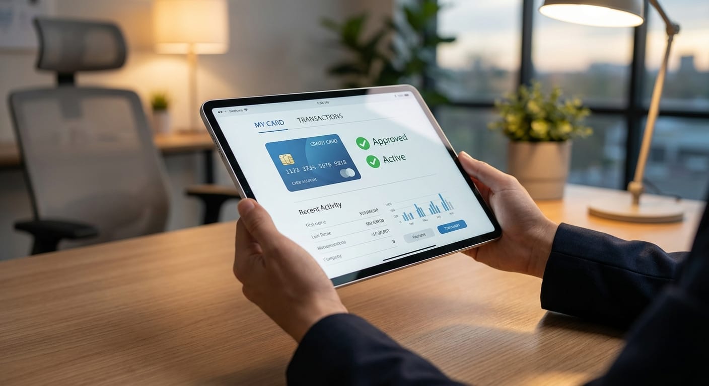
WUA benchmark research on Look&Feel of credit card websites. YourMasterCard.nl wins with clear layout and effective use of visual elements for quick information processing.
Discover how WUA can help you outperform the competition.

