general
2 minwebinar
Learn how information flow drives conversion. 5 common pain points, best practices, and actionable tips to retain visitors and boost conversion.
By Linda
Attention spans on digital screens have dropped dramatically: from 150 seconds in 2004 to just 47 seconds in 2023. Meanwhile, mobile usage continues to rise and consumers expect effortless interactions. Within seconds, they want to understand where they are, what they can do, and why they should choose you. After all, alternatives are always just one click away.
This e-book demonstrates that how you organize and present information matters more than the content itself. Even valuable information misses its mark when presented in a fragmented, illogical, or overwhelming way. The findability, sequence, and readability of information determine how visitors experience your brand and whether they stay or leave.
Visitors behave as information foragers: they follow 'scent trails' from headings, buttons, and visuals that signal value and relevance. They constantly evaluate whether the path is worth pursuing. The bite-snack-meal method also applies: not everyone has the same information needs. Layered information lets visitors decide how deep they want to go, without feeling overwhelmed.
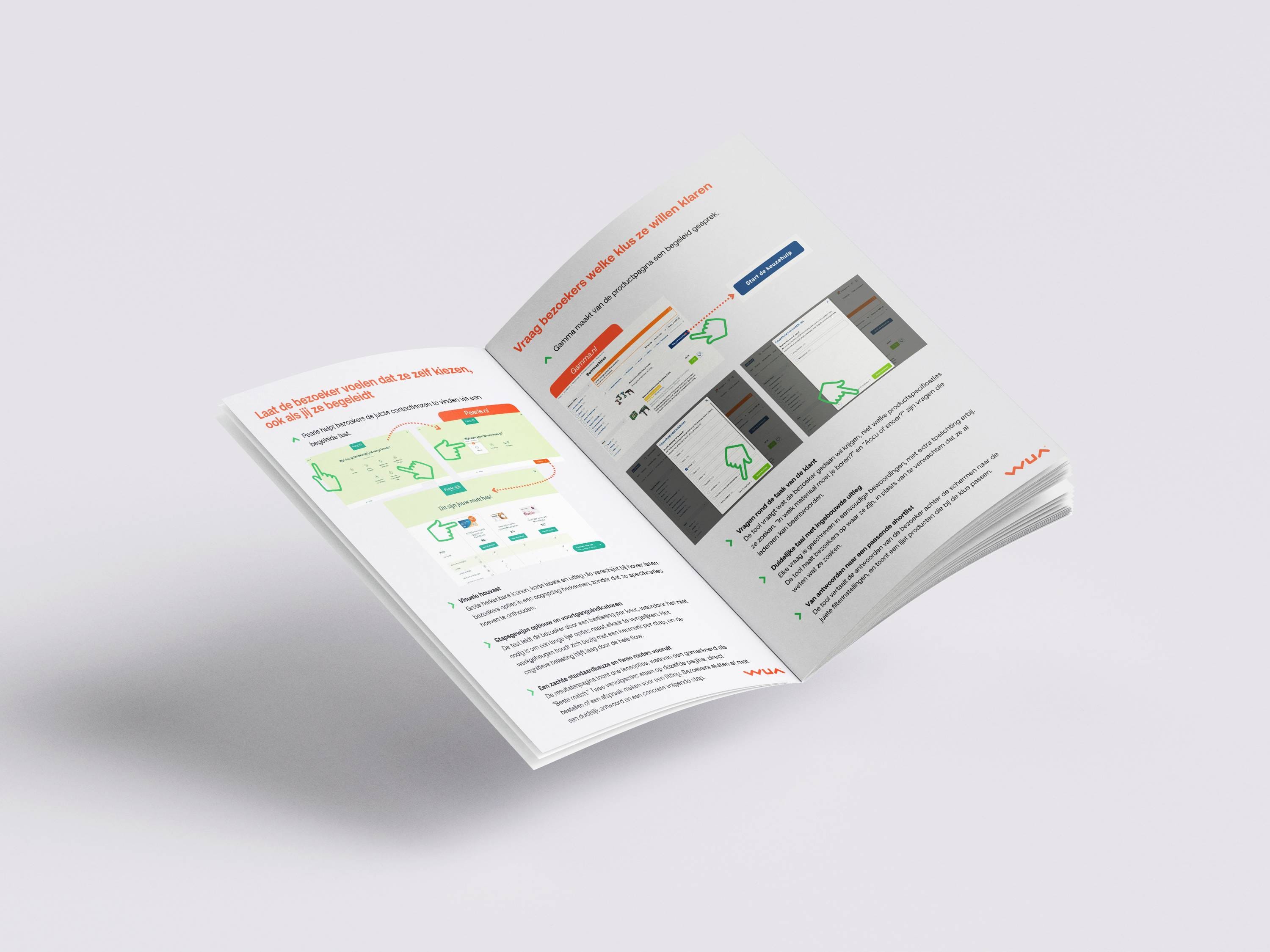
WUA identified five pain points that cost conversions: overcrowded landing pages with moving banners, unsuitable navigation without clear direction, suboptimal comparison layouts in tile format, excessive text that makes scanning impossible, and fragmented information without logical grouping. Each problem may seem small, but together they cause visitors to abandon your site.
The e-book showcases best practices from leading brands like ANWB, CentraalBeheer, FBTO, and Brand New Day. They demonstrate how calm landing pages, intuitive navigation with quick-access menus, effective comparison tables, compact information with accordions, and clear segmentation lead to better conversion. A comprehensive checklist helps you improve your information flow step by step.
Winning in the market starts with understanding the customer journey. By optimizing your information flow, you ensure visitors quickly find what they need and develop trust in your brand.

Attention spans on digital screens have dropped dramatically: from 150 seconds in 2004 to just 47 seconds in 2023. Meanwhile, mobile usage continues to rise and consumers expect effortless interactions. Within seconds, they want to understand where they are, what they can do, and why they should choose you. After all, alternatives are always just one click away.
This e-book demonstrates that how you organize and present information matters more than the content itself. Even valuable information misses its mark when presented in a fragmented, illogical, or overwhelming way. The findability, sequence, and readability of information determine how visitors experience your brand and whether they stay or leave.
Visitors behave as information foragers: they follow 'scent trails' from headings, buttons, and visuals that signal value and relevance. They constantly evaluate whether the path is worth pursuing. The bite-snack-meal method also applies: not everyone has the same information needs. Layered information lets visitors decide how deep they want to go, without feeling overwhelmed.
WUA identified five pain points that cost conversions: overcrowded landing pages with moving banners, unsuitable navigation without clear direction, suboptimal comparison layouts in tile format, excessive text that makes scanning impossible, and fragmented information without logical grouping. Each problem may seem small, but together they cause visitors to abandon your site.
The e-book showcases best practices from leading brands like ANWB, CentraalBeheer, FBTO, and Brand New Day. They demonstrate how calm landing pages, intuitive navigation with quick-access menus, effective comparison tables, compact information with accordions, and clear segmentation lead to better conversion. A comprehensive checklist helps you improve your information flow step by step.
Winning in the market starts with understanding the customer journey. By optimizing your information flow, you ensure visitors quickly find what they need and develop trust in your brand.
Log in and get instant access to all our content: 250+ articles, case studies, masterclass recordings, and whitepapers.
Log inWant to automatically stay up to date with our latest best practices, whitepapers and masterclasses? You can opt in after logging in.
Discover how WUA can help you outperform the competition.
Get in touch