What customers say about the websites of American Express, Tangerine, and Scotiabank
In our inaugural study in Canada, 300 respondents ranked websites offering credit cards. While we addressed the sales performance of the study here, AmericanExpress.com, Tangerine.ca, and Scotiabank.com were among the best for Digital Customer Experience. This Customer Experience Ranking is a representation of the total experience on every website based on questions on the themes Look & Feel, Offer, and Brand. Think of, for example, the clear and quick presentation of the offer on a website, and the trust people have in the company behind the website. Below we address what AmericanExpress.com, Tangerine.ca and Scotiabank.com either do well or can improve in terms of customer experience management.
AmericanExpress.com scores highest on customer experience
Respondents complimented the visual appeal of AmericanExpress.com, not just at first glance but also when consumers look further into the website. The website has a clean feel, with simple interactive mouse-hover elements with the credit card offers below a relevant and appealing banner. With strong name recognition throughout Canada, as well as the US and globally, AmericanExpress.com can count on a strong, established brand to benefit its customer experience performance.

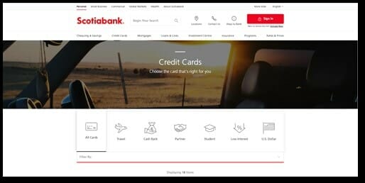
Images that lack relevance to the customer journey knock off CX-points for runner up Scotiabank
Scotiabank.com effectively manages its site visitors towards preferring their credit cards and achieves second place in the Digital Sales Ranking. Nonetheless, it can make steps forward in the customer experience. Though the site performs quite well on the perception of its product offer and of the Scotiabank brand, it scores lower on appearance (Look & Feel). For example, the banner picture does not match the customer need. An empty car and sunshine have little congruency with credit cards. Besides one other image at the bottom of the page, the website lacks imagery to convey the benefits of a credit card with Scotiabank. Here, consumers are presented with an image of a family teaching their child to ride a bike. A nice touch, but easily missed by consumers.
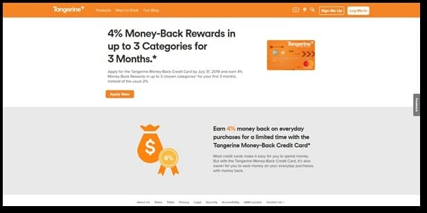
Simplicity in a single offer for the Toronto market is a success for Tangerine.ca
Branchless challenger Tangerine keeps credit cards simple by offering a single credit card focused on Money-Back rewards. Both the landing and product pages present a simple offer to consumers with strong competitive benefits. Next to good brand perception and pleasing appearance, the website comes in second in customer experience. The credit card provider cuts straight to the point on its landing page: “4% Money-Back Rewards in up to 3 Categories for 3 Months.*”, clearly summarizing the key benefit of a credit card on Tangerine.ca. Further down the pages, clear page segments outline additional benefits, how the card and company work, and all associated costs. By stating the benefits upfront, Tangerine.ca creates a good price-to-quality perception, which convinces consumers to apply for a credit card at Tangerine.ca. Altogether, simplicity is key for a website solely catering to the Greater Toronto Area. Parent company Scotiabank can take note.
Get the latest numbers in the Canadian Credit Card market
This analysis is based on a study conducted in Canada in May 2019. Read more about this study here.