How to communicate your brand through web design: The case of AmericanExpress.com
Three customer experience themes are measured when we conduct a Digital Sales Scan: Look & Feel, Product Offer, and Brand. The last theme is vital for the longevity of any company, but one that is at times misunderstood. In this piece, we’re going to further develop the ideas behind the theme Brand through a case study of AmericanExpress.com
In our second customer experience benchmark of the online market for credit cards, AmericanExpress.com received a score of 84 for the theme Brand on desktop and a score of 85 on smartphone—the highest scores in the study. But what does this really mean? While some clients believe that Brand is simply a marker for how well-known a company is, the reality is that Brand is something much more complex. Brand underlines how committed companies are perceived to be by potential customers and the level of support they expect to receive. Brand deals with trust and clear-cut communication which must consistently be brought over throughout the customer journey. Brand doesn’t simply measure a company’s reputation, but rather, it measures how the website handles the company’s reputation. To get a gage of how Brand is measured in our studies, here are a few of the statements that respondents rate on a scale from 1 to 7 during their customer journey, with 1 being completely disagree and 7 being completely agree.
– The company behind this website seems sympathetic
– The company behind this website makes a professional impression
– The company behind this website seems knowledgeable
– I trust the company behind this website
– I expect to receive good service from this company
– I don’t expect any hidden surprises
– I like the options for contacting the company behind this website
Beyond rating these statements we also ask open questions such as “What do you like or dislike about the company behind this website?” The results from these statements and questions provide us outstanding insights into the perception that consumers have of companies. Before we dive into this case study, it’s crucial to understand that Brand goes far beyond displaying contact information on the website, or pasting awards and prizes to show credibility. Whether or not a customer thinks a brand is sympathetic, knowledgeable, or capable or living up to its promises is directly reflected by the way the visitors are treated throughout the customer journey.
Brand perception during the first impression
Companies must communicate the reliability of their brand the moment the customer enters their website. And in no industry does this hold more truth than in the credit card market. After all, credit card providers deal with the way people spend cash, something that can’t be taken lightly. Before we dive into the deeper messages that companies communicate throughout the customer journey, we should first look at some of the practical design implementations to bring a sense of trust and care to potential customers. For example, placing a ‘lock’ icon beside the log-in tab is a simple way to communicate that the website is on a secured server. A lock icon graces the homepage of AmericanExpress.com, which finished first in the category ‘Trust’. On the other hand, BankofAmerica.com, one of the bottom-dwellers for this category, doesn’t feature one.
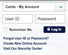
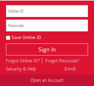
A snippet of the home pages of American Express(left) and Bank of America (right)
Card comparison
A webpage that allows customers to compare different credit cards is a staple on the websites of credit card providers. With a seemingly infinite selection of cards to choose from, it’s imperative that providers display all the options and features that come with each one in a manner that’s simple, clean, and easy to understand. Simply put, the website design must make the customer feel assisted when comparing different cards. And while such suggestions seem like they mostly have to do with theme Look & Feel, the reality is that it also has a major influence on the way consumers experience the Brand. The examples below will further accentuate this point.
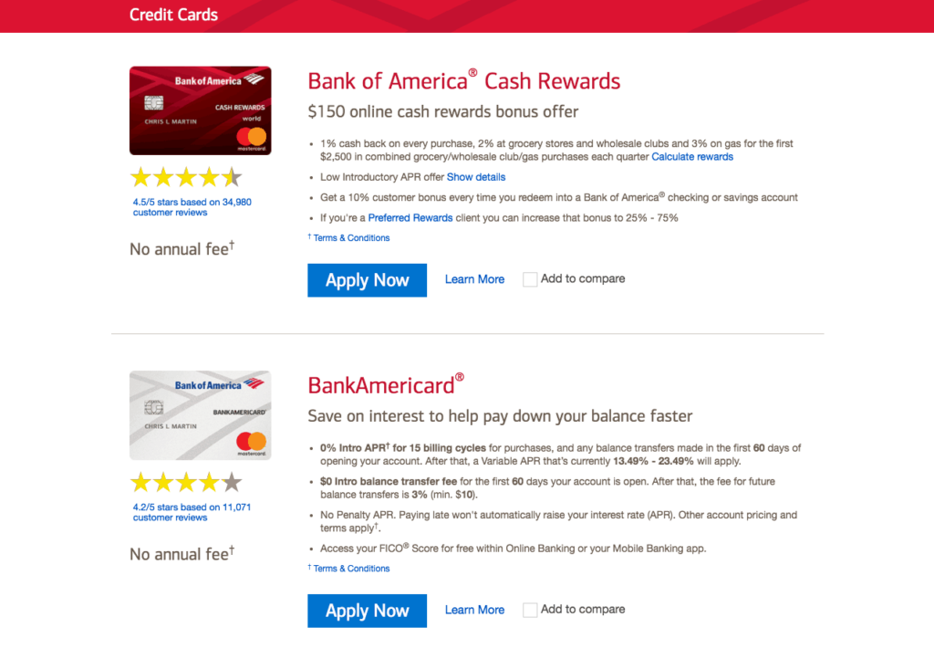
The credit card comparison page on BankOfAmerica.com
Every credit card comes with different fees, rewards, and interest rates, making the process of selecting one a bit complex. BankofAmerica.com doesn’t make it any easier to choose one. In the screenshot above, we see the credit card comparison page featured on BankofAmerica.com. Each credit card is stacked above the other, forming an endless column of different credit cards. However, the consumer can only see two cards on their screen at a time, and the bullet points situated beside each card lists a number of features in no particular order. Respondents in our study weren’t too impressed by all of this, with one respondent saying they “hate all the scrolling” while another respondent lamented the comparison page for being “overwhelming.”
So, what does this all have to do with the theme Brand? To answer this, we must ask a different question: What are you saying about your brand’s approach to customer service when you don’t make it as easy as possible to choose a credit card? As mentioned earlier, the theme Brand is partially measured by the level of support customers expect to receive from the bank, and with Bank of America’s website design, it’s as if the bank is saying “Here are a bunch of credit cards. Go figure it out yourself.” The design of the comparison page on BankofAmerica.com doesn’t give customers the impression that the brand will go the extra mile to keep the customer informed and satisfied. Behold how AmericanExpress.com communicates their brand through the design of their website.
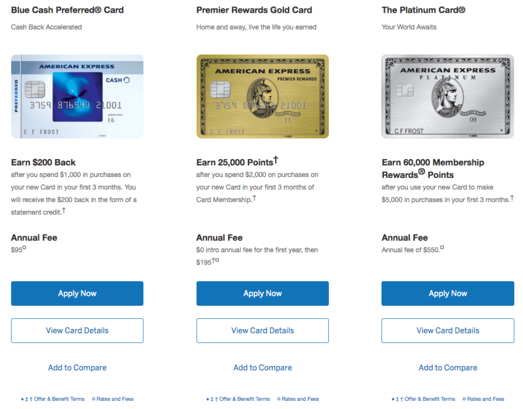
The credit card comparison page on AmericanExpress.com
Above we see the credit card comparison page on AmericanExpress.com. Notice how the different options are placed neatly in a row, making it simple to do a card by card comparison. The potential customer isn’t overloaded with information and fine print, and if they do want more information, a click on the “View Card Details” button takes them to another methodically organized page that explains all the features of the credit card in full. It’s a simple page, but one that won over respondents in our latest digital benchmark study. Multiple respondents expressed that the website was “easy to use.” Another respondent wrote: “There is absolutely nothing junking up the website. It is clean and simple.” That sums up AmericanExpress.com and their brand quite nicely.
Communicating the brand from start to finish
It’s been mentioned before, but it’s worth mentioning again: Brand is something that a company must communicate throughout the customer journey. Whether it be directly through the text placed on the website or through the functional design of the website, it’s essential that a message of professionalism and reliability is consistently being conveyed in order to build trust. That means that the general design of the site shouldn’t change too much from the moment the customer enters the site to the last step of customer journey, namely the application process. In this aspect, there’s a world of difference between BankofAmerica.com and AmericanExpress.com.
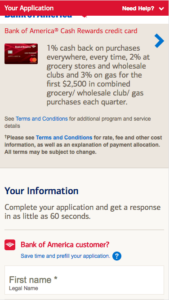
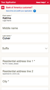
The credit card application process on BankOfAmerica.com
In the trio of smartphone screenshots above we see the application process as featured on BankofAmerica.com. To say it’s a bit messy would be an understatement. The screenshot on the far left is the first thing that the customer sees upon entering the site—a header that cuts the logo of the bank in half and a small review of what the card has to offer. Below this comes a couple dozen standard questions about personal information as displayed in the central screenshot. Once the customer finishes filling out this portion, they are met with a behemoth sized document full of terms and conditions where the font only shrinks the further one scrolls down. This only works to evoke suspicion within the customer and doesn’t help the brand in their quest to gain the trust of their potential customers. And despite there being so much text on this application page, there’s no mention at all that the customer’s personal information is safely secured. Shall we take a look at the application process of AmericanExpress.com?
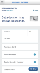
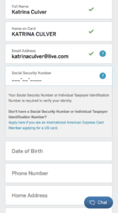
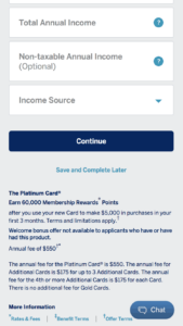
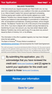
The credit card application process on AmericanExpress.com
What is shown in the three screenshots above is all there is to the application process of AmericanExpress.com. Unlike Bank of America’s website, this isn’t an intimidating scroll-a-thon. Rather, it’s a proper example of how to communicate brand through design. Notice the contact options that AmericanExpress.com displays throughout the application process. The option to call is featured promptly at the start of the application process, and the option to chat remains in sight throughout the process. By doing this, the customer feels supported by the brand. Secondly, the site keeps the customer informed about the progress they’re making while filling in the application. If a box is filled in correctly, a green checkmark appears next to it, as is displayed in the central screenshot. Another thing AmericanExpress.com does well here is they explain why they have to ask for highly personal information such as the social security number. When the customer clicks on this page, a textbox unfurls that briefly states that the social security number is needed to verify the identity of the customer. It’s also worth mentioning that, just like on the log-in screen at the beginning of the customer journey, this page also tells the customer that they’re on secured server. Lastly, the customer doesn’t run into an overwhelming amount of fine print at the end of the application process, which may help to explain why respondents rated AmericanExpress.com best for the category “Do not expect any hidden surprises.”
So what have we learned from all this?
The reputation of a brand doesn’t hinge entirely on their website design, but it does play a leading role. After all, in the age of the Internet, the website of a company is often the first place where impressions are formed. Here, brands have the opportunity to present themselves in a professional manner that is truly representative of their service. With this case study, we saw how AmericanExpress.com succeeds in displaying the value of their brand with their sleek, minimalistic design. The website constantly assures the customer that they’re on a secured site, keeps the customer informed, and carries over an air of professionalism throughout the whole customer journey. That is what the theme Brand is all about: creating a website in such a way the customer perceives the company as trustworthy and supportive.