This is how Simpel.nl gives the impression it has something for everyone
Simpel.nl has been winning the Digital Sales Scan since July 2017. An important reason for this is the price, although it’s not the only thing that convinces consumers. The website looks ‘festive’ and gives the impression the consumer will be able to find a suitable offer there. This way, people leave Simpel.nl’s online store content. This Best Practice is from the WUA SIM-only study from January 2019, conducted among 400 consumers.
At Simpel.nl, you choose simplicity and honesty
Simpel is open and honest about the prices and the data and minutes you’ll get for the prices. And that’s clear in Simpel’s pay-off as well: At Simpel.nl, you choose simplicity and honesty. And a little further on: maximum control over the costs. And regarding clear brand proposition at Simpel: all special deals are presented as separate choices, which makes it simple. This way, the visitor instantly sees how much a ‘package’ with an x amount of data and minutes will cost.
The same product presented as different options
By offering different suggestions for data and minutes presented as ‘packages’, the website visitor tends to think they’ll find a suitable offer on the website. Then, after the initial choice for a package, it’s still easy to switch to a different package. On top of that, the consequences of the choices are instantly visible on the receipt.
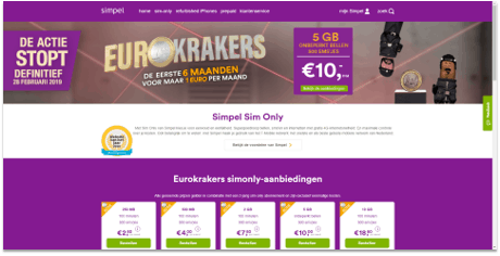
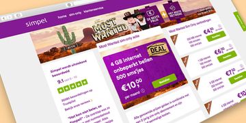
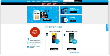
The website is clear and immediately offers insight into the provider’s services
“They come across as cheerful, it’s quite humorous, and I like the use of color,” says a consumer about the landing page (seen above) on Simpel.nl. The page has a simple layout, and the purple from the logo is also used as ‘visual cue’. The offer, with the prices for SIM-only subscriptions in it, is presented in a purple box, making it stand out immediately. It’s one of the reasons Simpel.nl scores high in clear presentation of the offer. Ben.nl is also positively assessed: “the site comes across like a party, it’s very cheerful.” The promotions, as on Simpel.nl, are presented clearly, which consumers appreciate.
AIDA: deals convince visitors
The marketing principle AIDA is clearly used on Simpel’s website. The text ‘deal will end definitively’ draws consumers’ Attention. The header and the several purple areas on the page show the most important focal points. Then, consumers’ Interest is peaked by drawing attention to the prices: website visitors can get 5GB of data for ten euros, for instance. By emphasizing the fact that Simpel uses the T-Mobile network – the fastest, best mobile network – consumers are slowly convinced of the offer (Desire), which is further assisted by the Website of the Year Award. Aside from the low prices, the final nudge comes when consumers scroll down: the several different options are perceived as variety in the offer, and the green ‘Order’ button is a clear push towards action.
Further down the page, reviews are published, one of which is opened. More reviews can be found after following a link-out.
Simpel has a special page designed to present the ‘benefits of SIM-only at Simpel.nl’. This mentions USPs in several places, as well as certifications and explanations in more elaborate texts about what the company offers.
Simpel’s success
Dutch level-headedness is the common thread in Simpel’s page. The website is clear, honest, provides a clear overview, and gives the website visitor the feeling that they will find what they need there.