How Eneco makes a good First Impression on its business customer
Making a good first impression on website visitors – it’s important in both the consumer market and the b2b market. In WUA’s April 2018 Energy Contract B2B study (find the most recent rankings here), Eneco.nl scores best in First Impression on CX themes Look & Feel, Offer and Brand.
The brand is also convincing on Offer and Brand in the In-Depth phase. The content on the website is inviting, the attention is drawn to the right elements, and the benefits for business customers are quickly made clear. Below, we explain the success of Eneco.nl in First Impression.
1. Look & Feel: A relevant welcome at Eneco.nl
The Eneco.nl website design is appreciated by visitors. One of the business customers in the study says: “Clear and well-organized website,” and also: “Nice, organized, good color combination” about the energy provider’s website. The images are pleasant and inviting to see and: they show (real) entrepreneurs.
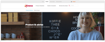
Furthermore, the website shows the most popular products on the landing page, and on the homepage of Eneco Business, the most important service tasks (enter your meter readings, view your most recent bill) are placed at the top.

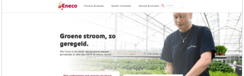
Eneco.nl keeps the looks of its website calm. With green buttons that stand out, blue text links, changing background colors, and light grey borders around the products, the website is given a modern, clear appearance, that’s neither messy nor busy. Thanks to icons, users are assisted further on the website.
2. Offer: Repeating USPs and offering overview of highest importance
The offer on the Eneco.nl website is also appreciated. Eneco.nl has “no bells and whistles” and a “wide selection”. On the page, USPs and benefits for business customers are mentioned. They save “money and energy” with Eneco, for example, and their business is “sustainable”.

The website gets down to business quickly, with a clear product overview, giving the visitor the choice between Gas and Energy. With clear product names that describe the product, the offer is also very clear. In Gas, for instance, there’s the choice between Natural Gas and Eco Gas, and in Energy, there’s EcoEnergy, DutchWind (wind energy), DutchWind from your neighborhood, and DutchSun.
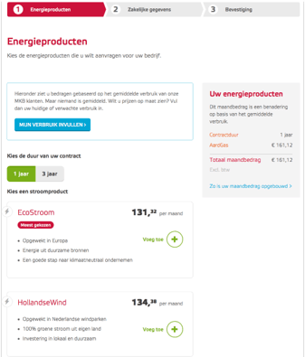
After the business customer has chosen from the energy products shown above, the website once more shows a clear overview. On the right side, in the light grey area, visitors instantly see the (average) monthly costs, and with the + behind the products, customers can easily add another product.